Poll results
Save to favorites
Add this poll to your saved list for easy reference.
Which graphic design and color theme is better for a Communication Skills / Assertiveness themed book cover? Which would entice you to buy the book? Why?

Option B won this Ranked poll with a final tally of 52 votes after 1 round of vote counting.
In a Ranked poll, respondents rank every option in order of preference. For example, when you test 6 options, each respondent orders their choices from first to sixth place.
PickFu requires a majority to win a Ranked poll. A majority winner differs from a plurality winner. A majority winner earns over 50% of the votes, whereas a plurality winner earns the most votes, regardless of winning percentage.
If an option does not earn a majority of votes, PickFu eliminates the option with the lowest number of votes. The votes from the eliminated option are reassigned based on each respondent’s next choice. This process continues in rounds until a majority winner emerges.
Scores reflect the percentage of total votes an option receives during the vote counting and indicate the relative preference of the respondents. If there is no majority winner, look to the scores to see how the options fared relative to one another.
| Option | Round 1 |
|---|---|
| B | 52% 52 votes |
| C | 22% 22 votes |
| E | 15% 15 votes |
| A | 7% 7 votes |
| D | 4% 4 votes |
Age range
Education level
Favorite book genres
Gender identity
Household income range
Options
Personal income range
Racial or ethnic identity
7 Responses to Option A
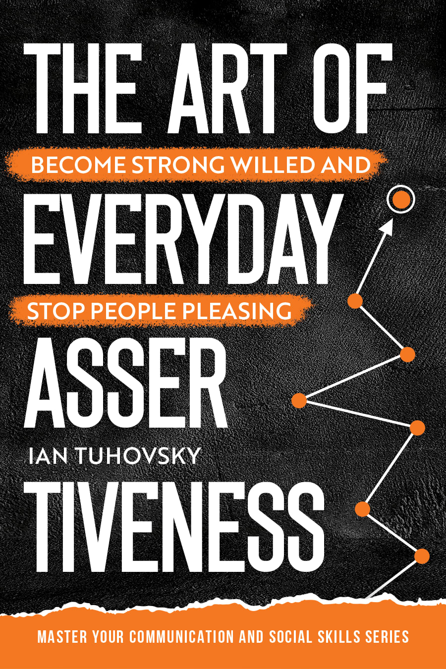
I chose option A because the line segments look like a graph that I would find in an important office job like CEO or something. And it makes me feel like the person who reads this book would do well in business.
I like option A the best because I like the graphic design to the right of the cover and I like the way the text is arranged. The only change I would recommend would be to change the orange colors used to yellow colors and I think that would make a slam dunk cover that is vibrant and attention grabbing.
I prefer covers where the title or concept stands out from the background
Option A particularly appeals to me. Very strong design work with an artsy feel. I like the inclusion of the chopped word in the title. Cool and clever.
The words of a title shouldn't be broken up like D and E, I like the option A because it feels like a map. Self-help should be a journey.
For me, A or D works for me,because the colors and design just make the cover appealing
The design, font, color scheme and flow of choice A makes it a desired choice. The cover makes me want to learn more and purchase the book.
52 Responses to Option B
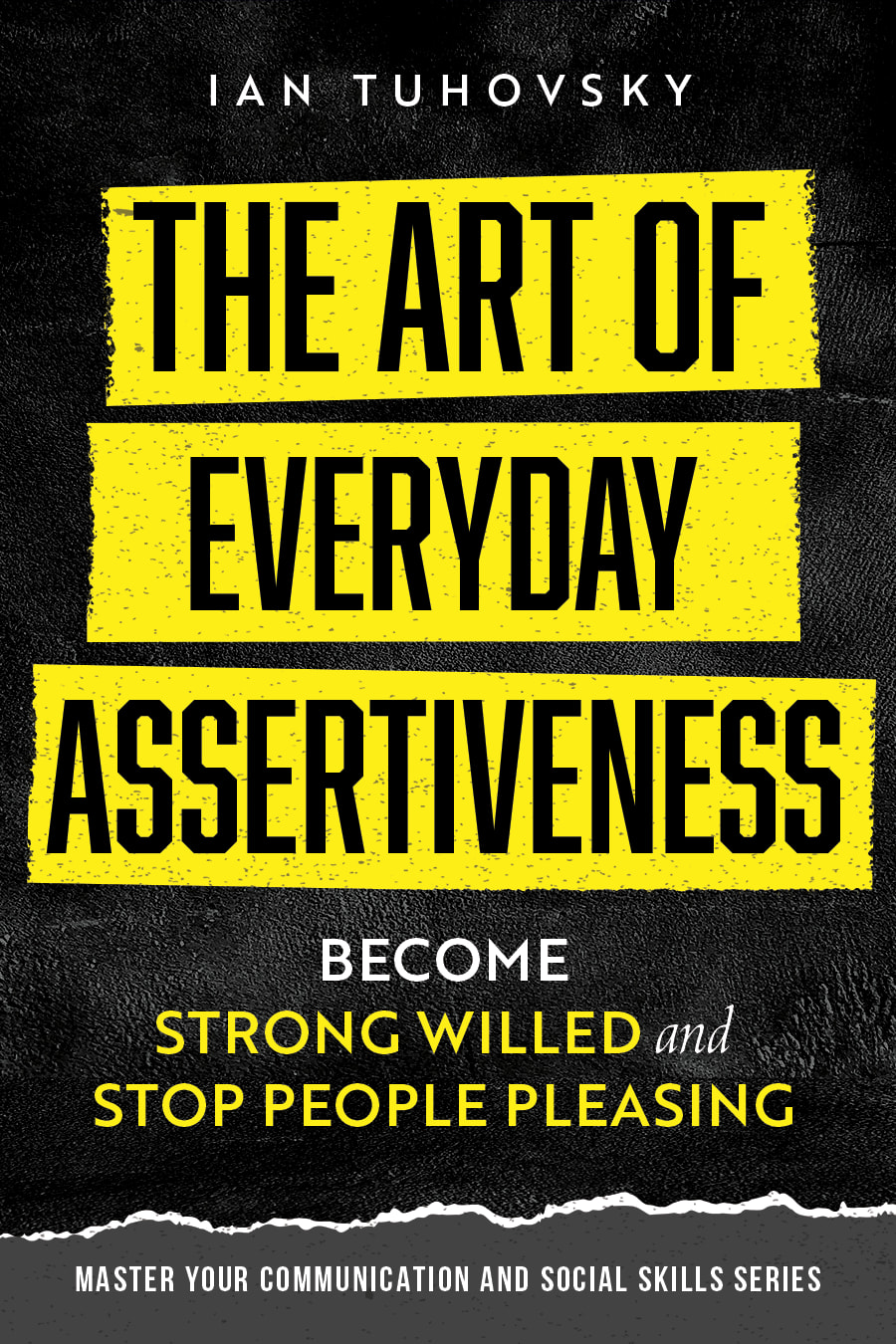
I prefer choice B because the yellow makes it stand out more.
I felt that B, and to a smaller extent-A we the most bold and most enticing for the casual browser. I didn't care for the breaking up of the word "assertiveness" in the other three and felt that the design of E was irrelevant overall.
The yellow makes B really standout. My eyes would go there first if this was on a bookshelf.
Option B- The color combination looks more professional and appealing to me.
I chose B first because the colors in the cover really stand out. I also like that you are able to read the title straight through without words breaking it up. I like that the authors name is at the top and the "about the book" is underneath the title as I would want to read the title first and then get a better idea of the book. I chose C next because it is a professional design and one I could see college courses using. I chose A, D, and E next because I do not like that the word Assertiveness gets broken up and I really don't like that there is wording and the author name in between each title word. It feels overwhelming and would not make me open the book.
Option B keeps the text in line in a way that is easily understandable. I don't care for the splitting of a word in an arbitrary spot down the cover. The yellow stands out as a warning, in option B, and helps aid in understanding how this could be useful.
B is best one, easy to read and stood out with the graphic design. C is second best, clear to read as well. D, A, E were all off-putting trying to be fancy and break off "ASSER" then next line "TIVENESS" they don't look professional to do that to the word. I wouldavoid all those books. And in that order. But B and C are the best choices and what I would look at, in that order.
I like option B the best, because it is the most clear and easiest to read. Many of the other options break up the title into multiple sections. It is awkward to read the titles from choices A, D, and E, because the word "ASSER" is broken up and separate and awkward to read. B is my favorite because the title is in bold yellow and black and stands out the most. In addition, I like that the phrase "become strong willed and stop people pleasing" is located below the title and not mixed in with the rest of the title. Putting the subtitle in between the title of the book makes the cover look confusing and cluttered, and Option B is the only one where the subtitle is below the title. Option C is my next choice, because I like the gold lettering and I think it looks fancy and professional. Options A, D, and E are equal to me, because they all look cluttered and are more difficult to read than options B and C. In addition, the art on Option E is ugly and I am not sure what the image is supposed to be. However I do like the orange and black coloring on options A and D.
I chose B first because it is the easiest to visually scan (title on top, descriptor below it), I chose C second because it's still relatively easy to scan with the title and descriptor split up. D, A and E absolutely make me twitch and I see them as equally bad with how the word "Assertiveness" is broken into two separate lines.
i chose option b as the one i would buy because using the yellow lettering on the black background really makes the book stand out visually and grabs your attention
Option B uses big, bold color extremes to grab my attention. And I think the boldness of the colors goes hand in hand with assertiveness. It absolutely makes me look and makes me want to explore further. Option C has a different look - it's more stately (almost oratory - good for communication), but is easy to read with the dark background (I like the gradience in the background). Option D, A and E are strange to me. I think it's a design mistake to not have one of the most important words in the title, be split up on 2 lines. That doesn't come across as smart, it doesn't make me want to look further....if anything, that comes across as poor communication (the anti-thesis of the book topic I would think). Though of the latter 3, I definitely prefer the color choices for D and A over E (and D gets points for being larger and slightly bolder). I like the graphics for E on the side....it's interesting, but overall it doesn't pop on the page (maybe if the background were a bolder color and "assertiveness" was not split up, it would work better).
The design in B is basic but perfect. The design in E is good. D is lacking in color. The font in C is weird. Finally, A leaves to be desired.
I think b is the best by far. I dislike the way asser-tiveness is broken up in the other covers as well. The colors and contrast of B looks sharp and professional, and makes it stand out and look like something I would want to pick up and find more information on.
B looks the best because each word is spelled out and it has a strong bold style that fits the book well
I do not like the breaking of the text of the word "assertiveness" so that eliminates three options from being my first choice. Option B is both eyecatching and also is the most legible. I like the yellow color theme which appears bold and assertive. My next choice also does not break the word "assertiveness" but I feel that the gold color does not match the book as well. I like the imagery of a barge breaking through ice of Option E which I think fits well with the topic assertiveness and communication. I feel that it is clever and also supports the subtitle of becoming "strong willed" and to "stop people pleasing". I also enjoy how the subtitle appears between the lines of the main title. However, it breaks the word "assertiveness 'across two lines which ruins the cover. It would otherwise be my first choice. The next option I like because it suggests that the topic is goal oriented however the cover is a little more generic than Option E. Lastly, Option D Is both generic and again breaks the word "assertiveness" across two lines.
I don't like breaking the word assertiveness into two different lines. It looks really odd.
Option B would grab my attention first because the bold yellow "tape" like background demands my attention. It feels like an important message that the book does not want me to miss on the cover. That would make option B an easy choice for me.
I LIKE THAT OPTION B SHOWS THE STOP PEOPLE PLEASING IN LARGE PRINT. THIS IS VERY IMPORTANT TO ME
I think option B is the most attention grabbing and the easiest to read which makes me the most likely to read and buy. I like that assertiveness is all on one line and the overall colors
I think the colors used on B grab my attention and make it very easy to read the cover. C has a more classic, professional look. I would place A, D and E in the same category. I don't like how the word "assertiveness" was split up on two lines. I looked at it initially and did not know what it said.
I don't like the use of orange for this design. The yellow of B, however, really mixes in well and grabs attention immediately.
i would prefer a shorter title without the tiny text making it feel more like a paragraph than a title. so B works best. i like the coloring that catches my eye for B, A, and D.
I think the black and yellow helps the book stand out. It is simple and sweet. It makes it easier to spot and the text is much easier to read like it pops off the cover.
I chose B because I like the yellow and black together. It's a good look and is attractive to me. I also like that the word assertiveness is mot broken up into two parts.
I ranked option B first the book title is direct there are no in-between distraction like it is in other options. The 'become strong willed and stop people pleasing' insertion makes the other options look somehow, makes the title of the book confusing even. I also like the blend of colors-black and yellow, they complement each other. I'll stick with option B.
B is the best because of the bold yellow and black colors and graphics goes with the theme of assertiveness. C is the second best because the dark blue color and gold lettering give off a royal vibe and that seems strong and regal and fits the theme of the book. A, D, and E and clumsy and broken looking and seem too light hearted and childish for the theme.
I prefer option B because of the color combination used here - it resonates well due to reminding of other very popular "How to for... Dummies" line and it is attention grabbing and seem higher in quality, trustworthy, I do like a lot option A as well, orange is good here. And name "Assertiveness" should be written all in one line and not divided.
I like the look of option B the best. I think the yellow stands out well and is appealing to the eye
B is eye catching and easy to read and know what the book is about. Same for C but not as eyecatching as the yellow outline. E D and A all has the word Assertiveness broken into 2 lines. That does not make sense to me and I won't buy a book that I have to figure out what it is about. Like the color of E a bit better but the three are equally awful.
My number one is b because I think the yellow against the black really catches my attention especially since it is blocked. C kind of reminds me of other book covers like leadership styles so it catches my attention but also looks like it has copied other books. I love the orange on A and D, it’s so bright but it looks more like a sales book. E is my last choice because it looks a tad outdated.
First of all, I think breaking up the word "Assertiveness" like "Asser" "Tiveness" is an extremely poor choice. It took me a couple seconds to figure out what "Asser" referred to. I ruled any of those options out immediately as my first two choices. That left option B and C as my first two choices. B was number one, because I like the bold contrast between the yellow and black. It looks more catchy and appealing. After B and C, I picked E, because I like the color scheme. It looks like an interesting read just based off the cover. Then I picked A as second to last choice, because it's less plain that option D.
I chose by options that look most bold and easy to read. I do not really like seeing the word assertiveness split as it does not look sensical.
I chose option B because the write up is clear and concise.
Okay: I find it hard to read the covers where “assertiveness” is broken between two lines; because of this, I like cover b the best, because the black and yellow is highly visual and I can read it and understand it without straining. However, I prefer the look of the orange and black cover (d) — in a perfect world, I would prefer that color scheme and layout just with a different font/design choice so that the word assertiveness was not broken into two lines.
Definitely the one with the yellow as the background to the Text, it is very clear and gives a bold statement, much like how the motto is to become strong willed, next I could say the option C looks more "vanilla" and looks like other leadership books. Definitely not the last 3 choices because the word "ASSER" looks like a swear word to me.
I ranked the ones that had the word "assertiveness" altogether instead of being broken up. I also ranked the ones with a design higher than the more simple ones without a design.
Option B is the least confusing of the five; with the subtitle interspersed between the main title, a lot of the other covers are illegible. I like the color scheme and font choices of E but the text on the cover is very confusing. I would be more compelled to buy the book if it looked a little bit less formal and more casual and fun; the cover seems designed for folks who maybe are already assertive, not those who are gentler and may need stronger boundaries.
Option B is a slam dunk for me! Here is why I love it "Stop People Pleasing" is probably the most compelling part of the title is STOP PEOPLE PLEASING! So in choices C,A, E and D the "Stop people pleasing" gets lost because it is sandwiched between the parts of the main title. This can be very difficult for anyone with a learning disorder or dyslexics, etc. (I have never been diagnosed but I suspect I fall into this category). In contrast, choice A clearly puts that part of the book cover title down at the bottom so the entire title reads more cohesively. Also I love that the main title is black lettering against yellow blocks, but then the "stop people pleasing" part is yellow lettering against black! It just makes both colors "pop" more. Also the authors name stands out more when it is up at the top of the book in white lettering.
I like that option B and C don't have the word assertiveness broken up. I found it much easier to read the title this way. Between the two, I prefer b because "strong willed and peaople pleasing" is bold and more eye catching. I like the yellow. I think it would be more eye catching on a shelf in a book store.
Option B is hands down the best cover. It conveys everything you need from a cover. The font text is also easy to read and really gets highlighted with the yellow background. Other cover are to busy and takes up too much real-estate. The ones with compound word seems unprofessional and makes the cover hard to grasp. Option B's cover looks professionally done and capture the attention. It also has the best balance from a graphic design perspective.
i really like choice B cause i like that it is the most simple and to the point. i think that it makes the most sense and is easy to tell what it says right away compared to the others. i do like the colors the best in choice B and A though so they are my top two choices.
I like B the most because the colors make it stand out and it does not have writing in between the title. I like C next because the words in the title are not split up and I like the blue color of the book. I chose D and E next because it is harder to read the title it is too confusing with all the words.
I like B and C the most because the words are written out well and the all the words are all on one line. B is first because it's clear and easy to read because the words are highlighted and the font is large. B is 2nd because the colors are not good for bring attention to the words but at least each word has it's own line so you don't have to stop and about what the title of the book is saying. The other choice are bad because the words are split up onto different lines.
I like B best because I like the yellow banners with the black. It stands out the most. I also like that the subtitle is below the title and not boke up like it is in the other ones. I think that looks better too.
I like the color scheme of B (yellow on black) because it's easy to read (except for the italics "and" at the bottom). Option C is okay, but it the smaller text between the lines is confusing. It took me a minute to figure out that E is a ship breaking through ice. Good visual, but not well designed. FOR THE LOVE OF ALL THAT IS HOLY... DO NOT DIVIDE THE WORD ASSERTIVENESS! It is one word. Dividing it looks like you're bad a spacing ... and "Asser Tiveness" looks like it's supposed to be the author.
I like this option the most because the colors are bright and attention grabbing, and the title looks better not all broken apart.
The layout of Option B is the most assertive. Option E has the icebreaker in it, which is very clever imagery. Options D and A have a nice orange and black color scheme. Option C looks very generic and bland.
I do not like the words in the title broken up in mid word like in E, A, and D. This looks unprofessional and cheesy. However E and A ranked slightly higher than D because of the design to the left of the words and E was better than A because it was a catchy design while A was just lines and points. Another thing I did not like about E, A, and D was that the subtitle was dispersed between the main title which is why C was rated second. I chose B as the best because the title then subtitle was given and the words are all kept intact and not broken up between lines. This made for the most professional looking cover like someone who knows what they are talking about would present their book.
Option b I like the most because of the layout of the text it's more readable in my opinion followed by option c with the same option A is the most visually appealing to me other than the way the text falls out I just don't care for that
I like option B. The yellow font call out that's bold stands out and helps to communicate the message better. It seems like a key aspect of a communications book.
choices b,a,d has more modern book covers
Option B is bold print and highlighted and it stands out.
22 Responses to Option C
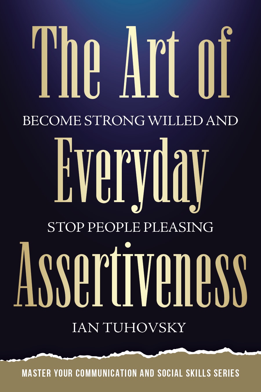
I ranked #1 as my first choice because it makes the book look very classic. I then ranked them from the most "classic" looking to the most "modern/trendy".
C and B were the highest due to one simple thing - the formatting of the letters were correct. Meaning that all the words were placed in one line and were not cut off. Unlike E, A, and D, in which the word ASSER- then -TIVENESS made it really awkward looking and unprofessional towards the viewer.
This one looks more sophisticated thus more effective. Plus the word Assertive should not be divided.
I chose the books in order of the book using the full word, "assertiveness". "Tiveness" isn't a word.
My first choice for graphic design is option C with the golden look which is very professional and interesting to select. Second is option B because the yellow background brings out the information for easy reading.Third is option E because the light background draws attentionFourth is option A because the bright orange color draws attention with the graphic added.Fifth is option D because it is a less attention getter
The light which is showed from the top in C and D design symbolizes the hope and exit from the hard situation. But I chose C the first because I consider blue color more optimistic than black. The option A has a scientific hint meaning that the text should be valuable. The option E looks more childish, so I moved it to the end, preferring the option B more.
I would only look at option C.It looks like a bible. It looks professional but strong
I like the overall lock and font combination on option C, however, If it has incorporated some sort of graphics like on option A or even option E and the brighter orange color it would be better.
I really felt like the gold and black combination looked the most eye-catching. It really seemed more high quality to me.
C and B really stand out the most with the way the title is laid out, it is a bit on the confusing side with the other 3.
Option C is my first choice because I like the font type against the black background. It looks strong and assertive and I really like the color of the title font and how it looks shadowed on the right and left sides. Easy to read and classy. My second choice is Option B because the black title on the yellow insert looks very strong and all of the different colored text is easy to read and understand. My next choice is Option D followed by Option A, but to be honest I wouldn't be interested in either of these because of the word break in "Assertiveness". It's off-putting. Last choice was Option E for the same reason and also because the design makes no sense to me.
Option C has the design and the color scheme that looks strong and powerful. This combination of black and gold gets my attention and makes me think of strength and determination. I am impressed by the design and the confidence of the cover. I am drawn to the combination of color and confidence
As the book's cover suggests, the book will be quite interesting to read, I recommend option C'. The book appears quite appealing, therefore I believe that will further encourage me to buy it.
C is a nice color and has assertiveness together. B is not so nice color but at least assertiveness is together. D has text that is entered. E and A is left aligned making a mess of the words, but E is a nicer color.
This book looks professionally made like i would find on a book shelf and the authors name is in a good location. B/ Like the Authors name at the top and the colors are bright and assertive like what the book is about. D/ I like the orange and black as it stands out well and book cover seems to be a decent quality the way it is designed but i do not like where the authors name is . E/ The color, artwork, and over all design are well laid out but still do not like where the authors name is placed. A/ Authors name still in a bad location it should either be at the top or at the bottom of the book cover. I do not like the over all lay out of this one its got to much going on as in feels busy on the cover. The Black and orange are good colors to go together but the layout just not organized right.
C looks the most inspiring and least aggressive of the options with the word "assertiveness" all as one word. I don't like options A, D, or E because it bothers me having "assertiveness" split in two. As for option B, that is the most aggressive, not what someone who needs to be more assertive is going to gravitate toward.
I like this option most because I feel that with assertiveness it has a level of sophistication that I get from the design of the cover.
Option C is my choice because the cover design is more professional and engaging when compared to the others.
Black on a gold background stands out very well to be read online and easily spotted away from other books! The whole Title is evenly spaced on the whole book cover.
Option c is very professional and polished. Option e is intriguing, the glimmer on the right is inviting. Option a and d are professional and makes me want to see more. Option b is good but reminds of of the dummies books
This cover looks the most appealing because the font aligns with assertiveness and correlates with the title the best.
Option C is very attractive. I like the way it presents itself. B is unique with the yellow background with black lettering. D and A are somewhat similar with the black background and white letters and not as interesting. E would be a good choice.
4 Responses to Option D
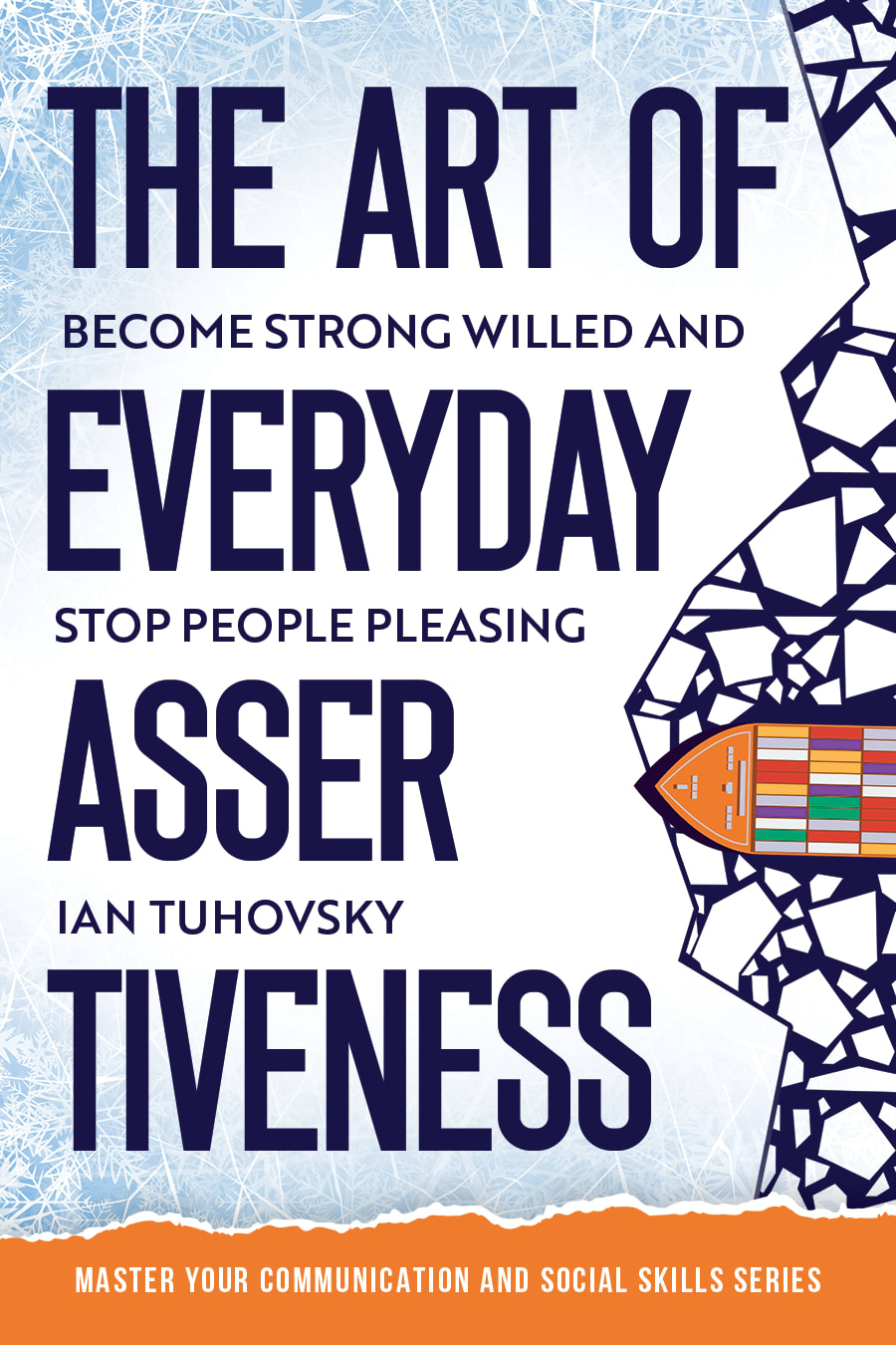
Option D would be my first choice. Because first the color, the black and the orange go great together. And it's not overwhelming at all it's actually pleasurable to look at and they say blue is a calming color but the orange and black is too if that makes sense it has a nice appeal to it.
I like the orange and black colors. They look bold and professional which fits the them perfectly. D was first because the font is also bold and the layout looks commanding. A was second as I liked the graphic to the right. E was third, again, because of the colors and font. The two that came before it were more suitable based on the aforementioned. B just looks dated and the yellow doesn't work. It means yield. C looks like an English mystery novel or something with that design. No go.
I prefer a simple, basic cover that looks professional. It does not need a lot of designs or eye-catching things. Just show me the text in an easy-to-read font and color. My top 3 choices look the highest in quality to me.
the colors used on option D are more amenable and more friendly
15 Responses to Option E
C's cover felt too boring and plain. I liked that E's cover was lighter in color as that was the most engaging and inviting. B's colors felt tacky.
I like the white and the design of this one the best. I like the cracked design on the side. I don't like the dark books. They don't stand out enough.
Knowing the topic at hand I was still attracted and drawn in by the visualization styles. The light background of option E made it stand out among the rest with such a sharp contrast and the imagery used. The orange footer was a bold and dominant way to create the separation in the white space. Between the font, size, and overall style, I felt this was the most attractive book which would have the most valuable information. Choice A was very close and I would have liked it more with a white background but it still is a great job at blending the color scheme together. Choices B, D, and C are where I felt this started to fall off. The font styles and placement either became too generic or had no creativity while choices E and A really stood out as creative.
The graphic design shown off in choice E is the most accurate looking for the covers to get over assertiveness so it expresses the feeling well.
First going with the cover that actually looks like it has some kind of art on it as my fav cover. Followed by the second cover to implement some kid of art to match the title of the book. The other three are more of my personal preferences on what cover I thought look better than the remaining covers.
4 I don't like the fonts. 5 I think is too busy. I really love #1. The rest are kind of boring after that.
I personally find the orange of A and D to be too bold for me and something that feels a bit more sales like than I would like. That is why those 2 are at the end. From there though, I like E a lot because the cover looks so modern, fun and I love the brightness of it as well.
I really like the blue background. I feel like it stands out more to me.
I chose "E" first because I like the colors used on the cover. I'm not sure exactly what the design is supposed to be, but I don't care. It's just appealing to me and I like abstract art and to me this is abstract. Next I chose "A" because it has that same kind of "broken up text" style, which I also liked in my first choice as well. That to me is also abstract. At first I thought, "why would they want to break up the word like that? It just looks silly". But the more I looked at it the more I started to like it because it is original and out of the box, and I think that's what's going to catch peoples' attention. I chose "D" next because I like the orange text on a black background. It's not one of my favorites though because there is no abstractness to it and it is kind of boring. But the text is still broken up which again is appealing to me, so I chose this before the last two. Which brings me to "B" which I chose second to last, because it is not appealing to my senses and is rather boring. It looks like any other book on the market and would not stand out to me at all. No graphics, images, broken words, nothing. I do like that it says "Stop people pleasing", though. And last I chose "C" because it is too "perfect" and rigid. The color palette is one of the most boring ones I've seen in a while, and I would just walk right past this book without even noticing it. It looks like it is for adults who are prim and proper and perfectionists. Not interesting to me in the least bit.
The cover really grabs my attention with the bright color theme. The book cover peaks my interest.
I like option E the best because I think the brighter colors and the boat in the corner make it stand out. The other covers look too boring and I don't think they fit as well with the title.
I put the Communication Skills and Assertiveness themed book covers in E, A, B, C, and D order. I really like E and A. I love both book covers. I would be happy with either. I would buy both. I like the colors. I'm drawn to the colors and designs on the books.
I picked the covers in order of attention grabbing. I thought the first one really spoke to a person who is wanting to be unapologetically who they are. It's fun loving but also shows no mercy or apology. The books that I chose second and third also are out there and assertive in the design but it felt more like it was too loud in the design some people might become overwhelmed by it. The last two just didn't hold my attention.
c is no good. it looks like a religious book. e looks cool and is also drawing attention to the tougue in cheek idea that being assertive is something that people who meet you is just you being an ass. E is first Because a lot people are offended when someone else stands up for them - this is the most playful cover. This cover says that the ART part of of being assertive is a balance between that and actually being seen as an asshole. I like it!A is next because it is the closest to Ebut its a neck and neck tie with D because that's a whole nother take on the same attitude - it basically says: yeah, well, the perception of you now is that you are way too much (caution tape look with black writing and yellow tape), but so, what fuck them! because that is the attitude of people who are people pleasers, which is what I'm working to eliminate as my character flaw. Also the black tape on yellow could also be "caution: construction zone"
I chose the covers with some artistic design to them then I chose the bolder looks and bright colors. I like C because it looks illuminated and E is my favorite because of the eye catching geometric designs.
Explore who answered your poll
Analyze your results with demographic reports.
Demographics
Sorry, AI highlights are currently only available for polls created after February 28th.
We're working hard to bring AI to more polls, please check back soon.

