Designing a book cover about a subject like postpartum depression can be tricky. You want to convey the seriousness of the disorder while also inviting readers to open the book.
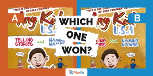
One author used PickFu to create a round-robin tournament with three head-to-head matches to choose the perfect cover for her book about coping with postpartum depression. She tested exclusively from a female audience.
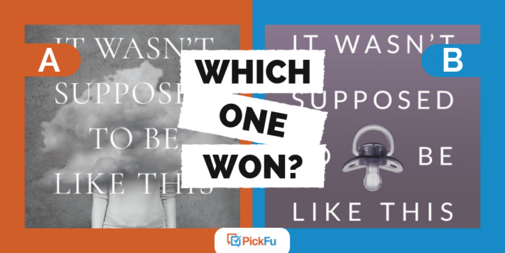
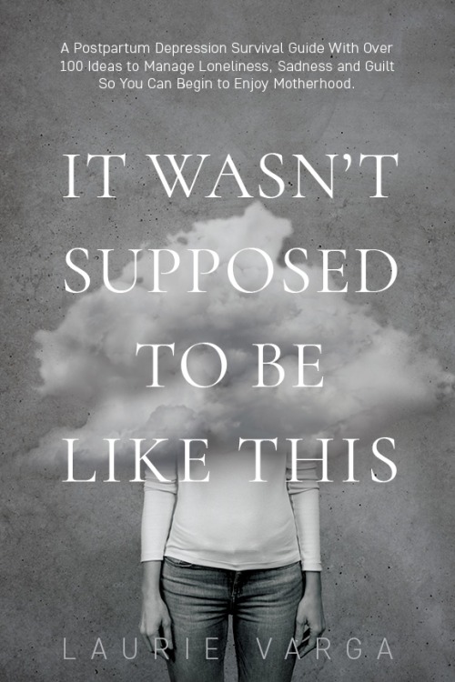
Option A’s cover is in black and white with an image of a woman in the middle. But instead of the woman’s upper body and head, you see a cloud of gray.
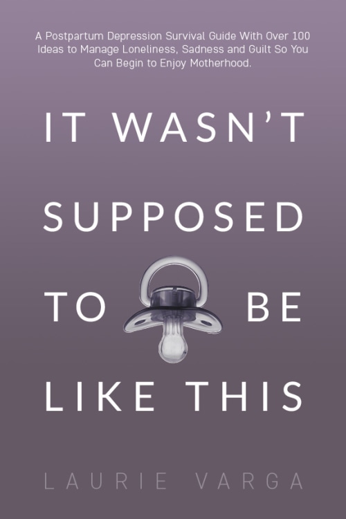
Option B’s cover, a soft purple, takes a slightly lighter approach: it features an upside-down pacifier in the center.
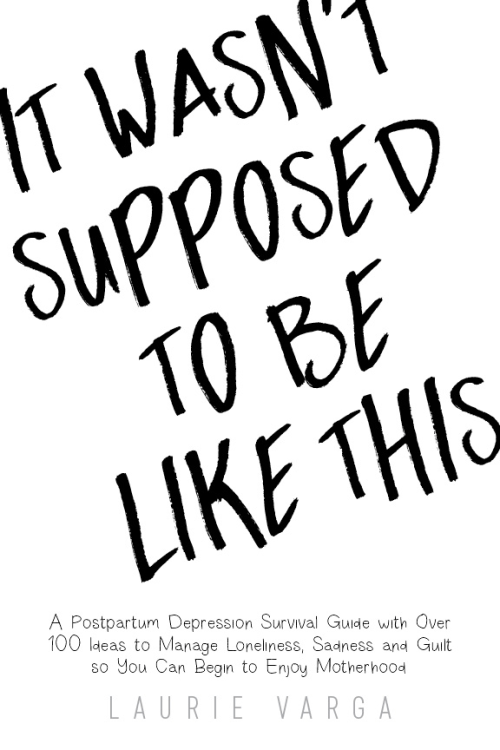
Option C resembles the cover of a young adult novel with large font reminiscent of handwriting.
Can you guess which one won?
And the winner is…Option A! With a score of 61 points, Option A edged Option B’s 57 and handily beat Option C’s 32.
Let’s see why Option A attracted the respondents’ admiration the most.
When designing a book cover, symbolism matters
With the cloud over the mother’s head and upper torso, Option A resonated with several respondents. Depression is often described as feeling like you’re in a fog, and Option A’s design evokes this feeling well.
One respondent put it nicely when she said, “The cover with the woman and cloud is beautifully sad. It really illustrates how hard depression is.”
Many respondents who voted for Option A had personally experienced postpartum depression.
“I like the idea of the head being shown in a cloud, because that’s how I often felt,” said one woman.
Another woman wrote that she didn’t like Option B’s pacifier on the cover because it made the postpartum depression seem like the baby’s fault, when really it is more “[the mother’s] mind being the enemy.”
Take the topic seriously
Few respondents voted for Option C’s scrawly cover because it seemed too lighthearted and fun for such a heavy, sad topic.
“[Option] C makes [postpartum depression] look like a joke, and it’s not something to joke about,” said one respondent.
Interestingly, those who did vote for Option C found it more personal than Option A’s blotted-out woman.
“At least C isn’t erasing the woman who is struggling,” said one respondent. Another added, “The way [Option C] is handwritten helps make it feel more personal.”
Still, these comments were in the minority. Most respondents felt that Option C’s bland design and playful font made light of a scary situation.
Key takeaways
If you’re designing a book cover about something as gritty and tricky as postpartum depression, make sure you honor the difficulty of the experience in your cover design.
Postpartum depression can be terrifying and debilitating for new mothers, and many of the comments supporting Option A’s gray and cloudy cover came from women who’d experienced depression themselves. They related to it, and they’re who the book is for. The cover speaks to their experience of feeling muddled and foggy and unsure of how to relate to their new baby.
Yet, it’s not the baby’s fault, which is why several respondents disliked the pacifier on Option B’s cover.
On your own cover, be aware of what the symbols you’ve put there are saying. Think about the cover from several different perspectives, if you can. And most importantly, ask for different perspectives. Create your own PickFu poll to determine which cover resonates the most with your intended audience.