When shoppers pick up a product at the store, they probably don’t realize how much time and effort goes into every little detail of the product packaging. From the logo to the text to the images, there’s a lot to consider. Which is why it’s worth testing even the most minuscule details, like this PickFu user did.
Guess what the entrepreneur tested? The top part of a pump. As in, the pump that gets shampoo or soap from the inside of a bottle to the palm of your hand.
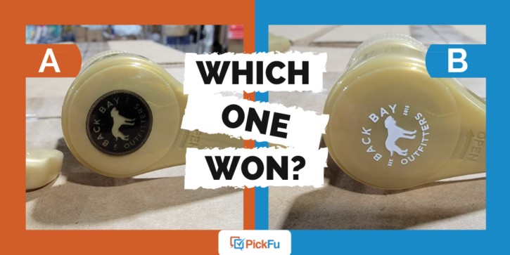
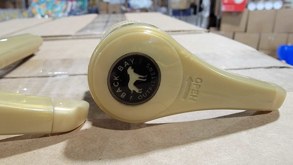
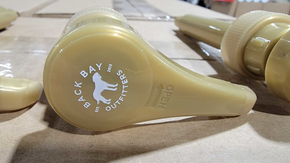
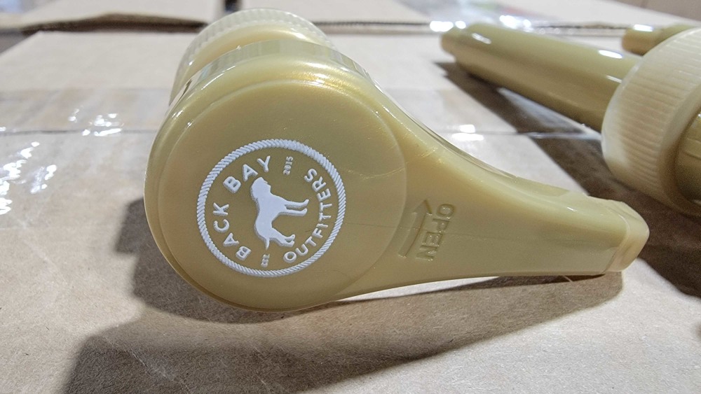
Each of the three pumps in this ranked poll is a golden-brown color, but the images are all different. Option A features a black logo with lettering and and image that matches the pump color. In Options B and C, the logo is white, but Option C adds a border to the circular logo.
Can you guess which one won?
And the winner of this ranked poll is…Option C, with a total score of 60 to Option B’s 40 and Option A’s 26!
Let’s find out why respondents preferred the pump with a bordered logo.
“Clean, clear, and bold”
Few respondents chose Option A because the logo was difficult to read. Options B and C were both much easier for potential shoppers to see, but Option C had the added effect of a border to make it pop.
One respondent put it this way: “[Option C] is clean, clear, and bold. Whereas [Option A] is dark and harder to see. [Option B] is okay, bright white font easier to read, it’s just not as bold as [Option C].”
Others agreed that the circle’s border gave it “a much better contrast,” “shape and definition,” and “more complete.” Several felt that Option B, while easier to read than Option A, had an unfinished look about it.
But some respondents liked that open-ended look. One even said, “An open logo in which there is no borders around it shows the company is open minded and not rigid to new ideas.”
This is an interesting concept to keep in mind!
https://giphy.com/embed/3gK8jL6ziIcdCua8qD
Other highlights
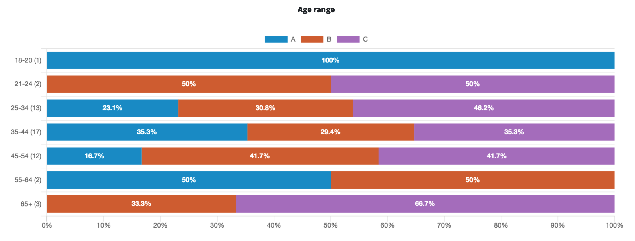
- Of the seven age groups represented, the age range of 65+ gave Option C the most votes at 66.7%.
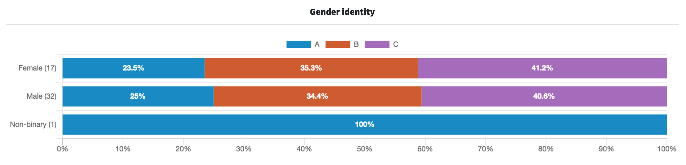
- Female and male respondents voted in similar proportions for Options A, B, and C, but the single non-binary respondent voted for Option A.
What they said
“I can see the white one better and I prefer without the circle — it blends better with the product rather than looking like it was affixed like a sticker to the product.”
“[Option C] is my favorite because I think the white contrasts nicely against the beige color of the pump. [Option A] is my second because the logo looks sleek and professional, but it doesn’t stand out as much as C does. [Option B] is last because without the ring, the logo looks unfinished.”
“[Option] A has a more distinctive look that makes the product look higher quality to me. It looks stronger and more durable.”
“The options in white are much easier to see and read, even from a distance. Also, the option without the circle around it allows the logo itself to be larger and more readable.”
“The white has a much better contrast here. I would go with that as the best choice with the circle. That gives it shape and definition. Think that logo looks the best in Option C. A great look for the product brand.”
Try PickFu for free and test your book cover.
Key takeaways
Some respondents may have felt that Option C looked too much like a sticker affixed to the top of the pump, but most liked the circular border. It gave the logo a finished look. Several respondents pointed out that the border made Option C look “more complete,” “more professional,” and less “unfinished.” Furthermore, it is identical to Option A, aside from the color.
If the pump were white, the black label would probably have worked just fine. But against the gold-beige color, white stands out the most.
Perhaps the most fascinating thing about this poll is the amount of feedback respondents gave over such a small detail. This just goes to show that even the smallest details can make a huge difference!
We don’t know yet which logo the brand chose for its pump, but other brand material features the same bordered logo found in Options A and C, only in different colors.
Read our guide to avoiding the top logo mistakes for more help!
Want to dive deeper?
Results by commonly used words:
Results by age range: