You might think you remember what it’s like to be a kid, but when it comes to creating a book cover that appeals to children, you probably shouldn’t depend on your memory. Kids change, tastes change, and you want to stay on edge of what’s eye-catching in the book world.
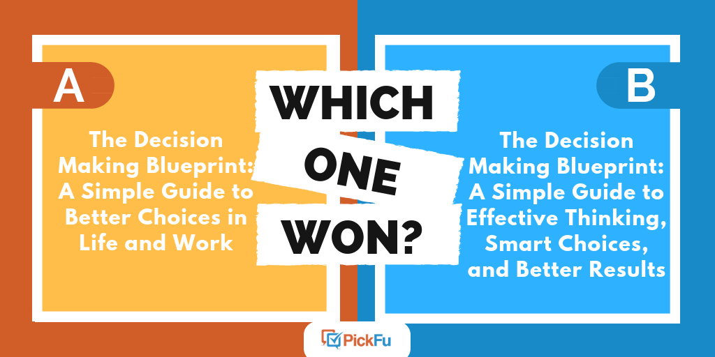
That’s why one author used a PickFu poll to test book covers for a children’s book. The poll asked its respondents—parents of 1, 2, or 3 children—to decide which one they liked best.
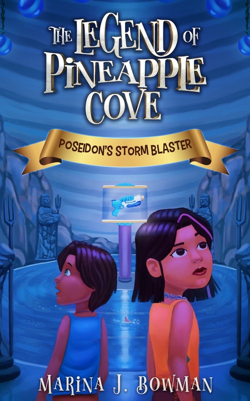
Option A shows a blue background, two girls looking around them, and playful title font.
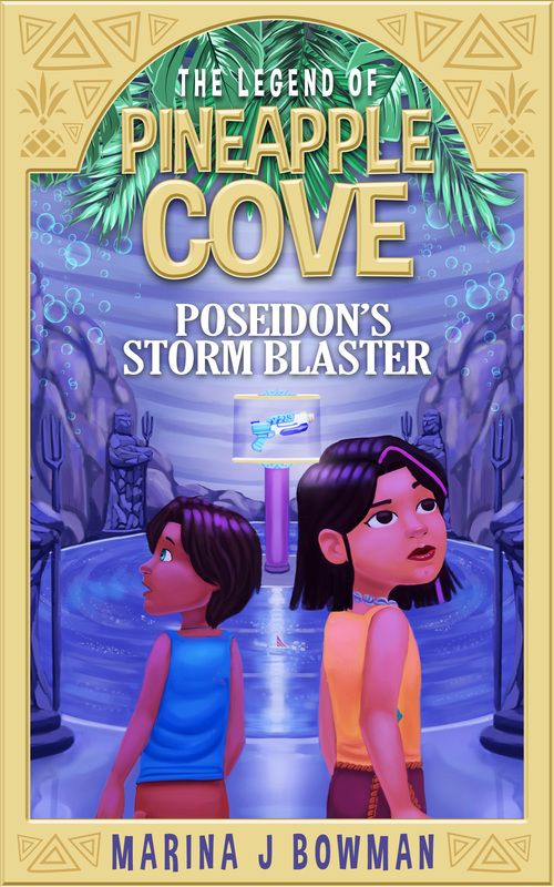
Option B adds a yellow border and palm fronds, and adjusts the font to something more serious—but still kid-friendly.
Can you guess which one won?
And the winner is… Option B! Option B won with a score of 58 to Option A’s 42.
The border
Many respondents loved the yellow border in Option B. One respondent said, “The border along the edge is a great touch to the art[.] [It] has a fun but mysterious vibe to it.”
Other panelists agreed that the yellow border helps to add contrast to the blue background. Plus, its pineapple theme not only goes better with the title but also matches the color of the words Pineapple Cove in the title font. This gives the cover a bright, cohesive look.
Contrast is important! When you’re choosing a book cover for kids, make sure the colors you use are attractive and make each other pop. Kids will flock to what is bright and easy to see.
Pineapples and bubbles
While some respondents liked Option A’s smooth blue cover, many thought the cover needed something more
Other panelists loved the bubbles floating up toward the palm fronds, saying that they give the illustration “a sense of adventure” that Option A doesn’t have.
With the added pineapple and bubble elements, respondents felt Option B’s cover fit the title better than Option A’s plain blue. Importantly, one parent said, “I think my son would be a lot more interested in it initially when he sees the cover.”
It’s always a good idea to check with kid and parent readers when you’re figuring out the best cover for a kid’s book.
Key takeaways
While some respondents liked Option A’s simple look and fun font, many felt it lacked a sense of adventure. Option B’s color and font changes add that energy to the cover.
Option B, panelists found, is also more welcoming. It invites the reader into a mysterious cove to solve a heart-pounding mystery with two engaging characters.
When you’re picking a cover for your middle-grade mystery book, consider how you can use colors and details to draw the reader into your story—before they even flip to the first page.
Using PickFu, you can choose a parent-based audience and create a PickFu poll that uses a split-testing method to find out which cover is most attractive to kids. So if you’ve got that kid’s book written, start designing covers and use PickFu to help you choose the best one!