Kids’ book covers do double duty: they have to attract not only kids but also the adults who actually buy the books.
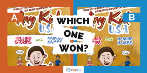
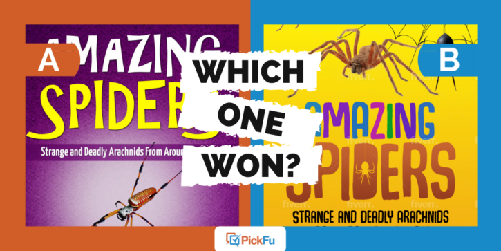
In this PickFu poll, a user tested two options for a kids’ nonfiction book cover about spiders with a general audience of 50 people, asking which one they find most appealing. The book is aimed at kids ages 4-9.
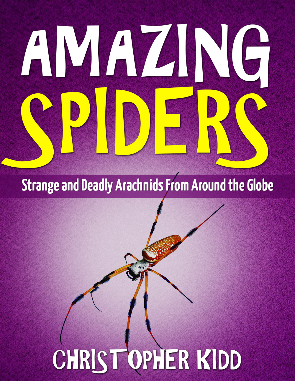
Option A features a single spider on a purple background and the title in large white and yellow font.
Option B features a spider image dangling inside the letter D in the title and three more spiders — plus a web — on a bright yellow cover.
Can you guess which one won?
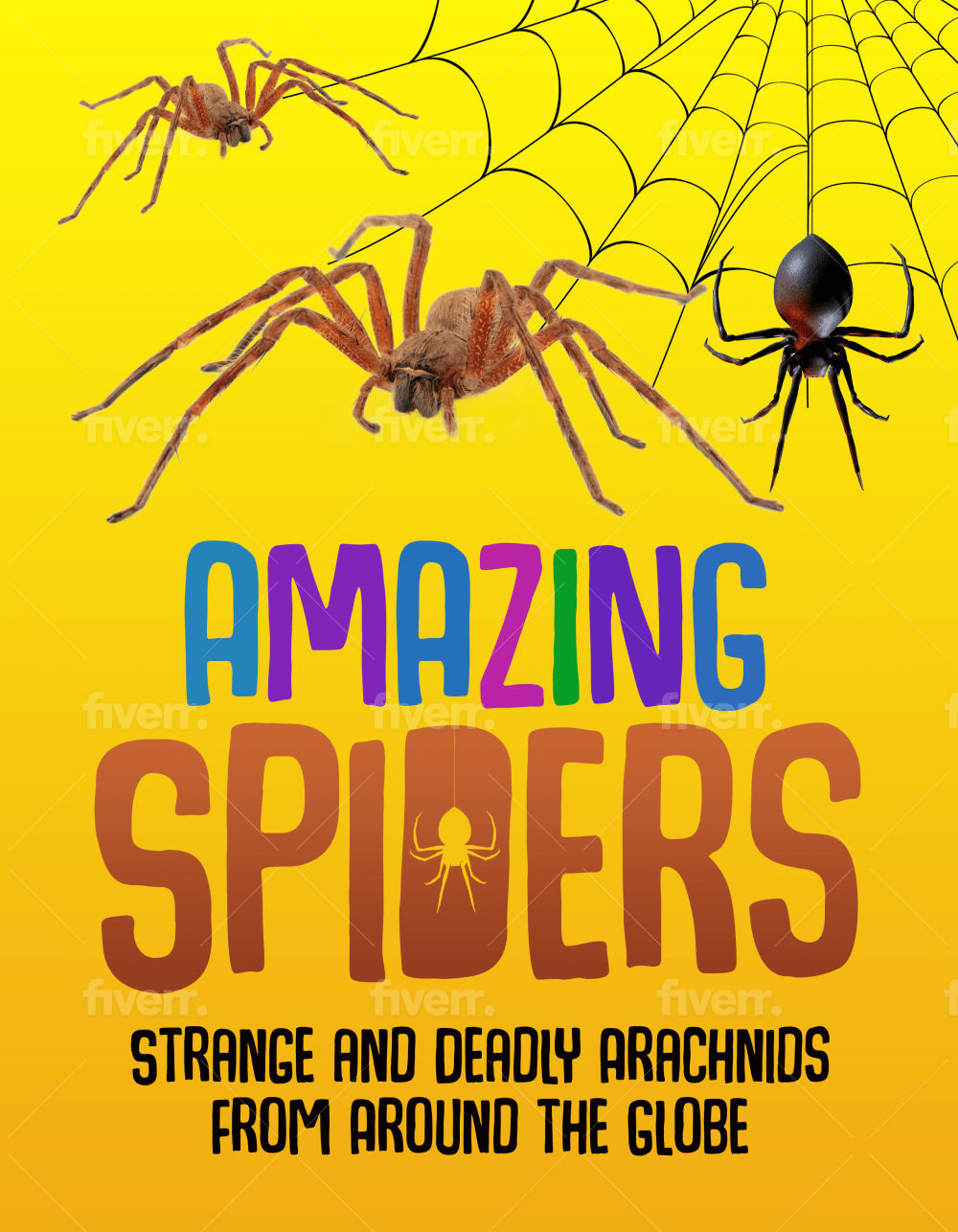
And the winner is…Option B, with 68% of the vote to Option A’s 32!
Let’s find out what respondents had to say about these creepy-crawly book covers.
The more spiders, the merrier
Speaking for the book’s target audience — and in a few cases, their own children — respondents who voted for Option B said the more spiders on the cover, the better.
“My son is 8 and he likes this option,” one parent wrote.
“[Option] B looks more fun and has a more diverse array of spiders. I feel like my kids would get more excited about it,” said another.
Respondents also preferred Option B’s brighter, sunnier color scheme. Not only does the yellow stand out, but it also lightens up what can be a scary topic, especially for young readers!
“The lighter background is a little more inviting and I think it makes the spider look more friendly, which would attract children better,” said one respondent.

The design appeals to adults, too. One respondent said the enlarged images of spiders add “an interesting realistic look.” Others commented on the layout, font, and vibrant graphics.
But it’s worth noting, as two respondents did, that the author’s name appears in Option A but not Option B.
Other highlights
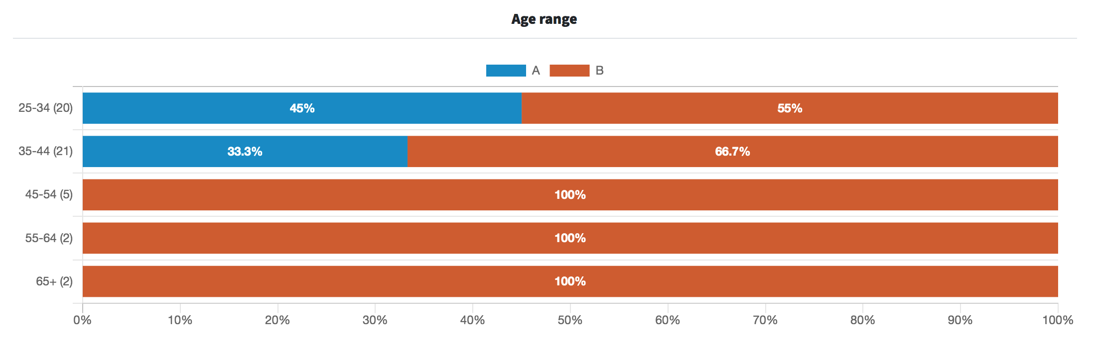
- Of those 45 and older, not a single person voted for Option A
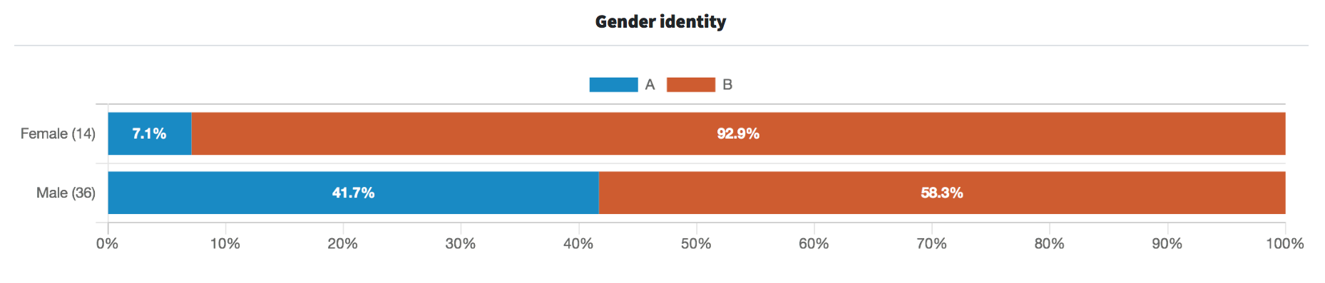
- Female respondents overwhelmingly favored Option B (92.9%), while 58.3% of male respondents voted for it
What they said
“The yellow will attract more kids. And there isn’t as much of a focus on strange and deadly [on Option B] as there is on [Option A]. It’s there but the font makes it less of a focus.”
“I think kids would like seeing more than 1 spider on the cover [in Option B]. Also, kids like spider webs and I like how the word amazing is in different colors.”
“Option B is a little terrifying to me.”
“Tough choice, but I will go with [Option] A because of the purple scheme. Purple is often used to denote poison or venom, which fits the theme of deadly spiders. It’s a toss up though because yellow is often used as a cautionary color, which also fits the theme.”
“I prefer the Option B book cover because I like the spider web and three spiders shown on this book cover. I would like it if the Option B book cover also had the author name somewhere on the book cover like on the bottom of the Option A book cover.”
Key takeaways
Option B has more shelf appeal thanks to its bright, playful design and, of course, the spiders.
But what if the user had polled parents with young children, not just a general audience? And what if they’d included the author’s name on Option B?
It goes to show how one poll can open the door to more design possibilities — and the need to test those options with the right audience.
Read our article on smart demographic targeting to learn more about how to tailor your poll to your market and goals.
Want to dive deeper?
Results by commonly used words:
Results by age range: