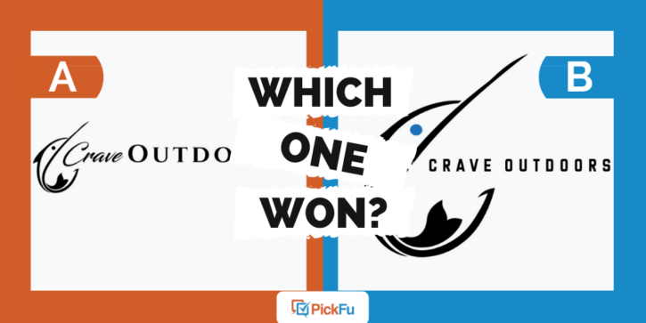
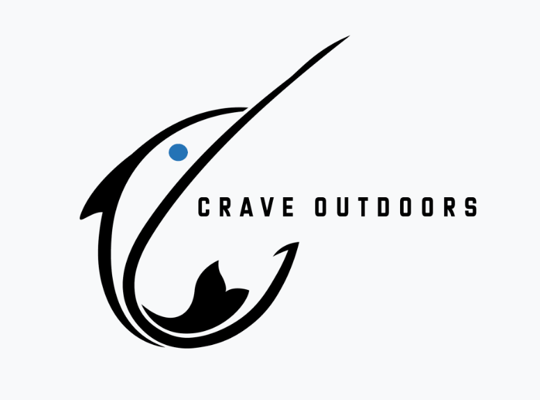
It takes a lot of thought — and testing — to design a logo that will hook customers. Every detail matters, as one PickFu user discovered in this Head-to-head poll testing two logos for an outdoor brand called Crave Outdoors.
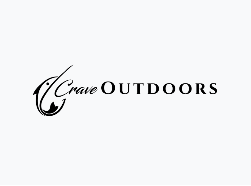
Option A features a black-and-white fish and two types of font. In Option B, the fish is larger and the font is uniform and more modern.
Can you guess which one won?

And the winner, determined in just 16 minutes, is…Option B with a score of 62 to Option A’s 38!
Let’s find out why a bigger fish is better for this logo.
Big + bold = outdoorsy
While some respondents who voted for Option A liked that the fish didn’t dwarf the text, those who voted for Option B felt that the bigger fish was more appropriate for an outdoor brand.
Respondents used words like bold and dynamic to describe Option B. Some said the fish made the whole logo stand out more.
They also appreciated the pop of color from the blue dot representing the fish’s eye.
“Option B is bigger and bolder,” wrote one male respondent, “which is good for an outdoors company.”
Other highlights
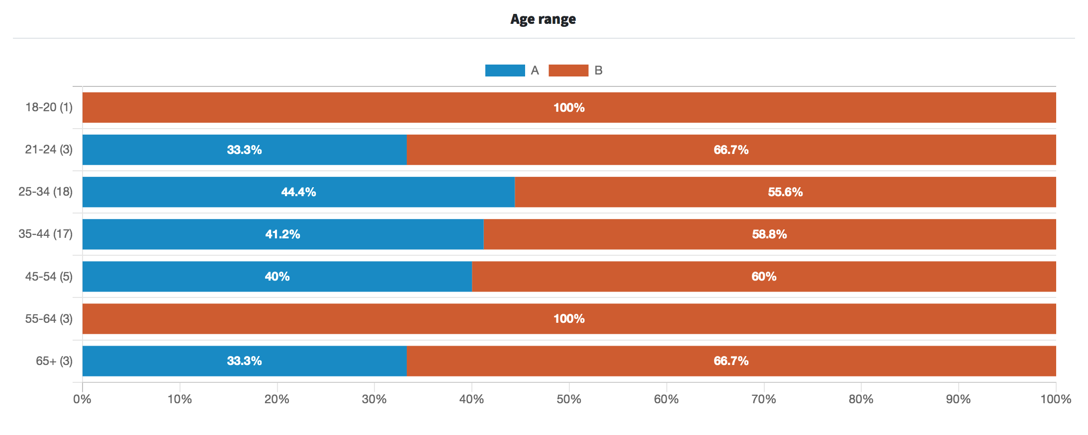
- Respondents across age groups voted similarly in favor of Option B
- None of those in the 55-64 and 18-20 age groups voted for Option A
What they said
“The little touch of color on Option B adds quite a bit to its appeal. I also like that only one font is used on Option B vs. the two font styles on Option A.“
“Option B is so much more impactful and attractive. I really love how modern and intense this option seems….it’s more hip and urban whereas Option A is classier and weaker.”
“I like [Option B] with the bigger fish since it gives the air that the company is rugged and elegance at the same time, always being able to keep the perfect balance.”
“The graphic in Option B feels too large. Also the italicized font in Option A conveys more emphasis of craving.”
“I like Option A the best, I think the logo isn’t too overpowering like it is in Option B. I think it’s creative. The word in cursive is really fun as well.“
Key takeaways
Option B’s large fish and bold font are a winning combination. Still, it’s worthwhile to pay attention to the comments of respondents who preferred Option A.
Some said Option A emphasizes the word crave in a good way — and it’s true that the word is less obvious in Option B.
Others said the different fonts in Option A give the unique brand name the attention it deserves.
What if Option B kept the bigger fish but used a more eye-catching font for the word crave? It wouldn’t hurt to adjust the design and run another test.
For more on choosing a logo, see our guide to testing logo designs.
Want to dive deeper?
Results by commonly used words:
Results by age range:
Test your designs with PickFu to avoid these top logo mistakes.
