From Cinderella’s evil stepmother to The Parent Trap‘s Meredith, there’s no shortage of despised stepmoms in the stories we encounter every day. But for many people, stepmothers are the pillars of blended homes.
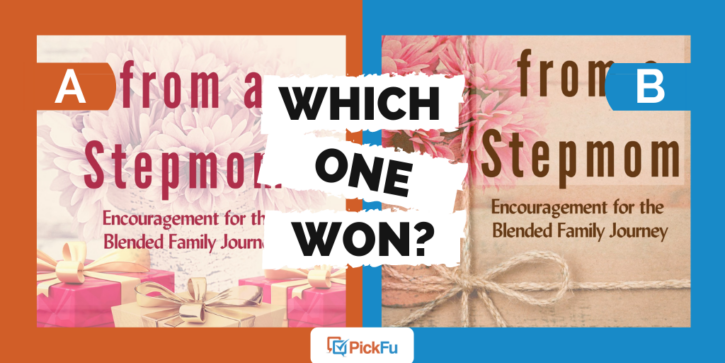
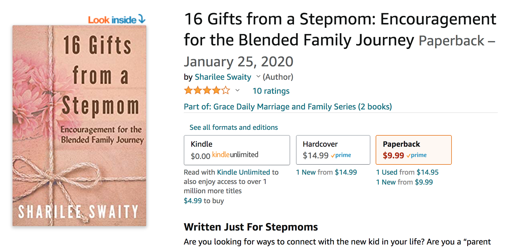
In this PickFu poll, the user tested two covers for a book titled, 16 Gifts from a Stepmom: Encouragement for the Blended Family Journey. The audience for the poll was 50 women between ages 25 and 44.
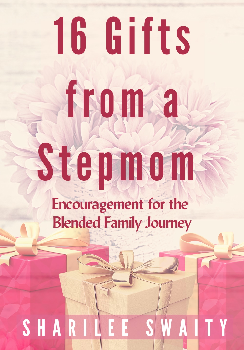
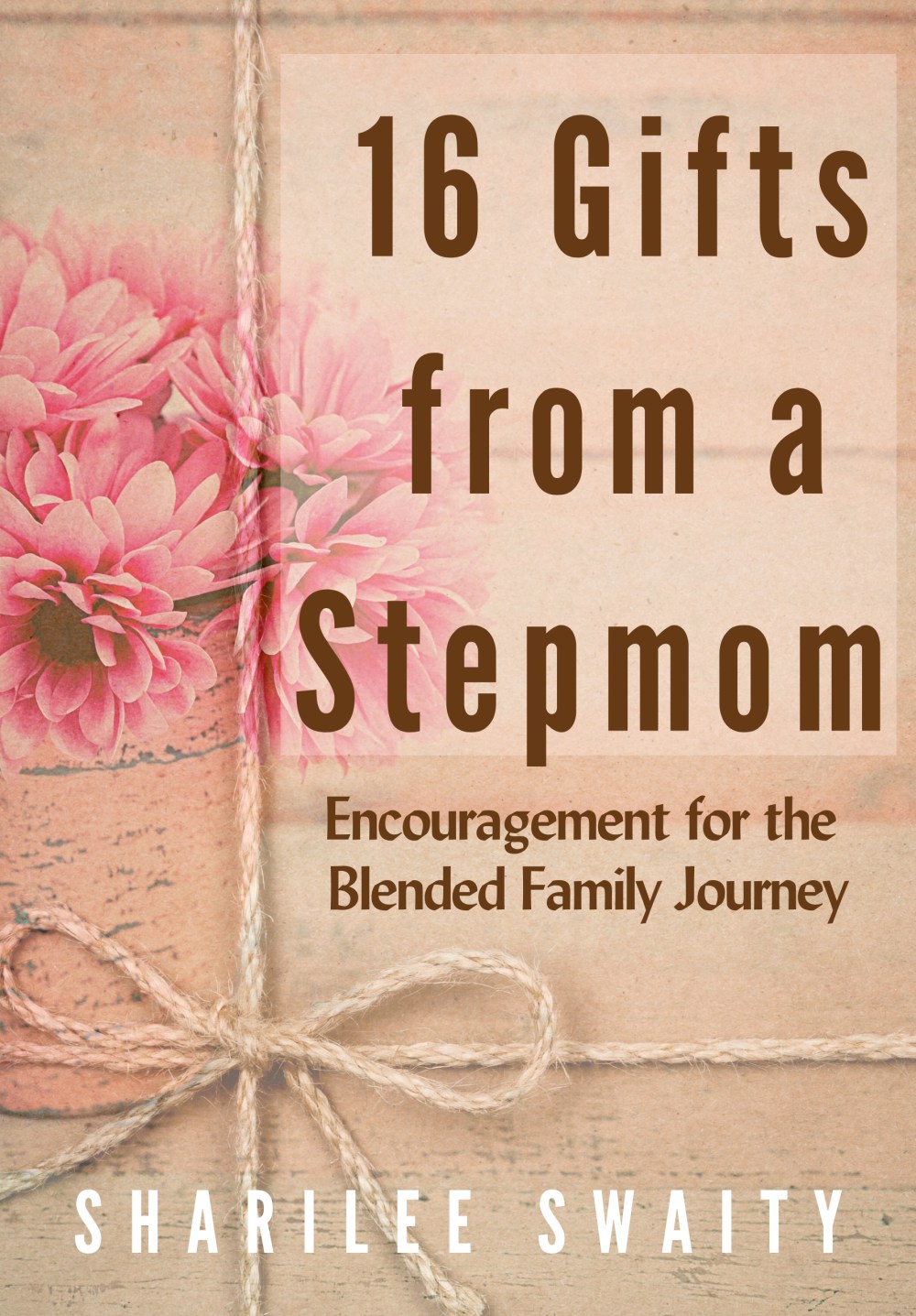
Option A features a pink color scheme and an illustration of gift-wrapped boxes. In Option B, the pink is more subtle. A piece of twine tied in a bow makes it look as if the cover is a gift in and of itself.
Can you guess which one won?
And the winner is…Option B, with 35 out of 50 votes and a score of 70 to Option A’s 30!
Let’s find out why respondents preferred Option B.
Not-so-literal gifts
Yes, a stepmother may bring actual, material gifts to a blended family. But it’s more likely that the gifts this book discusses are those of an emotional, not physical, kind. Option B’s more rustic design reflects this better than Option A, according to respondents.
One woman said she was “connected to it more emotionally.” Another wrote that the natural colors used in Option B “mimic that these gifts are something not material-based but more about connection and spirit.”
Several respondents said the use of the bow in the image was so effective, they felt they could gift the book to someone without wrapping it.
One respondent added that “the twine makes [the book] seem a little older, implying that the stepmom has wisdom to impart.”
How’s that for elevating stepmothers above their stereotypical ranks?
Try PickFu for free and test your book cover designs.
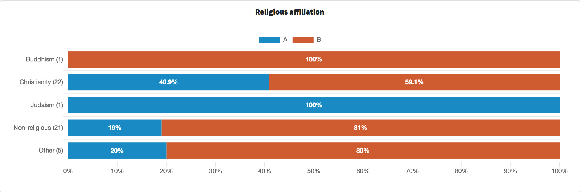
Other highlights
- Respondents who are non-religious strongly preferred Option B (81%) over Option A (19%)
- Those who identify as Christian also favored Option B, but by a smaller margin
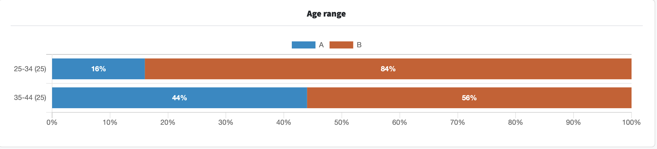
- Only 16% of 25-to-34-year-old respondents voted for Option A compared with 44% of 35-to-44-year-old respondents
What they said
“[Option A] is kind of cheesy with all the flowers and presents.”
“I prefer [Option] A. There is a joy to it, which I think the book most likely contains a bit of. [Option B] looks almost somber.”
“I felt like [Option B] embraced and represented the title better. The colors were softer and more inviting as well. And the picture is not so literal about the 16 gifts being something tangible.”
“I liked Option B because it had kind of an elegant peacefulness about it that appealed to me. I thought that fit with the subject matter. Making the book look like a gift was very clever. I thought that would make it stand out and also be memorable to people. Overall, I thought it looked prettier and more high quality than the other option.”
“[Option A] borders on old-fashioned, but [Option B] has a rustic charm that makes it feel somehow modern.”
Key takeaways
Respondents felt that Option B’s design is more appropriate for the book’s subject matter. And as some pointed out, it’s a more subdued pink than Option A, which adds to its appeal.
The vintage design of the cover balances the effect of the pink flowers and vase, and the twine ties everything together. The user who ran this poll seems to agree — Option B is the cover they ultimately chose for the book.
Want to dive deeper?
Results by commonly used words:
Results by racial or ethnic identity:
Results by education level:
Results by income range:
Get feedback on your book cover and title using PickFu.