
Are you loyal to specific brands when buying products? You’re not alone – a 2022 report from Salsify found that 46% of Americans look for brands they know and trust, and that number is only climbing.
A great brand identity is instantly recognizable, helps build trust, and reflects what the company or product is all about. But with competition in almost every industry at an all-time high, it’s harder than ever to foster brand recognition.
The Deloitte CMO report in 2023 learned that businesses are spending 12.3% of their budget on marketing efforts, and of that 9.7% on brand strategy and awareness. That’s up from 4.6% in 2021 – nearly double.
Put simply: branding is a critical part of a company’s success and a huge part of discretionary spending. And if you decide to rebrand, bad branding can sink your business almost overnight.
That’s why it’s so important to get your rebranding right. Before we get into our examples of bad rebrands and tips for avoiding them, let’s do a recap on the basics.
What is rebranding?
Rebranding is a way to reestablish or redefine your company by changing its logo, brand colors, messaging, or sometimes even its name. The most obvious first step is a new logo, followed by new style guidelines and brand identity work, including color palettes, slogan, taglines, and more.
Why do companies rebrand?
A rebrand allows a company to reset and readjust its position in the market, attract new customers, and re-engage its target audience.
Sometimes a brand is trying to shake off a bad image, step forward into a more modern identity, or simply address growing competition.
Changing customer values and attitudes are also a good reason to reinvent a brand. The growing wave of eco-conscious consumers is also driving some companies to rebrand, such as Tropicana and BP, which we’ll touch on later.
Common rebranding mistakes
Rebranding is a risky and delicate business. The majority of rebranding mistakes come down to a handful of avoidable errors. These include:
- Rebranding for the sake of rebranding
- Not understanding your brand’s value
- Complex and badly designed logos
- Using outdated styles and typefaces
- Ignoring your ideal customers
- Not communicating your rebrand to the market
5 bad rebrands (and how to avoid their mistakes)
The rise of social media has made rebranding faux pas even more dangerous, as customers and the general public have more channels than ever to complain, revolt, or even mock bad examples.
Here are some famous failed rebrands, plus tips for avoiding their mistakes:
1. A poorly “Krafted” modernization
Kraft is an icon in North American homes and around the world. The brand sells its famous Kraft Mac & Cheese dinner (KD in Canada) as well as countless spreads, condiments, and other foods. You’d be hard-pressed to find a pantry in its target region that doesn’t have a Kraft product in it.
Kraft was founded in 1923, and its red and white oval with the blue “Kraft” name in the center was its logo from 1988 until 2009, when the corporation attempted a dramatic rebrand.
They changed their simple and well-known logo into a complex blend of mismatched fonts, colors, and even a new slogan.
The “kraftfoods” logo was largely hated, with many customers failing to understand the relevance of the new color burst addition. The slogan “Make today delicious” in a multi-color font was hard to read and didn’t blend with the rest of the design.
It only took a few months for Kraft to revert to the old logo, this time changing the all-caps name for a sentence case version.
The rebrand failed because it was complicated, and because it went against the brand’s core values in consumers’ eyes. As a reliable staple in American kitchens, the logo had earned generations of trust. The confusing new version alienated key customers.
How to avoid the Kraft rebrand errors
Once again, a lack of public consultation hurt this brand. They didn’t fully understand why customers loved the company and sought it out on shelves. The simple, reliable formula that made it ubiquitous in kitchens was thrown out entirely in the rebrand.
With no real rationale behind the dramatic overhaul, and a design that lacked cohesion, Kraft customers felt like they’d been left behind.
2. A “Gap” between company and customer
At the end of the 2008 Lehman shock and the ensuing recession, Gap, a popular clothing retailer, was facing a heavy downturn with a 12% drop in sales. Even scarier for the board of directors, Gap suffered a 40% decline in the share price.
Drastic times call for drastic measures, and the board decided to spend some $100 million on a high-level rebrand.
The problem? There was no real reason for the rebrand. It was a rebrand for the sake of rebranding, in hopes it would help lift sales. There was no public consultation, no communication, and no purpose. Nothing in stores or in Gap’s offerings changed – just the brand.
Worse, the simple and iconic Gap logo adopted an outdated font, Helvetica. It also added a nondescript, confusing, and basic blue square with a gradient color change (in a supposed homage to the original logo’s blue box). The logo looked generic and uninspired, while also being more complex than the previous version.
The negative reception to the sudden logo change was loud and boisterous, especially online. Gap board members watched as their 20-year-old brand became a laughingstock. There was even a parody site with a “Make your own Gap logo” generator where users created thousands of unflattering versions of the logo.
Within a week, Gap reverted back to its original logo.
How to avoid Gap’s mistakes
A rebrand needs to be meaningful in order to successfully connect with customers. Fans of a brand will be frustrated if the logo suddenly changes for no apparent reason.
Other problems were a lack of consultation with their consumers and a lack of awareness of public tastes and trends.
Public consultation would have highlighted the fundamental design problems before launch. Gap should also have positioned the rebrand alongside some other shift in the company’s direction, rather than simply abandon its hard-won brand recognition and loyalty.
3. Taking the tropic out of Tropicana
There are examples of well-executed “green” (sustainability-focused) rebrands in the world. British Petroleum (BP) changed its logo from a dated shield to green “flower” with a simple “bp” logo in small letters. The redesign is unusual in that it was a more complex logo, but one that actually worked. BP’s logo tried to convey the company’s shift toward better environmental practices, and it largely worked.
We’re bringing up this example to highlight that sometimes having a good reason behind a rebrand still isn’t enough to make it work.
Orange juice icon Tropicana also tried to “green up” its brand image while capitalizing on the “100% natural” trend that was sweeping the food and beverage industry. In 2009, perhaps also motivated by the great recession, Tropicana turfed its old carton design for a new one.
Key changes included replacing the original orange with a plastic straw in it with a glass of juice. The imagery was supposed to suggest more sustainable practices by forgoing plastic straws in favor of a reusable glass. Unfortunately, the yellow liquid was unappealing, and the glass was hard to see.
They also removed the large “no pulp” label and replaced it with “100% orange, pure and natural.” Again, this was to cash in on the trend for more “natural” food products.
Lastly, they changed the original logo, rotated it 90 degrees, and made it harder to read.
This dramatic change was too much all at once and failed to take into account the brand’s main selling points. The orange and the straw were familiar and reassuring for customers, and the logo was easy to find.
The sudden change also made the “100% orange, pure and natural” claim feel untrustworthy, and made consumers question their previous faith in the brand.
The mistake cost Tropicana an estimated $30 million after sales slumped 20%. The carton design was replaced by its predecessor within months.
How to avoid Tropicana’s rebrand blunder
Tropicana is guilty of taking a wholesale redesign without engaging customers for their opinions. With this change, they distanced themselves from their target audience, erased the inherent trust that consumers had, and lost the appeal they’d built.
With more public consultation, a more iterative approach to the redesign, and with a keener eye on what their customers liked about the brand, Tropicana could have saved a lot of time and money.
4. A Mastercard masterclass in making things worse
If your logo is one of the most well-known in the world, don’t make drastic changes. Mastercard’s admittedly dated two-ring logo might have been worth refreshing, but the company’s attempt took things too far. For one, they made the logo far too complicated by adding a third ring, which was both semi-opaque and offset from the center of the other two.
It was complex, and confusing, and created a weird magic-eye effect that alienated customers. Then Mastercard decided to only use the new logo for corporate communications, and the old logo for consumer-facing purposes.
Users couldn’t figure out what it was all supposed to mean and complained loudly.
Eventually, the company went back to its simple design style, but tweaked it slightly to make it feel more modern.
How to avoid the Mastercard mess-up
As the adage goes: if it ain’t broke, don’t fix it. Simple is almost always better. Mastercard was too ambitious with its redesign, and spent a reported $1.5 million on the concept without engaging its users.
This rebrand failed to take into account the sentiment of the target market and customer base, while also trying to do too much all at once.
5. Thank goodness it’s not Friday
TGI Fridays is a clever and celebrated company name. The cheeky family eatery is one of the most well-known restaurant chains and has captured the hearts and minds of working families.
By removing the red-and-white stripes that evoked traditional pubs and barbershops, the brand was already moving away from its folksy roots. When they removed the “TGI” from the name in many markets, they took the essence of the establishment right out of the equation. No amount of flair can make up for the loss of whimsy – and whimsy is a key part of TGI’s charm.
How to avoid a TGI Fridays fumble
Short answer: be mindful of what makes your company stand out. Brands spend time, energy, and millions of dollars creating a unique selling proposition and differentiating themselves from the market. TGI Fridays seemed to have an identity crisis during their rebrand.
This could be avoided with more public consultation, a deeper understanding of their brand value, and a more well-considered plan. It doesn’t seem like there was a real need for a rebrand here, so it’s hard to understand the method behind it.
The key to a successful rebrand: testing with consumers
The key themes that keep popping up in these rebrand fail examples are A) failing to talk to their customers, and B) lack of brand market research.
Including your customers and target market throughout the research and design process can help your brand spot potential flaws early – and avoid costly mistakes.
You don’t even need to spend thousands of dollars or months of time on consumer research when rebranding, especially if you’re a small or midsize business (SMB) and not a huge enterprise like the ones we’ve mentioned above.
PickFu is a consumer insights platform that gives brands quick, easy access to a survey pool of over 15 million people across 90+ demographic subsets. By running polls in PickFu, your brand can test logo designs, slogans, and more with real consumers in your target audience.
Example
Nokia is another company that had a poorly executed rebrand recently. The Swedish company was known for building ultra-tough and reliable mobile phones throughout the early 2000s. After the rise of the smartphone, Nokia pivoted to providing the infrastructure and networking hardware that powers our cell phone networks and internet systems.
Its 2023 rebrand aimed to move the company’s public persona beyond it cell phone legacy and reflect its changed mission and role in the technology industry.
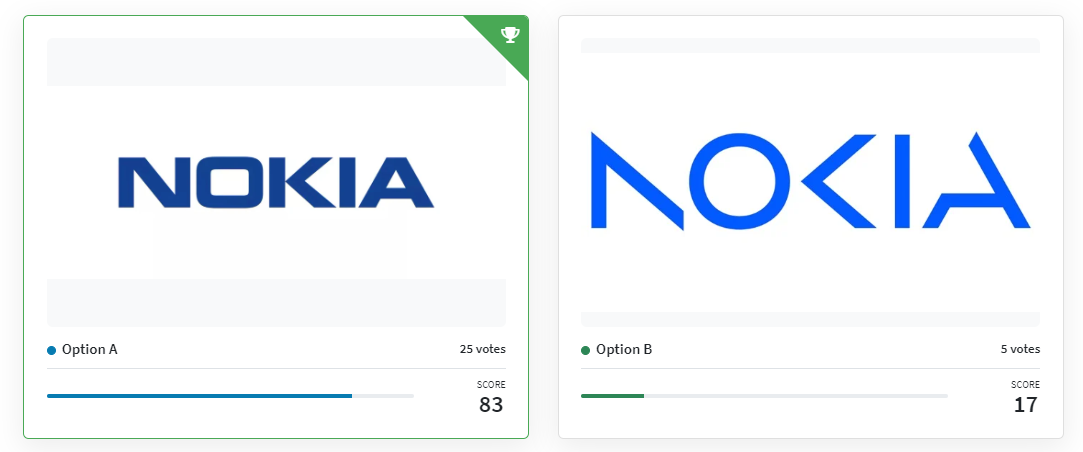
In a Head-to-Head poll in PickFu, we asked consumers to rate the new Nokia logo versus the old. While users overwhelmingly preferred the old version, these results are more than just a simple popularity test.
Every respondent also includes written feedback on why they chose the option they did. PickFu’s built-in AI tools also parse through the comments to extract actionable insights brands can use to refine their direction.
“In this survey comparing two versions of the Nokia logo, the old version (Option A) emerged as the clear winner with 25 out of 30 votes. The characteristics that made Option A stand out were its legibility and familiarity. Respondents consistently mentioned that they preferred the older version because it was easier to read, had a simpler design, and evoked a sense of nostalgia. On the other hand, Option B was criticized for being difficult to read due to missing parts of letters and for lacking recognition value. The winning option’s strong brand recognition and simplicity seemed to resonate with respondents, leading them to choose it over the newer alternative.”
This feedback could have given Nokia a more successful rebranding logo design by giving the company three points to work on: simplicity, readability, and nostalgia.
You can also use PickFu Ranked polls to assess multiple options of logo designs and help refine your direction. In some cases, PickFu’s Open-Ended polls can help brands assess whether a rebrand is even necessary with a brand name test – just ask a question about your current or hypothetical new brand, and respondents will provide open-ended feedback.
Rebranding yourself or your company successfully is easy to do – IF you spend the time and energy conducting market research and listening to your ideal customers.
Try running polls in PickFu to get feedback on your branding and avoid a rebranding disaster. You’ll get feedback within a few hours, and polls start at just $15. Sign up for free today to improve your chances of rebranding success!
Rebranding FAQS
How do you rebrand a company?
In simple terms, a rebrand changes a company’s visual identity, usually through a new logo, new brand colors, new packaging, etc.
The rebranding process involves assessing the need for a rebrand, researching customer wants and trends, and then potentially redesigning your logo, changing the brand name, or changing your color palette.
Rebranding is deceptively hard. Companies need to come up with their rebranding concept and strategy, test it with their target market, and finally communicate the new brand image to the world.
What are some famous rebranding failures in business history?
Some more failed rebranding efforts include:
- Pepsi: a complicated logo update that seemed pointless
- Royal Mail: a rebrand to Consignia that confused customers
- Radio Shack: its rebrand to “The Shack” with a logo that read “Radio Shack, The Shack” failed to convey the brand’s desire to reinvent itself as a modern tech store