Thanks to Rodney Laws of Ecommerce Platforms for this guest post on choosing the best fonts for your brand.
Typography is so easily overlooked, yet it subtly affects everything around it. The best fonts and typography choices ripple out, significantly affecting how consumers view your brand. What message is conveyed? Does the brand stay in memory? Ultimately, typography influences people to choose your brand or avoid it.
Even if it seems like the bottom of your priority list, never be casual about the fonts you choose. If you choose wisely, you only need to do it once.
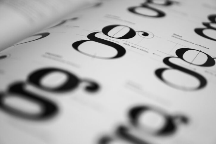
The best fonts quickly convey distinct styles
Regardless of whether you’re aware of it, you associate different font types with different scenarios, genres, and tones. Our shared cultural memory reinforces these messages in myriad ways. Serif fonts with flourishes might make you think of Victorian London. Sleek rounded fonts might make you think of futuristic science-fiction. And Comic Sans might make you feel desperately disappointed.
Choose the best fonts to communicate the style you’re going for:
- Try a simple sans-serif option if you want your brand to appear modern.
- Look for fonts that incorporate leaf shapes into the letter designs if you want to show an affinity with nature.
- Keep in mind, your font choices don’t have to be literal. A brand for children need not be written in a juvenile font. The hint of an image or idea goes a long way, even if someone doesn’t consciously notice it.
- Consider having a custom font designed through a service like Fontsmith.
Your typography choices follow you across channels
If you adhere to brand guidelines (and you should — they should feature your color palette, tone, logos, etc.), then whenever you have your original content featured on another site or platform, push that site to use your fonts. While not mandatory to do this, it’s an interesting option if you really want your brand to stick out.
More commonly, though, your brand will adopt a multi-channel marketing strategy — adapting your content to suit different channels so that you broaden its exposure. If you’re an online retailer, you may even move things up to multi-channel selling, with plenty of multi-channel e-commerce platforms that support native selling in various scenarios.
Now, you can’t choose your fonts on every channel, but you should wherever possible. Try to avoid using wildly-differing fonts. If a content template gives you a choice of ten preset fonts, for instance, pick the one that most closely resembles your website font. Doing so maximizes continuity and minimizes the confusion for followers of your brand.
The best fonts clarify your content
Have you ever visited a website that uses a highly-ornate font against a non-contrasting background? I’ve seen a fair few, and it’s always immensely frustrating. Typography choices can make it harder to discern the words, sometimes to the point where it’s almost impossible to read without manually selecting the text to highlight it.
Online, you never want to make people wait. Big companies happily invest large sums of money to establish a lightning-fast site infrastructure. They know that saving a fraction of a second in page loading time can make the difference between winning or losing someone’s interest (and business).
Now think about the valuable time lost trying to puzzle through a horrible font. Given that you have about 1/20th of a second to gain a visitor’s trust, it quickly adds up to lost interest, which directly damages your brand. You must choose a font (or set of fonts) to make your copy optimally easy to read and understand.
Typography makes it easier to highlight elements
Your brand exists, in large part, to sell something — it may be a product, a service, or some kind of special interest. Regardless, the purpose is to convince people to invest in it. To achieve this, your content needs to place things in a clear hierarchy, with some elements being vitally important and others being moderately useful.
To a large extent, hierarchy is achieved through structuring — you display the most important element prominently at the top of the page, for instance. But using distinct fonts for headings, subheadings, and text also contributes to a clear hierarchy. Don’t want to go overboard with this (don’t use more than three fonts overall), but you can use different styles (bold, italics, etc.) to mix things up.
The better you make your typography, the easier it will be for people to pick out the most important elements. That way, they’ll be considerably more likely to take whatever action you’re encouraging them to take.
Not sure of the best fonts? Ask.
Never launch your brand without a solid typography plan. It really does matter.
This PickFu poll demonstrates how your font choices can communicate your company’s essence. Option A used Didot, a serif font. Companies often use serif fonts because they are considered easier to read than sans-serif. Option B used swirling calligraphy.
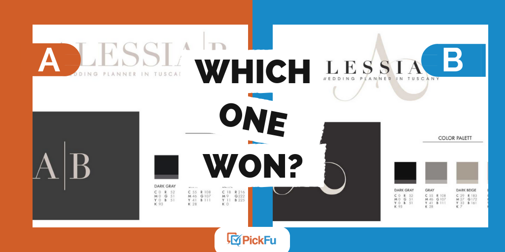
Many respondents felt that the elegant A made Option B stand out. One commented, “The logo has a more formal calligraphy lettering for its logo which gives it a more formal elegant look of style. This gives the logo a more classy upscale presentation over the logo option in block letters.” Others echoed these feelings, using words such as exotic, interesting, sophisticated, and fancy.
Not sure if you’ve chosen the best fonts for what you’re aiming for? Use PickFu to test designs on a target audience by creating a poll and get results in minutes.

Rodney Laws edits ecommerceplatforms.io, a website built to enable e-commerce startups and business owners around the world achieve success online.