As much as we’re told not to judge a book by its cover, when it’s time to shop, we tend to make decisions based on how a product looks.
Even details like the color of a product’s label can mean the difference between winning and losing a sale, as this PickFu split test suggests.
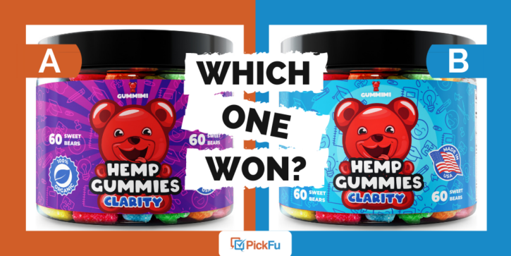
Gummimi, a maker of hemp gummy supplements, asked 100 Amazon Prime shoppers who occasionally take nutritional supplements which of two images of a jar of bear-shaped gummies they would click on.
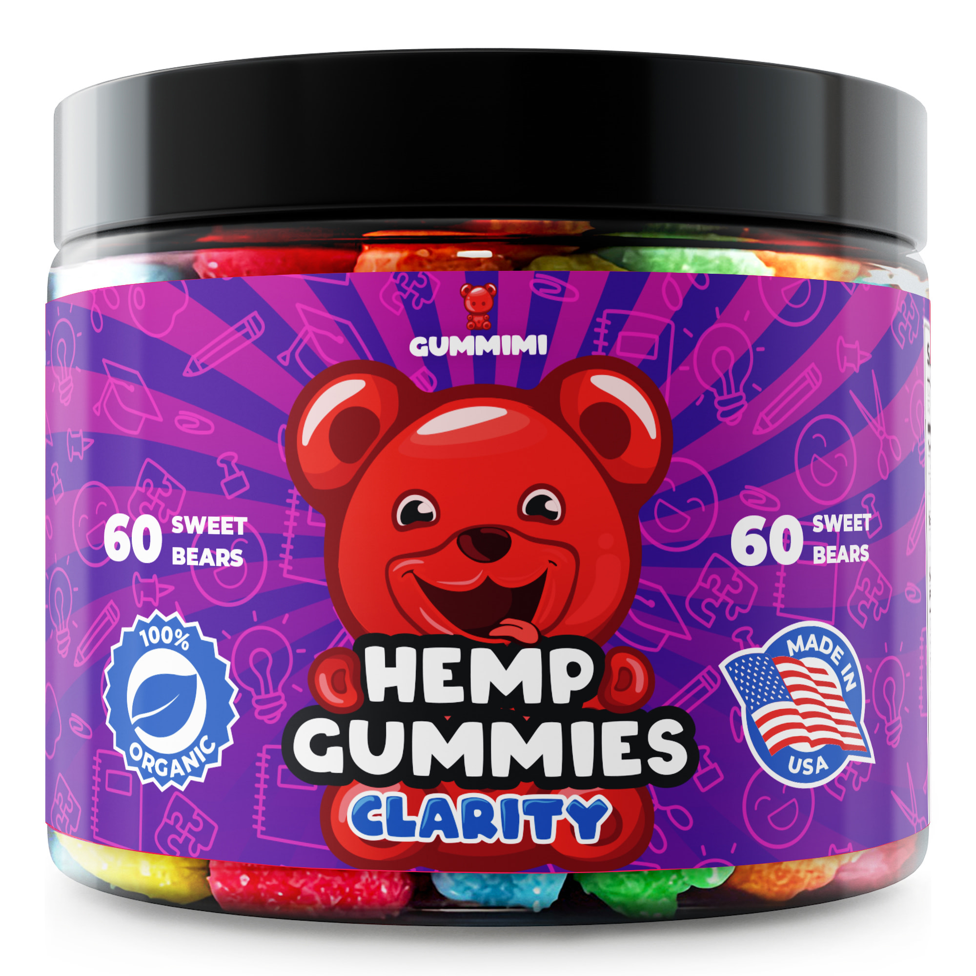
Option A’s label features a red cartoon bear on a purple label with text that reads “60 sweet bears” above 100% organic and Made in USA seals.
In Option B, the background of the label is bright blue, with “60 sweet bears” set below the seals.
Can you guess which one won?
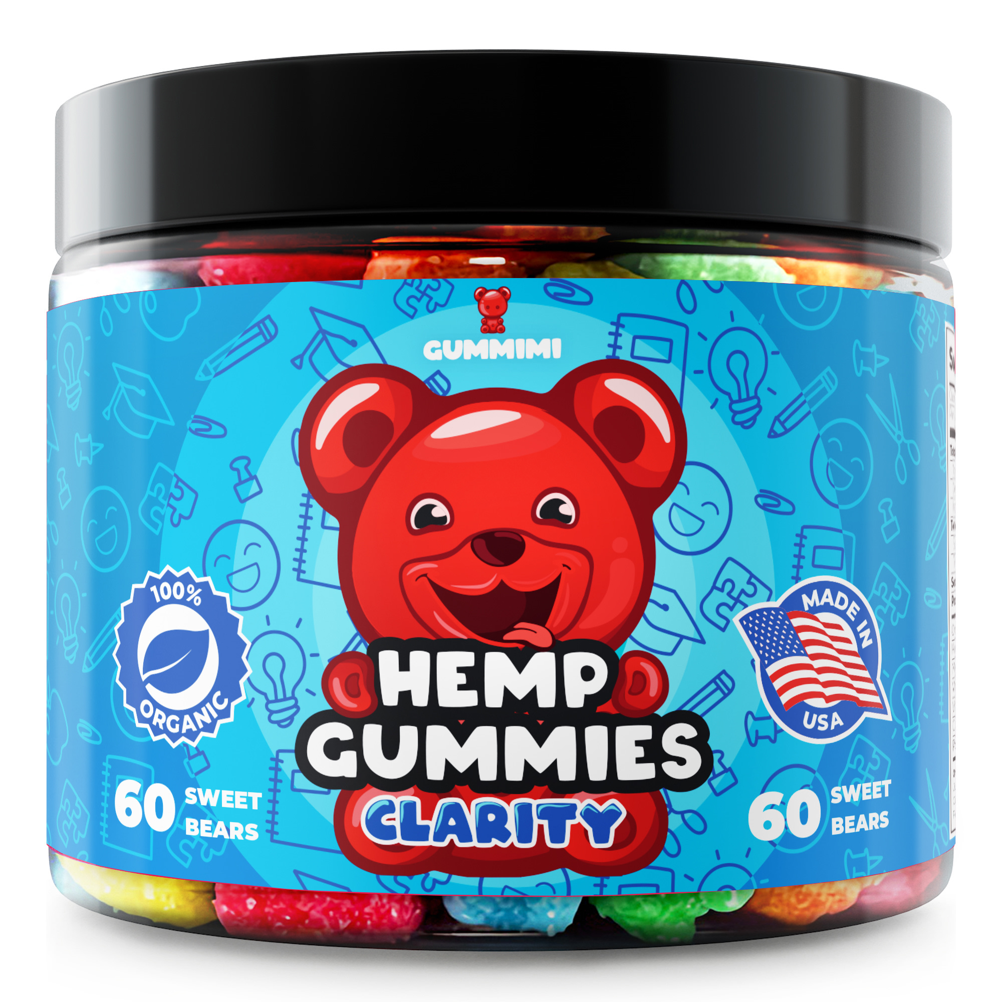
And the winner is…Option B, the blue label, with a score of 61 to Option A’s 39.
What is it about the color blue that people find appealing? Why did nearly 40 percent of respondents vote for Option A? Let’s look at their comments to find out.
True blue
There were a few subtle differences between Options A and B, such as the placement of the numbers and badges.
But for nearly all the respondents, it boiled down to the color of the label: purple vs. blue.
Some mentioned the visibility of the numbers and text, while others said the red bear looks better on one background or the other.
A significant chunk of respondents voted according to personal preference (“I like the color blue over purple”).
The core of the purple vs. blue argument, however, was how well the color fits the mood of a product like hemp gummies, which blur the line between recreation and health.
“This looks more fun and in line with the product,” said a respondent about Option A’s purple design.
“The color is more calming and makes me feel like I’m getting a product that will be healthy,” said one person who voted for Option B.
Another respondent who preferred Option B put it bluntly: “This image looks a bit less stoner-like. Which I think would give you a larger audience.”

Other highlights
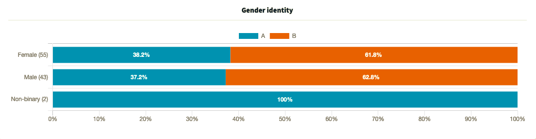
- Although color can be a divisive topic among genders, in this poll, male and female respondents were mostly in agreement about Option B’s blue, while the two non-binary respondents favored Option A’s purple
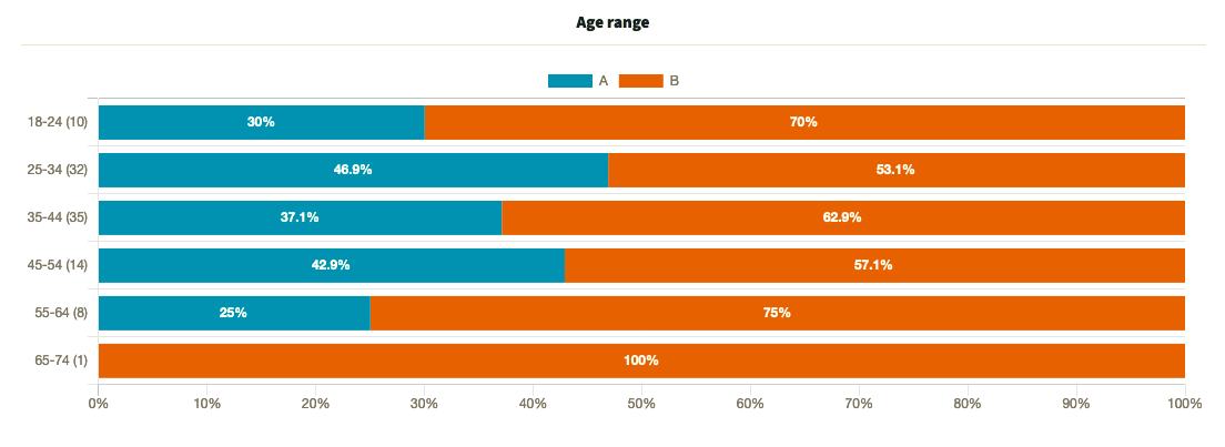
- Of all the age groups, 25-to-34-year-olds showed the most support for Option A
What they said
“The purple one [Option A] is almost TOO bright and I feel like it contains caffeine or something because it’s just really bright. It reminds me of the packaging for energy drinks with a bunch of things in them that speed you up.”
“The numbers were easier to spot (higher up) on [Option A], which is more important to me than the certifications. The white also popped more on the darker/deeper background.”
“I really like the blue background of Option B. I feel like the red bear stands out a lot more and the whole thing has a much more professional appearance while still remaining fun. In Option A, the red bear just doesn’t contrast against the background enough.”
“Option A seems visually loud and confusing which is, for me, the opposite of clarity. Option B is broad and open and calming and more likely to lead to clarity. I’m also confused why ‘60 sweet bears’ appears twice on the packaging.”
“[Option] A gives off more of that high feel with its packaging.”
Key takeaway
While everyone has their own color preferences, people tend to agree on the mood or tone that certain colors convey.
Option A may look more fun and “psychedelic,” but respondents said that doesn’t necessarily mean it’s better.
When choosing your products and designing your packaging and labels, think not only about whether the colors match your brand, but also how your target customers perceive different colors. Better yet, ask them.
For more ideas, check out this video of a kids’ bath brand that took its label and packaging in a fresh direction with the help of split testing.
Want to dive deeper?
Results by commonly used words:
Results by gender identity:
Results by age range:
Results by income range: