A self-help book cover should hint at the message tucked within its pages.
A book about relationships might show a couple on the cover, for example. But what about a motivational book about cleaning up life’s messes? How messy should the cover look?
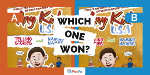
One author took to PickFu to answer this question by testing two covers for a book titled, From Mess to Master: 9 Steps to Overcome Failure, Crush Fear and Defy Your Limits With Inspiring Stories of Successful People.
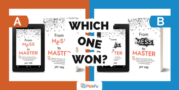
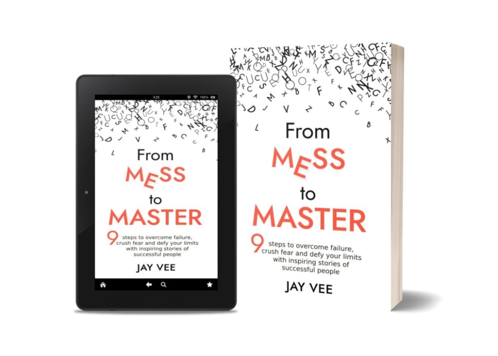
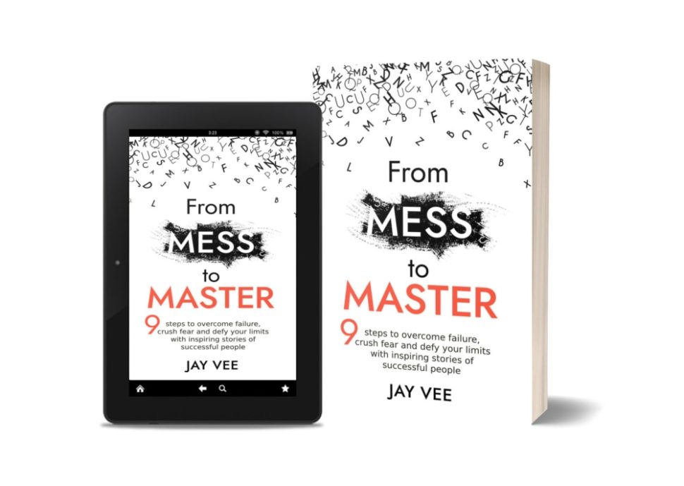
Both designs feature a jumble of letters on the top part of the cover. In Option A, the word Mess is crooked and set in orange font to match the rest of the title. In Option B, the word Mess is in white font against a bold black splash of background.
Can you guess which one won?
And the winner is…Option B! With a score of 70 to Option A’s 30, PickFu respondents clearly favored the second option. Here’s why.
Messy, but not too messy
Several respondents disliked the crookedness of the letter E in Option A.
“[Option] A is more distracting with the letter out of place and doesn’t look as appealing,” wrote one male.
Another male agreed, adding, “I don’t like the hanging letter in [Option] A.” A female wrote, “I don’t like the text displacement in ‘mess’ on A.”
Even though only one letter is out of place, the effect is slightly jarring. The word Mess stands out and not in a good way.
Better contrast with dark background
Nineteen of the 35 respondents who voted for Option B mentioned that the contrast in colors on the cover makes the book stand out and the title easier to read.
“I felt like the highlight over the word ‘mess’ really stands out and gives the book cover more contrast from all the white,” said one person.
“I like option B the best because I like the black streaky splotch that is behind the word mess. It highlights the word Mess and has a more aesthetic look compared to the simple lettering of option B,” said another.
Despite being easier to read, Option B’s cover still evokes a mess — but in a good way, said respondents. “I like that the word mess also looks [dirty],” wrote one respondent, noting that it’s “a clever way to make the cover even more enticing.”
“The black background with white font…really makes it stick out more and contrast more with the word Master,” said another. “It makes me think that there is a drastic change between the two, and this book can give me information necessary to do so.”
Key takeaway: colors on the cover
Contrasting colors on the cover not only make the title font stand out, they give readers a clear picture of what your self-help book is all about.
Learn more on PickFu’s site about how to get feedback on your book’s cover, title, and more. And if you’re still in the brainstorming stage, read our guide on how to structure a self-help book.