The logo is one of the staples of your business. It establishes your brand. It distinguishes your company from others. Therefore, it’s important to make sure that you have tested your logo design on a target audience. It might surprise you to find that one of your creative design choices doesn’t fly with your audience at all.
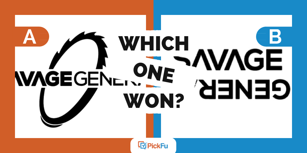
A company recently experienced this when testing its logo using a PickFu poll. It asked the test panel, “Which logo is more appealing?”
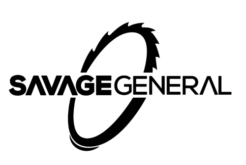
Both logos are all black. Option A shows the words “SAVAGE GENERAL” with a sprocket wheel behind it.
Don’t Make Them Work For It
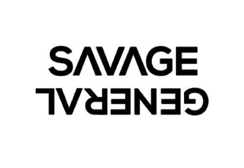
Most of the respondents preferred Option A because they felt that the upside down text in Option B was too hard to read. Poll respondents used words such as annoying, confusing, and unreadable to describe Option B. One individual wrote:
“I prefer A because I do not have to figure out the ‘upside down part.’ It just makes more visual sense.”
You don’t want your audience to have to work hard to “figure out” anything. If your audience can’t read what your company is, then they don’t know who you are. They can feel frustrated if they have to take extra steps to figure out your company name.
Make Non-Text Elements Relevant
The test panel also commented on the importance of connecting design choices with the company purpose. When observing the company’s risky move to include upside down text in Option B, one respondent writes:
“Unless the upside down letters tell something about your product or service, they’re kind of silly and gimmicky and don’t really add anything visually pleasing or informational to the logo.”
In other words, if you’re going to be risky, make it relevant.
Another respondent also commented on the connection between logo design and company purpose:
“[The] image of the gear in the logo [in Option A] gives me some idea of what the brand might represent.”
Other respondents made similar comments, but some mentioned that they were still confused about what the company does.
This shows the importance of being intentional when adding non-text components.
If you are making any tweak to the letters or adding other elements to your logo, consider the purpose behind doing so. Is it somehow related to the purpose of your company? This helps to give readers a hint about what your company does.
Key Takeaways
It seems like a no-brainer: when creating a logo, you want your audience to be able to read your text.
But you may not know that your design is difficult to read.
This is where creating a PickFu poll can come in handy. You can test your logo design on a target audience and receive instant results. Here are some best practices to help you test your logo with PickFu.