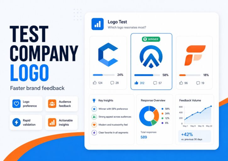
Use PickFu to test company logo designs with real people before you choose a final version. Compare logo options, get written feedback, and see which design your target audience finds most professional, trustworthy, memorable, and brand-appropriate.
Quick summary
A company logo shouldn’t win because the founder likes it, the graphic designer prefers it, or the team voted for it in Slack. A logo has to work in the real world, where people see it for a second or two, judge it almost subconsciously, and use it as shorthand for whether your brand feels credible, modern, premium, playful, or trustworthy.
The most reliable way to test a company logo is to compare your options with people who resemble your target audience. With PickFu, you upload two or more logo concepts, ask one focused question, choose the audience you want to hear from, and review both the vote and the written explanations behind it. That combination matters, because the best logo isn’t simply the one with the highest vote share. It’s the one people can explain, remember, and connect to the right brand personality.
PickFu is a consumer research platform built for exactly this kind of decision. You upload your options, choose the audience you want feedback from, and get written responses from verified human respondents who match it — with answers starting to come back within hours rather than weeks. It’s digital, so it won’t replace hands-on product testing, but for a visual decision like a logo, it’s a fast way to swap a guess for evidence.
Logo testing is most useful before a launch, rebranding project, website redesign, app release, packaging update, or ad campaign — any point where a wrong call gets expensive to reverse.
📊 PickFu example: A specialty coffee brand tested three logo directions with 15 U.S. women who drink coffee. See how the three concepts stacked up.
Get real feedback on your logo designs
Not sure which logo looks more professional? Upload your options to PickFu and get feedback from real people in your target audience. You’ll see which logo wins, why people prefer it, and what they’d change.
A logo test gives you more than a preference vote. It shows the gap between what you meant the brand to say and what people actually take away from the design. That gap is where a lot of early brand decisions go sideways. A founder sees a minimal wordmark and thinks “premium.” A buyer sees the same mark and thinks “generic.” A designer picks unusual typography because it feels distinctive, and a customer reads it as hard to follow.
That’s why logo and design testing belongs early in the brand identity process. Before you commit to a website, pitch deck, packaging, business cards, ad creative, app store listing, or storefront, the logo should be checked against the reactions you actually want it to create. Does it feel credible? Does it match your target market? Does it make people curious enough to click? Does it help them understand what the company does?
It’s the same reason brands test product images, packaging, slogans, names, app icons, and landing pages. Visual decisions rarely stand alone. A logo that works on a homepage hero can fail as a tiny app icon. A mark that pops on a white background can disappear on a product label. The earlier you catch those problems, the cheaper they are to fix.
How logo testing works on PickFu
Testing a company logo should feel simple, even though the decision behind it carries weight. A logo usually becomes the anchor for your whole brand system — colors, typography, packaging, website, ads, investor decks, app icons, and social profiles all take cues from it.
PickFu turns a subjective debate into a structured research question. Instead of asking “which one do we like?” you ask “which one does our target audience trust, remember, and understand?”
1. Upload your logo options
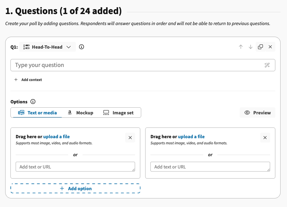
Add two or more company logo designs. They might be completely different concepts, or variations on one direction — a wordmark against an icon-led logo, a serif version against a rounded one, or a blue palette against black and white.
You can also test the logo in context. A polished PNG or SVG mockup looks fine on its own, but you may want to show the mark on a website header, product label, app icon, Amazon listing, or social profile. That’s where mockup testing earns its keep, because people react differently when a logo has to compete with real visual noise.
2. Choose your audience
A logo that works for one audience may not work for another. PickFu lets you test designs with respondents who match your target customers, so the feedback is more relevant than asking friends, coworkers, or social followers.
A SaaS startup might want business owners, managers, or software buyers. A beauty brand might target women in a specific age range who buy skincare. A kids’ product brand might target parents. A luxury brand might care about higher-income shoppers. “Premium” means something different to enterprise software buyers than it does to skincare customers, and “friendly” means something different for a children’s product than for a cybersecurity company. The feedback gets more useful when the people answering resemble the people who’ll decide whether to trust, click, buy, download, or book.
This is also a practical answer to a question people often ask: where can I post a survey and get responses I can trust? Posting to your own followers gives you a biased read, because they already know you. Choosing a matched audience inside PickFu removes that bias.
3. Get results and written feedback
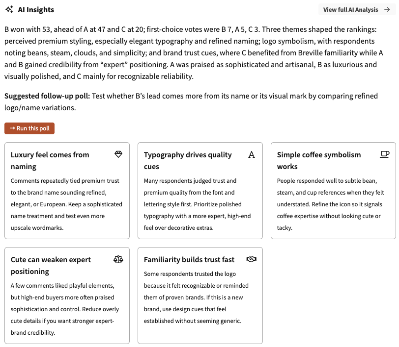
The vote tells you which logo won. The written survey responses tell you why, and that distinction is the point.
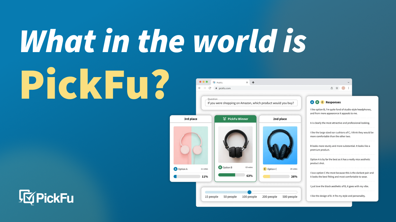
If one option wins with 63% of the vote, the number gives you direction. The comments explain the decision: the colors feel more trustworthy, the icon is easier to remember, the typography looks more established. Respondents also catch things the team missed, like a shape that resembles another brand, a font that feels dated, or an icon that doesn’t read as the right industry.
That’s the difference between real consumer feedback and a quick internal vote. People aren’t just picking a favorite; they’re describing what the logo makes them think and assume.
What types of company logos can you test?
A logo test isn’t only for early-stage startups. It helps any team choosing between visual directions before committing budget, time, or brand equity. The more places your logo will live, the more it matters to test how it performs across them.
You can test startup logos, e-commerce brand logos, SaaS company logos, agency logos, personal brand logos, app logos, product logos, rebrand concepts, color variations, font variations, icon-only marks, and logo-plus-tagline combinations.
For an e-commerce brand, the logo has to work on product images, packaging, email headers, checkout pages, and Amazon storefronts. For a SaaS company, it has to hold up in a browser tab, a product dashboard, a sales deck, and a LinkedIn ad. For a mobile app, the mark needs to read at small sizes, which makes app store screenshot and icon testing a natural extension of logo testing.
The same logic carries into nearby creative decisions. Whether you’re running package design testing, AI creative testing, mockup testing, A/B testing, Amazon split testing, or a brand name test, the logo is usually one part of a larger perception system. It can make a product feel premium, playful, technical, or trustworthy before the customer reads a single line of copy. Logo preference testing is the step that comes first. You settle the design with your audience before you spend on a live A/B test, where the losing variant also costs you sales.
What you can learn from a logo test
A PickFu logo test can tell you which logo looks more professional, which feels more trustworthy, which is easier to remember, which fits your industry best, and whether the design communicates the right brand personality. It can also reveal whether the icon or typography is confusing, whether the colors send the right message, and whether people even understand what the company does.
That last point is often the most valuable. Teams get too close to their own brand. They know the product, the story, and the strategy behind the design. Customers don’t. They see the logo cold, for a few seconds, and make fast assumptions.
Picture a founder launching a B2B software company. The team prefers a sharp, abstract black wordmark because it feels sophisticated. Software buyers, though, say it looks like a fashion label or an architecture studio. A second option, a simple blue icon with clearer typography, wins because it reads like a reliable business tool. The first logo may be more visually interesting; the second does a better job moving the customer forward.
Now picture a premium skincare brand choosing between a soft neutral logo and a bright, playful one. The bright version grabs more attention, but respondents say it feels young and inexpensive for a higher-priced product. The test isn’t just naming a winner. It’s clarifying the tradeoff between attention and positioning, so the team can make that call on purpose instead of by accident.
Example: testing two company logo designs
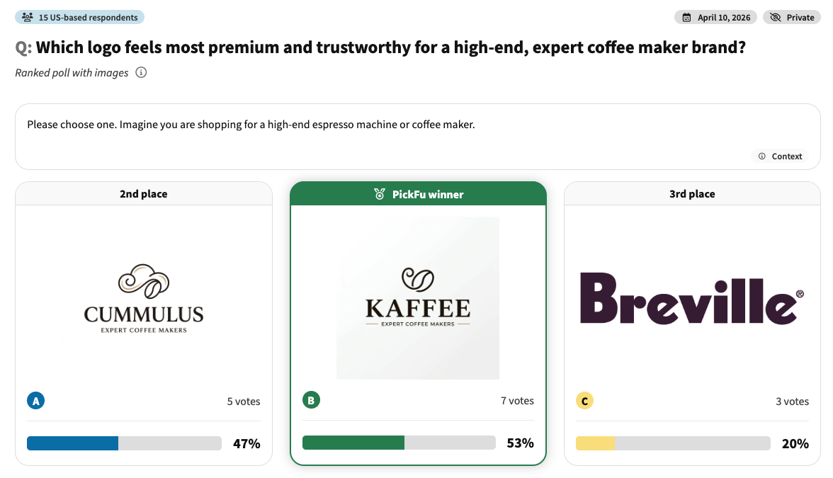
We ran a real test and asked 15 U.S. respondents: which logo feels most premium and trustworthy for a high-end coffee maker brand? The options were two fictional brand logos against Breville, an established brand.
The vote was tight: “Kaffee” took 53% to “Cumulus’s” 47% in the ranked result. The written feedback is where the decision actually lived:
- Typography did the heavy lifting. People judged quality from the lettering first: “the font used does give the logo a premium vibe.”
- The name carried weight too. One respondent wrote, “I love how ‘Kaffee’ feels like a fancy way to say ‘coffee,’ that makes it feel fancy and premium.”
- The losing option still had fans who called it “high end and small batch,” which is exactly the kind of signal you’d want before throwing a close runner-up away.
The lesson isn’t that one naming style always wins. It’s that the winning logo created a clearer premium impression for that audience, and the comments told the team which levers (typography, naming) were creating the effect. If the brand wanted to feel exclusive and editorial instead, the runner-up would be worth refining and testing again with a more specific premium audience.
Test your logo with your target audience

The biggest problem with informal logo feedback is that it usually comes from the wrong people. Friends want to be supportive. Coworkers carry internal context. Social followers may not match your future buyers. A designer brings a strong expert opinion, but the customer still has to understand and trust the design.
Choosing an audience before the test runs narrows that gap. In the Daybreak coffee example above, the feedback came from women aged 25 to 44 who drink coffee, close to the brand’s actual buyer, not a random crowd. That’s why their read on “who is this brand for” was worth acting on.
The audience decision should follow the business decision. Choosing a logo for a software company? You probably care most about professionalism and clarity. For an online store, trust and category fit matter more. For a kids’ brand, warmth and memorability may beat minimalism.
This is also where the question of synthetic respondents vs real consumer feedback comes up. AI can generate logo directions, summarize themes, and speed up exploration. But when the decision turns on human perception, real people still matter. A model predicts what a customer might say; a respondent tells you what they actually thought. That’s the case for human-in-the-loop product research for AI: use AI to move faster, and keep real human feedback in the loop before you commit to brand assets.
Logo test question templates
A good logo test question is specific enough to guide the respondent and open enough to reveal how people read the design. Weak questions ask, “which logo do you like?” Stronger ones tie the logo to an outcome like trust, memorability, category fit, or click intent.
- Which logo looks more professional for a software company? Why?
- Which logo would you trust more for an online store?
- Which logo is more memorable, and why?
- Which logo better communicates a premium brand?
- Which logo would make you more likely to click or learn more?
- What do you think this company does based on the logo?
- Which logo color feels more trustworthy, and why?
- Which logo best fits a brand selling [product/category]?
- Which logo feels easiest to recognize at a small size?
- Which logo and tagline combination is clearer?
- Which version would make you more likely to download the app?
Once the logo direction firms up, you can test the rest of the brand system the same way: run a poll to test slogans, a test for your business name or brand name test if the name’s still open, or app icons, product images, and packaging concepts to check that everything’s pulling in one direction. Founders chasing bigger questions, like how to sell app ideas or how to create original content for GEO / SEO, run into the same truth. The market doesn’t only respond to the idea. It responds to how the idea is named, framed, and shown.
What can a logo accidentally communicate?
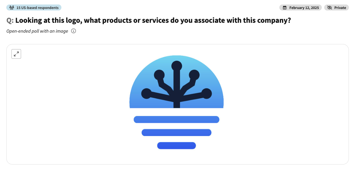
One of the most revealing questions you can ask is the simplest: what do people think this company does, just from the logo? When we ran exactly that test, showing one logo and asking what products or services people associated with it, the answers scattered in every direction.
- Several respondents read it as a tech, internet, or IT company (“circuits running through it,” “a tech leader”).
- Others saw electricity, a Tesla coil, or a lightbulb.
- A few landed somewhere else entirely: a water company, plumbing, even a genealogy service (“a family tree that has branched out”).
If the people you’re targeting can’t agree on what you do, the logo may be too abstract or visually tied to the wrong industry. That doesn’t mean every mark has to be literal. But if the design sets the wrong expectation, the rest of your marketing has to work harder to correct it.
Why use PickFu instead of asking friends?
Asking friends, coworkers, investors, or a LinkedIn audience is tempting, and it’s fine for an early gut check. But it has limits. People who know you respond to the relationship, not the design. People inside the company gravitate to the safest option or the founder’s favorite. Social audiences don’t reflect the target market. Logo testing works better when the feedback is independent, structured, and tied to a clear decision.
None of this makes professional designers less important. A strong graphic designer brings strategy, craft, typography knowledge, and brand-system thinking. But even the best designers benefit from customer feedback. The point isn’t designer versus respondents; it’s designer plus respondents. The designer creates strong options, PickFu shows how real people read them, and the designer refines the final direction with better evidence.
It’s also why PickFu shows up on lists of focus group alternatives. Focus groups are valuable when you need deep, moderated discussion. But if the immediate job is choosing between logo concepts, a fast preference test with written feedback is often enough to move forward.
Tools and alternatives for logo design testing
PickFu is best for iterative testing, comparing design options, and building flexible surveys with real people who match your target audience. You get qualitative insights on every test, and results come back within hours. For a rebrand or a pre-launch logo design decision, PickFu should meet most of your needs.
However, there are a few scenarios where an alternative tool might make more sense.
If you already have an audience to survey

PickFu’s core value is our consumer panel: real people in your target market you don’t already know. However, you can also build tests and surveys in PickFu and share the link with your existing audience – and it’s completely free.
If you have an engaged email list, community, or social following and just want to put a quick question in front of them, this is a great option.
A few alternatives to PickFu for surveying your own audience: Google Forms is free and easy to use; Typeform enables more polished, branded flows; and SurveyMonkey adds more structure if you need it.
If you need to watch people use your app or product
A logo test captures first impressions and preference, not whether someone can finish a task. If the real question is “can people navigate this app, flow, or prototype,” tools built for usability answer it better. UserTesting records real users thinking aloud through a session, and Maze runs prototype and task-flow tests.
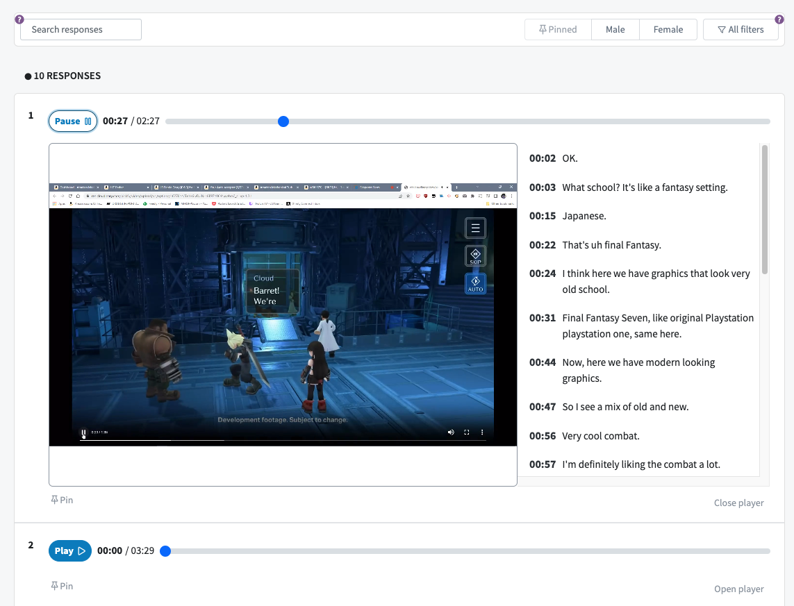
PickFu does have screen recording polls, where you ask respondents to record their screen and voice while they view your website, mockup, or other asset. However, you can’t ask PickFu respondents to download an app, create an account, or make a purchase.
If you’re testing B2B positioning
PickFu’s panel targeting is strongest for consumer (B2C) audiences. If you need feedback from a narrow professional buyer — a CTO, a procurement lead, a specific job function — a B2B-focused tool like Wynter is built better for that ICP.
If you need enterprise methodology or ongoing tracking
For advanced survey logic, brand tracking over time, or specialized methods like conjoint and pricing analysis, enterprise research platforms such as Qualtrics are a different category: more setup and budget, but built for that depth. PickFu is the faster, lighter option for a single creative decision, not a system of record.
Where logo testing fits in a brand launch
A logo is most useful to test when you connect it to the decisions around it. It never lives alone. It sits beside a business name, slogan, product image, website, packaging, app icon, or ad. When those pull in different directions, the brand feels inconsistent even when each piece looks polished.
For a founder, the sequence often starts with a test business name or brand name test. Once the name narrows, the next step is the logo. After that come slogans, homepage hero copy, product images, and a pricing-page mockup. Physical products extend into package design testing; apps move into app store screenshot and icon testing. Many of these map to ready-made PickFu playbooks you can follow step by step.
Rebranding works the same way. Instead of unveiling a new identity and hoping customers understand it, you can test several directions first. If the old logo feels dated but trusted and the new one feels modern but unclear, that tension is useful, and the answer may be to refine the new direction so it keeps the old brand’s trust while improving clarity.
For a product team, logo testing doubles as early prototype market validation. If people can’t tell what the brand or product does from the visual system, that may signal a positioning problem, not just a design one.
What breaks when you skip logo testing
Skipping logo testing rarely causes an obvious failure. Plenty of companies launch with a logo that looks fine. The trouble is that “fine” isn’t the same as effective. A logo can look professional but feel generic, modern but fail to signal the category, premium but cold, distinctive at full size but unreadable as an icon. None of that shows up in a controlled design presentation. It shows up once the logo has to earn real attention.
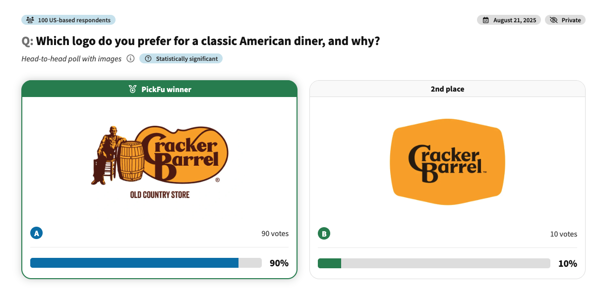
A recent rebrand made the point publicly. When Cracker Barrel, a well-known American diner chain, swapped its detailed vintage emblem for a stripped-down minimalist mark, we put both directions in front of 100 U.S. shoppers and asked which logo they preferred, and why.
- The classic logo won in a landslide: 90% to 10%.
- People tied the original to nostalgia, authenticity, and character. One called it “timeless and well known.”
- The minimalist version read as generic (“just looks like every other logo”), and several felt it stripped out the brand’s personality.
The cost of learning this after launch is steep. A rebrand ripples through the website, ads, email templates, packaging, social profiles, sales decks, and app icons. Testing beforehand gives you room to adjust while the decision is still flexible. Often you don’t scrap a concept; you just simplify the icon, fix the contrast, change the color, or clarify the tagline.
How to check whether a logo already exists
Before you finalize a logo, check whether a similar mark already exists in your category. A logo test tells you how people perceive a design; it doesn’t replace trademark clearance or legal review.
In the United States, a practical first step is the USPTO trademark search, which helps you check whether a mark is available for your goods or services before you apply.
Also search Google, image results, social media, domain names, app stores, and competitor sites. If your logo uses a common shape, abstract symbol, animal, or badge style, visual similarity gets harder to judge, and a trademark attorney can help assess risk before a major launch. Respondent feedback can surface perception issues a legal search won’t: if several people say “this looks like a bank” or “this reminds me of a delivery app,” that’s a flag worth catching early.
Why trust PickFu for logo testing?
Logo testing often involves unreleased brand concepts, so privacy matters. Your team might be testing a new identity, a confidential rebrand, an app concept, or packaging that hasn’t gone public.
When you use PickFu, your concepts are shown only to respondents in our verified consumer panel. We partner with specialized third-party panel companies, tapping into the same consumer panels used by large CPG brands for long-form studies and traditional market research. Respondents sign an NDA to ensure your data stays confidential, and they are paid for thoughtful participation. We have strict quality standards for both panelists and their responses. If you’re unsatisfied with a response, we’ll replace it for free.
Start testing your company logo
If you’re close to a final logo, this is the moment to test it. The design is developed enough for people to react to, and the decision isn’t so locked in that feedback becomes painful to use.
Upload your options, choose your audience, and ask a question tied to the call you need to make. Deciding between two broad directions? Ask which logo better fits the company. Refining a final version? Ask about trust, memorability, color, typography, or industry fit. Launching a premium brand? Ask which logo better communicates quality.
Your logo is one of the first signals people use to judge your company, and testing it with real people gives you a clearer view of how that signal lands.
**Create your free PickFu account** to run your first logo test. Upload your options, choose your audience, and see which logo design best fits your brand. You can also browse real PickFu poll examples to get inspiration before you run your own test.
FAQ
How can I create a test company logo for my business?
Develop two or more logo options, place them in the same visual context, and ask real people which one fits your business better. You might compare two concepts on a white background, in a website header, on packaging, or as a social profile icon. The goal isn’t just an attractive logo; it’s learning whether people understand the brand, trust the company, remember the design, and tie it to the right category.
How can I design a test company logo for free?
You can sketch early concepts for free using basic design tools, free templates, or a logomaker, which is handy while you’re still exploring colors, icons, and typography. Treat free tools as a starting point, not the final brand system. Once you have a few directions, test a logo with real people before committing. If a concept performs well, work with professional designers to refine the final files, including PNG and SVG versions for different uses.
How do you check if a logo already exists?
Search trademark databases, Google, image search, social media, app stores, domain names, and competitor sites. In the U.S., the USPTO trademark search tool is a useful start: https://www.uspto.gov/trademarks/search. A search surfaces obvious conflicts but doesn’t replace legal advice. If you’re investing heavily in a new brand identity, talk to a trademark attorney before launch.
How do you design a logo for a company?
It starts with strategy, not software. Define the company’s target audience, target market, category, brand personality, and the perception you want to create. Then develop concepts that express those choices through shape, color, typography, and style. After that, compare the strongest options with real people. The best process pairs professional design judgment with market research, because a strong logo is both well-crafted and clearly understood.
Which logo looks more professional for a software company?
Usually the one that feels clear, credible, and easy to recognize in digital contexts like a browser tab, dashboard, landing page, sales deck, and app icon. To find out, show respondents two or more software logo options, ask which looks more professional for a software company, and read the written feedback to see whether they’re reacting to color, typography, the icon, or the overall impression.
Which logo would you trust more for an online store?
For an online store, trust often comes from clarity, polish, and category fit. A confusing or cheap-looking logo creates hesitation before shoppers reach the product page. Ask respondents which logo they’d trust more on an e-commerce site. It’s especially useful before you design product pages, checkout, email templates, or Amazon storefront assets.
Which logo is more memorable?
The more memorable logo usually has a clear visual cue, a simple structure, and a distinct enough shape to recognize later. A logo can be beautiful but forgettable if it blends in with the category. Ask respondents which they’d be more likely to remember after seeing it once; the comments often reveal whether the icon, color, wordmark, or overall shape is doing the work.
Which logo better communicates a premium brand?
Premium logos tend to use restraint, balance, refined typography, and a palette that supports the price point, but premium looks different across categories. A premium skincare logo isn’t a premium SaaS, hospitality, or home-goods logo. Ask your target audience which better communicates a premium brand, then look for feedback about quality, elegance, price expectations, and whether the design feels too plain or too busy.
Which logo would make you more likely to click or learn more?
The logo that earns clicks is usually the one with the clearest, most relevant first impression: credible enough to investigate, interesting enough to notice. This question helps when logo testing connects to ads, landing pages, app listings, or search results, because it pushes past visual preference toward customer behavior.
What do you think this company does based on the logo?
This is one of the most useful questions because it shows whether the design communicates the intended category. If respondents consistently misread what the company does, the logo may be too abstract, too generic, or tied to the wrong industry. A mark doesn’t have to be literal, but it shouldn’t set the wrong expectation.
Which logo color feels more trustworthy?
It depends on category, audience, and positioning. Blue often signals stability in business contexts, but it isn’t automatically right for every brand. Green, black, white, orange, red, and neutral palettes all work when they support the brand personality. Test color variations with your target audience, ask which feels more trustworthy, and use the written feedback to see whether people are reacting to professionalism, warmth, energy, or familiarity.