If you’ve designed a face mask to sell on Amazon that looks like cake frosting, should your main image emphasize the facial care or frosting aspect of your product? The answer is complicated, as one seller discovered in this product image split test on PickFu.
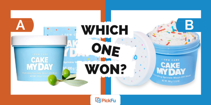
The seller asked 50 respondents between ages 18-44 which of three main images they’d click on for a face mask called Cake My Day.
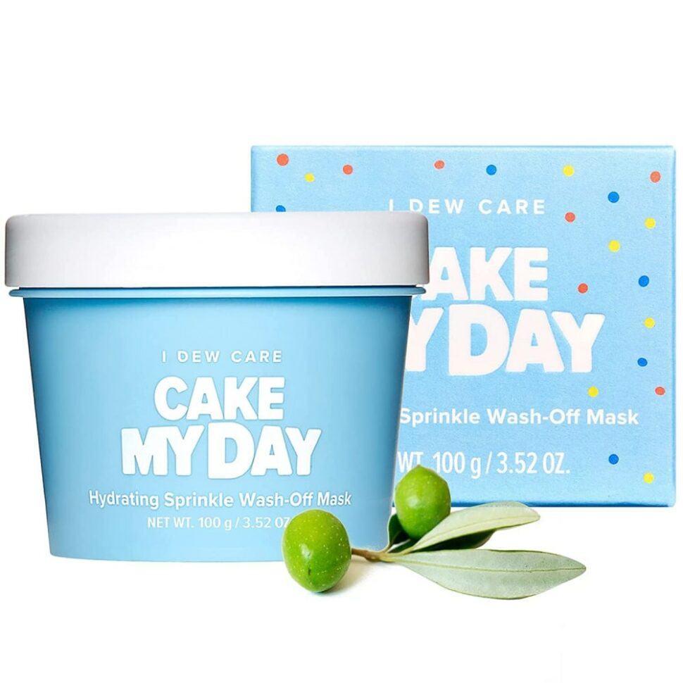
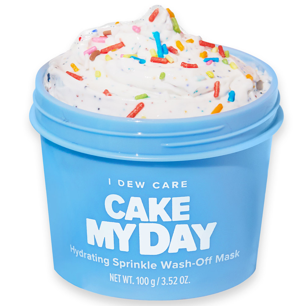
Each image positions the product differently. Option A focuses on the package, which is similar to an ice cream container, with green olives beside it. Option B shows the open container and the cute smiley-face lid. Option C zooms in on the facial cream itself, which looks like sprinkled-topped cake frosting.
Can you guess which one won?

And the winner is…Option B, with a score of 58! Option C was second with 36, while Option A scored only a 6.
Let’s find out what respondents had to say.
Face it: the lid is cute
Option A’s low score is easy to explain. The olives felt “misleading” and “irrelevant,” respondents said. But the main reason respondents didn’t like Option A was that it didn’t show the contents of the playful container.
That left Options B and C. The biggest difference between the two that tipped the poll in Option B’s favor is the container’s cute lid with its winking face.
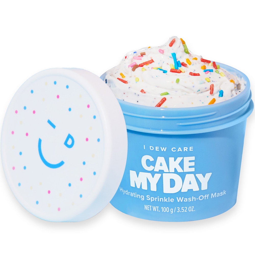
Here’s something interesting, though: several respondents didn’t realize that the product is not food. One male respondent liked Option B because it “showed the inside of the snack.” “Option C gives you a great look at the ice cream,” another male respondent said.
At least five other people commented on the delicious-looking “food” or “ice cream” in the “carton.”
There are two issues here regarding buyer perception that the seller needs to address, whether in the packaging, product description, or title (or all of the above). First, the mask is meant to look like cake frosting, not ice cream. Second, of course, is that the product is neither ice cream nor frosting. It’s a face mask!
Buying this product could be an unpleasant surprise for shoppers who think they’re getting a sweet treat but end up with a face mask they don’t want.
Other highlights
- 61.8% of male respondents voted for Option B, compared to 50% of female respondents (there were no nonbinary respondents)
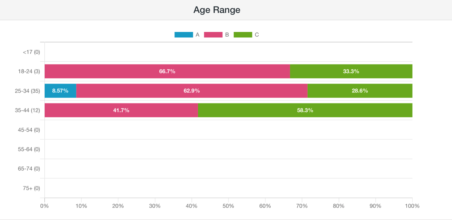
- Those in the 18-24 and 25-34 age groups preferred Option B, while those ages 35-44 preferred Option C
What they said
“I like to see what the ice cream looks like. I prefer [Option B] over [Option C] because the cap with the smiley face is cute.”
“[Option B is best] because it offers a closeup of the product and also shows you the lid. [Option C] is also a good product image but the cute lid isn’t in the photo. [Option A] is my least favorite because you have no idea what the product actually looks like and you don’t see how fun it is.”
“For [Option A], the olive makes it look very healthy and serious about its purpose. Option B looks more lively and fun but it is hard for me to take
seriously because it looks like frosting…something I would NEVER put on my face. Option A looksall out crazy, just frosting in a jar and I cannot take it seriously.”“I like [Option C] because it looks like it has more ice cream and it looks good, then [Option B] because I like how the ice cream looks more than [Option A] which doesn’t show the ice cream.”
Key takeaways
If your product packaging is cute, show it off, especially if your target audience skews younger.
However, it’s also important to make sure your main image lets shoppers know exactly what to expect from your product.
Here’s one more interesting twist: the seller chose to use Option A — the one with the olives — for its Amazon main image.
They must have paid attention to the food-related comments and decided that Option A was the least misleading of the three image options. As for the secondary image, they went with one that shows the open container but also the fun lid.
Need help with your main image? Check out our guide to creating strong Amazon product images.
Want to dive deeper?
Results by commonly used words:
Results by age range: