The importance of your brand logo can’t be overstated. Every time someone comes across your brand, they’ll see your logo. As part of a successful brand image, your logo should leave a lasting impression with customers. A subtle change can take immediately improve logo design, taking it from ‘meh’ to instantly recognizable.
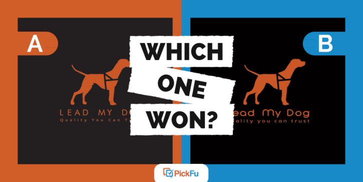
The creators of Lead My Dog have run a PickFu poll to split test two versions of their logo. At first glance, the logos seem nearly identical. However, there are a couple small differences between each logo – and those small differences had a big impact on the respondents!
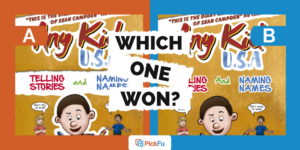
Which logo won?
After taking a look at both logo options, the respondents in this poll choose Option B as the winner. Out of 50 voters who were all dog owners, 44 of them preferred Option B, while just six chose Option A.
To improve logo design, choose your color palette carefully
When selecting the color palette for your logo, start with just one or two colors. It might be tempting to go with three or four colors to make your brand unique, but you don’t your brand to get muddled with too many options.
Instead, pick two colors that are similar in tone. The two that you choose should be equally dark, light, saturated, or pale. For example, you could pick two colors that are both fluorescent or both pastel.
In the Lead My Dog logos, Option A features shades of orange and black that are equally faded, whereas Option B features shades that are equally bright.
Respondents were clearly drawn to the bright colors of Option B:
- “The color of B is more vivid. The black is more glossy and makes the picture look better.”
- “I like the darker contrast and stronger outline. It looks more professionally done and new. The other one, A, looks like it’s been through the wash a couple times.”
- “The other design looks faded and I see no reason for it. Go with the bolder colors.”
To improve logo design, spend time perfecting your fonts
The font you choose for your logo can eventually evolve into your brand identity, like the recognizable fonts for companies like Coca-Cola and Disney. Take plenty of time to choose your fonts and go over your typography details before finalizing your design.
When choosing your font, look for styles that match your brand’s personality and the kind of audience you’re targeting. You also have to consider the readability of the font style, size, and spacing you choose.
Between the two Lead My Dog logos, the font, spacing, and capitalization are different. Thanks to feedback from the PickFu poll, the testers can read which options the respondents liked better and why.
Again, Option B came away with far more positive comments:
- “I love the fancier lettering in this and the use of both capital and smaller case letters. It just looks fancier and more professional.”
- “It’s more pleasing to the eye that the lower line is all lowercase.”
- “The font in Choice B is more inviting than Choice A. The font in Choice A feels harsh, while the font in Choice B has a softer/warmer feel, something I want to associate with my dogs.”
Always test your logos first
After you’ve come up with two or three logo options, you can run a PickFu poll just like this. It’s a quick, affordable way to split test your designs and get feedback from an audience!