Product packaging design is an art, but like other art forms, it’s subjective. What looks good to a company might underwhelm its customers, especially online. How do you know what your audience will like? You’re free to guess, but the best way to get concrete results is by testing your designs with a target audience.
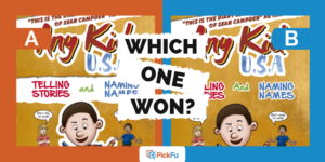
Just ask Longevity Botanicals, which ran a PickFu Ranked poll to see which packaging design shoppers preferred for a mushroom extract powder. The brand asked 100 people who are Walmart shoppers and Amazon Prime members to rank three designs for a resealable bag.
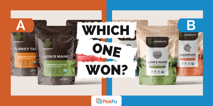
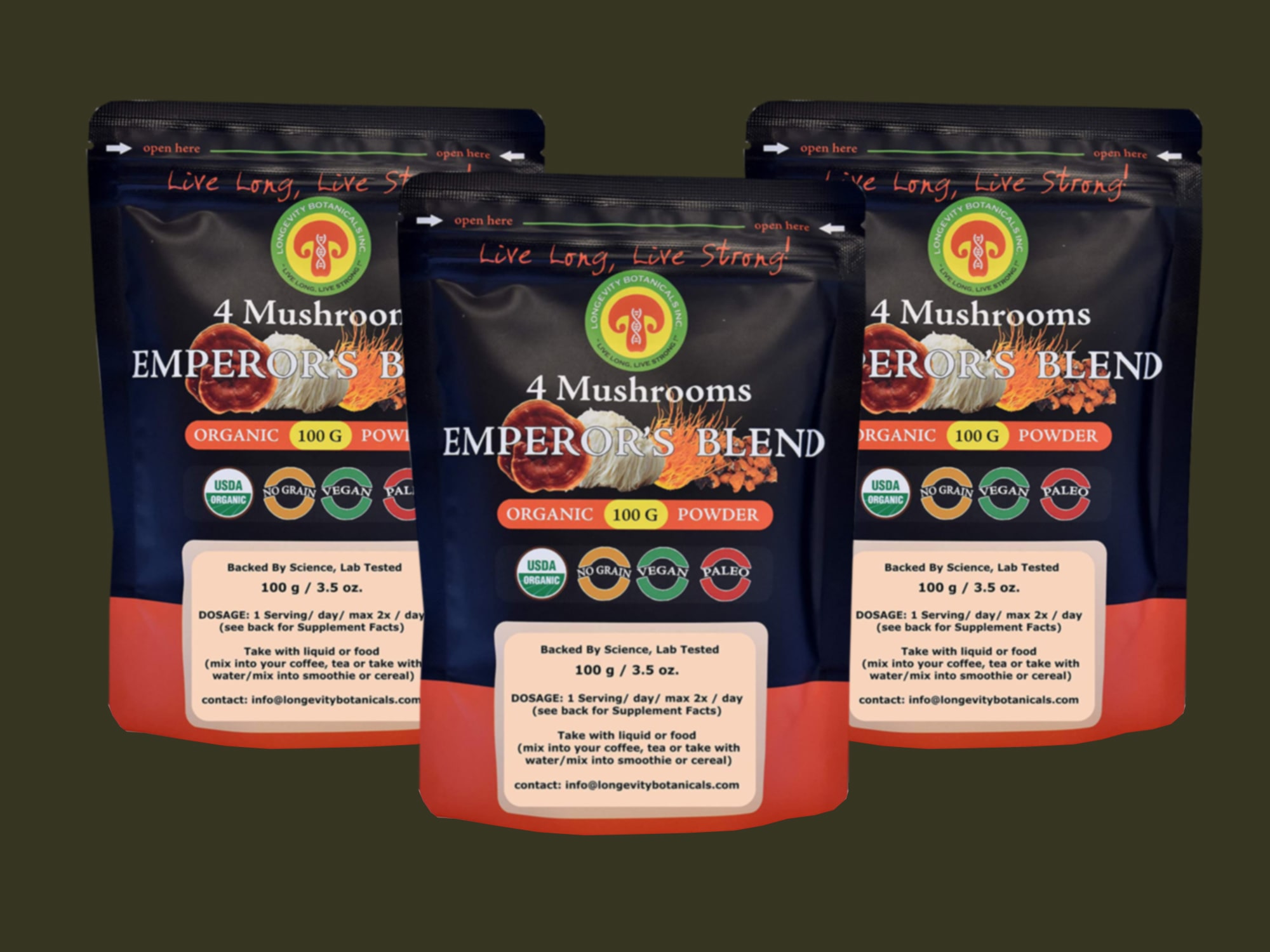
Options A and C have a similar color scheme and design, with a dark-colored bag and orange, red, and green accents for the labels and text. Option B features a light golden bag with a white label on a solid-colored mountain-shaped background.
Can you guess which one won?

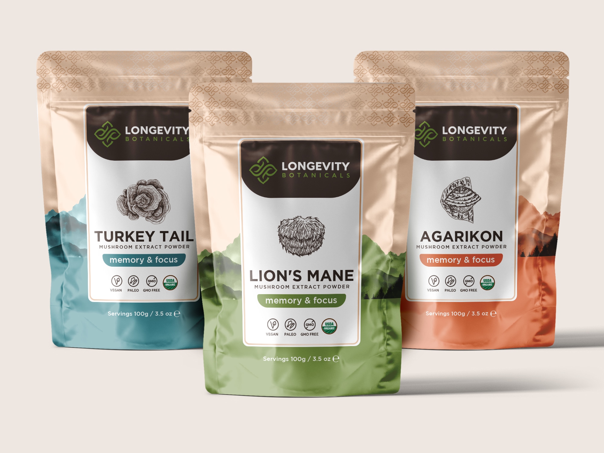

And the winner is…Option B, with a score of 51, followed by Option A (40) and Option C (9).
What set Option B apart and why did people connect with it? Let’s look at the results.
Down to earth, like mushrooms
Based on the comments from respondents, it seems Option B won because it is the simplest and easiest to read. While the color schemes of Options A and C stand out, for this audience, that isn’t necessarily a good thing.
“Option B is my favorite of the three because it is very easy to read the label,” said one respondent, adding, “Option A would have been my favorite if it were a different color package.”
Some respondents saw similarities between Options A and B, but Option B has more clarity and a better balance of “earthy” colors, they said.
“I like to keep it simple with the amount of text to read on a label, and [Options] B & A both do that very well. I think the color scheme in [Option] B is just more inviting than [Option] A,” one person wrote.

Still, Option A came in a close second, showing just how popular its design was. Respondents who ranked it first noted its “professional” design and appealing color contrast.
Option C, on the other hand, came across as “too busy” and “hard to read,” which explains why only a handful of respondents chose it as their favorite.
“I don’t care for the design of Option C,” one commenter said bluntly.
Other highlights
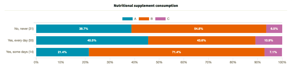
- Among respondents who take daily nutritional supplements, Option A slightly outperformed Option B
- Option B was the top pick for for people who sometimes or never take supplements
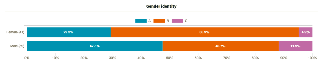
- While the majority of female respondents favored Option B, male respondents were divided between Option A (47.5%), Option B (40.7%), and Option C (11.9%)
What they said
“I like [Option] B the best, it feels higher quality and more natural. [Option] A looks like a drugstore brand and [Option] C is just ugly. Makes me think of something I’d order off a late-night TV show. — Female, age 25-34, $101+k income, doesn’t take supplements
“The golden, bright look of Option B is lively and full of energy and light which seems exuberant and healthy. [Option] C looks stylish, but not as wonderful as [Option] B and [Option] A looks the most plain and doesn’t stand out.” — Male, age 45-54, $31-60k income, daily supplement user
“I like the darker colored designs. I like [Option] A the most because the name is easy to read with the white letters on the dark background. I like the design in the background as well and the patterns on the package. I think [Option] C is a little too colorful and there are too many primary colors on the cover and its a little distracting, and I don’t like the lighter color package in [Option] B as much as the others. I do like the mountains behind the package in [Option] B however.” — Male, age 25-34, $31-60k income, doesn’t take supplements
“Option B has a color palette and contrast I find the most appealing for the packaging. I like how the colors and design elements interplay and grab my attention.” — Female, age 35-44, $31-60k income, daily supplement user
“I like the two-tone design [of Option B] and the use of more natural colors in the packaging. It gives the product a more organic look and feel. I like how they matched the color on the bottom of the package to the color of the banner as well.“ — Male, age 45-54, $31-60k income, daily supplement user
Key takeaway
Sure, color preference is important, as the close race between Options A and B suggests.
But readability was the deciding factor in this poll. The simple design of Option B’s dark text on a white background ultimately took it to the top.
Are you testing new packaging for your product? Here are 10 unique packaging ideas to inspire you.
Want to dive deeper?
Results by commonly used words:
Results by income range:
Results by nutritional supplement consumption:
Results by age range: