If you’re an author, especially a self-published author in charge of your own suspense book covers, you know the stress of getting the cover just right. Even when you’ve narrowed down your choices, you’re left wondering which one readers will be drawn to. How can you know?
One author recently took two book covers to an audience of 50 e-book readers on PickFu to test this very question.
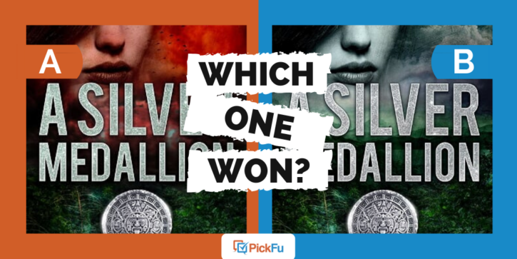
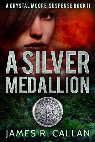
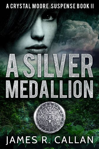
The covers are nearly identical, except for the color schemes. Option A features a fiery red color next to the woman’s face, while Option B puts the woman’s face and the clouds next to her in black and white.
Can you guess which one won?
And the winner is…Option B! With a score of 62 to Option A’s 38, readers clearly favored the black-and-white color scheme.
Let’s find out why.
Reader want suspense book covers to match the title
Several respondents felt that Option B’s black-and-white cover fit the book’s title, A Silver Medallion, much better than Option A’s red color scheme.
Said one respondent, “I like how the grey color kind of matches the word silver in the title.”
Another was more straightforward: “If the name is about a silver medallion, then we should keep the gray coloring rather than the red.”
If the book title were The Red Medallion, these respondents might’ve felt that Option A was the better cover.
If the book is about rescuing girls, readers don’t want gore
The specific poll question the author asked was, “Which cover do you prefer for a suspense book about a woman trying to rescue 2 young girls?”
Respondents had strong feelings about the use of red for a book with this premise.
One female said, “While the book says it’s about a woman trying to rescue 2 young girls, in choice A the color red looks to be about murder. If she’s rescuing the girls, the red color might not be the best choice.”
Another woman added, “The red on Option A makes you think of blood and gore.”
When presented with a potentially heartbreaking premise like this one, readers don’t want to think the girls will perish. They want “a cloud of hope,” as one respondent put it, and the gray cover provides that while the red spells doom.
Gray is more mysterious than red
Many respondents felt that grayscale is more nuanced and mysterious than red. “The darker colors make the book look more gripping and suspenseful,” wrote one male.
A female added, “Choice B is dark and foreboding with the gray/black and white face blending into the stormy clouds. Perfect for a suspense novel.”
Some respondents said that the red on Option A’s cover suggested more of an action or horror novel rather than suspense.
Others couldn’t quite pinpoint why they so strongly preferred Option B: “I like [Option] B because the grey tones add a certain something to the cover. This makes it feel like a really good suspense novel.”
Suspense book covers: Key takeaways
Color can change everything. If you’re writing a genre book, you’ll want to create a mood that evokes that genre without being cliché.
You don’t want to give readers the wrong idea or impression about the book, such as suggesting murder is nigh when the book is supposed to be suspenseful, with room for hope.
And of course, the color scheme should match the title and theme of the novel.
Do you need help choosing a cover for your suspense eBook? Start your own poll today on PickFu to get the feedback you need.