
What makes a logo bad, and how can you avoid common design fails? This guide highlights 14 real-world examples of poorly designed logos – from confusing visuals and inappropriate imagery to lack of clarity and bad typography – and explains why they failed. You’ll learn practical design lessons, tips for creating an effective and timeless logo, and how to test your designs using PickFu to avoid embarrassing or costly branding mistakes. Ideal for anyone asking, “What are common logo design pitfalls?” or “How do I know if my logo works?”
Few things impact your company’s branding like your logo. Get it right, and you’ll have a tool that boosts brand recognition and gives you a competitive edge. Case in point: the Nike “Swoosh.”

It’s a simple design, yet it says a lot about Nike. And more importantly, consumers connect with it emotionally – which is why it’s one of the most recognizable logos in the world.
However, getting your logo wrong can diminish your brand’s credibility, affect sales, and, in some cases, make your company a laughingstock. To avoid this, you have to invest time and resources in creating a great logo that resonates with your target audience and effectively communicates your brand identity.
In this post, we’ll explore some of the worst logo designs, why they didn’t work, and how to ensure you don’t make the same mistakes.
Bad logo designs and why they failed
1. London Olympics
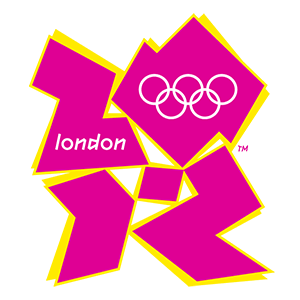
The 2012 London Olympics logo
In 2007, the International Olympic Committee unveiled its logo for the Olympics, which took place five years later (2012). But it was a disaster. The logo featured jagged, abstract shapes and vibrant colors. It was supposed to read “2012”, but people saw very different things. Some saw Lisa Simpson in a compromising act, others saw a swastika, and the Iranian government saw “Zion” and claimed it represented a hidden pro-Israeli agenda.
Why it didn’t work
- The logo lacked clarity – people interpreted it differently than the designers intended (and ended up seeing some controversial symbols instead).
- It didn’t convey a sense of connection to either the Olympic Games or London, or evoke the excitement and spirit of the event.
2. Kudawara Pharmacy
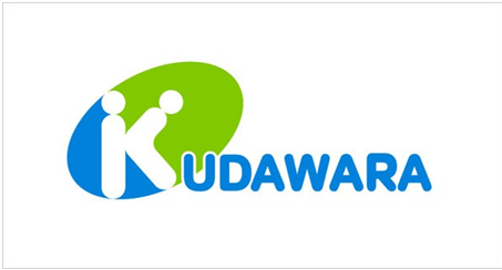
A Japanese pharmacy, Kudawara’s logo consisted of two stick figures in the shape of a “K”, with the rest of the pharmacy’s name spelled out normally. However, the positioning of the figures made for a somewhat suggestive logo.
Why it didn’t work
- The logo design didn’t align with the professional image that the pharmacy wanted to express.
3. Office of Government Commerce (OGC)
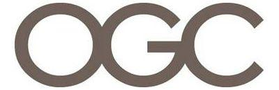
At first glance, this logo doesn’t look bad – but rotate it 90° clockwise, and you’ll see what all the fuss is about.
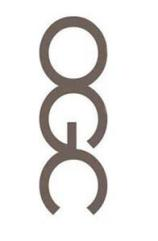
Instead of signifying the commitment of the OGC to “improving value for money by driving up standards and capability in procurement,” it became a laughingstock. The ribbing got so bad that OGC had to recall the logo.
A representative said: “It is true that it caused a few titters among some staff when viewed on its side, but on consideration we concluded that the effect was generic to the particular combination of the letters OGC – and it is not inappropriate to an organization that’s looking to have a firm grip on Government spend.”
Why it didn’t work
- It led to an unintended interpretation not aligned with the professional image or purpose of the OGC.
- Because the logo served as a source of amusement, it undermined the organization’s efforts to establish a strong and reputable brand identity.
4. Bing
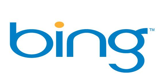
Different blogs and readers voted this the worst logo in 2009. Microsoft has since updated it, but the new logo still isn’t winning many points. In fact, according to the poll we ran on PickFu comparing Bing’s old and new logo, the results were tied – meaning people still aren’t feeling the new version.
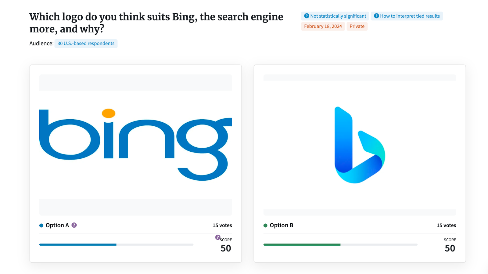
Why it didn’t work
- The original logo was too plain, without much visual interest – a problem that the redesigned logo managed to avoid, according to this poll respondent: “I like the logo in option b (new one) because it looks more modern and updated. I like the way the blue shines in this option. I like the simple yet pretty design and color in this option.”
- The logo didn’t align with Microsoft’s branding as an innovative tech giant. You’d expect it to look more modern, sleek, and professional.
5. Catholic Church’s Archdiocesan Youth Commission
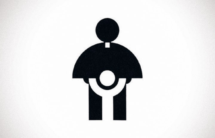
This logo is a great example of how times and people evolve and why your brand should evolve alongside them. When the design was released in 1973, it didn’t stir any controversy. In fact, it won an award from the Art Directors Club of Los Angeles. But now, we can’t look at the logo without seeing something “unholy.”
Why it didn’t work
- Instead of evoking a sense of religious reverence for a priest protecting a child, it did the exact opposite. As people’s perspectives shifted (and controversies in the Catholic Church were uncovered) the unintentionally inappropriate design became more clear.
6. Gap
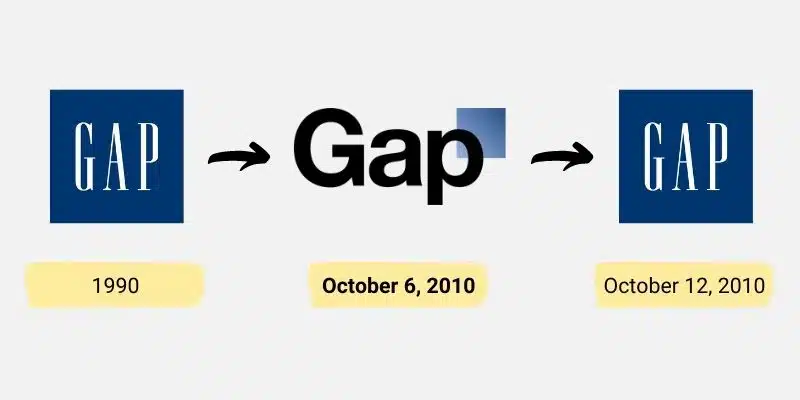
Source: The branding journal
When Gap rebranded in 2010, its new logo received so much backlash that the company went back to its old logo in less than a week. The incident is now mockingly referred to as Gapgate.
Why it didn’t work
- The change was random, with seemingly no purpose behind it, alienating customers with emotional connections to the old logo.
- It was a poorly received rebrand because Gap didn’t conduct market research before they rebranded to understand how customers felt.
7. Pepsi
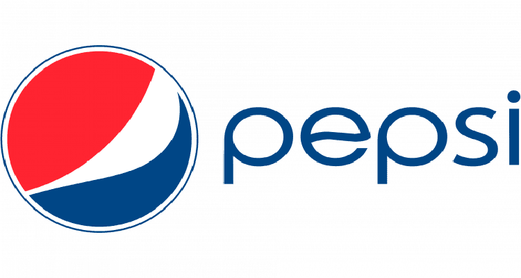
Pepsi logo
Before 2023, Pepsi’s last logo redesign was in 2008, for which they paid $1,000,000. The controversy surrounding this redesign was because of a leaked brief that made some pretty wild justifications for the logo.
For instance, Arnell (the design company) linked Pepsi to the Parthenon and Mona Lisa, and claimed that the color palette is “derived using a scientific method of color assignment based on the product’s essence and primary features.” What ridiculousness.
Why it didn’t work
- The surrounding story was so outrageous that people found the logo silly. Fast Company called it “branding lunacy to the max.”
8. Verizon

Verizon logo
After Bell Atlantic acquired GTE and changed its name to Verizon in 2000, there was a need for a new company logo. But it didn’t go as expected. The design community criticized the logo and called it ugly.
Why it didn’t work
- The oversized red check mark and gradient combo made Verizon’s logo visually unappealing.
9. MegaFlicks
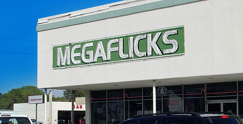
Megaflicks logo
If only the “L” and “I” in “MegaFlicks” weren’t so close together, it would have prevented the ensuing confusion and misinterpretation the video store garnered.
Why it didn’t work
- The lettering in the company name wasn’t well-spaced, making the sign ambiguous. In logo design, kerning (letter spacing) and typography are two of the most important elements because they impact the legibility and visual clarity of the logo.
10. NYC Taxi
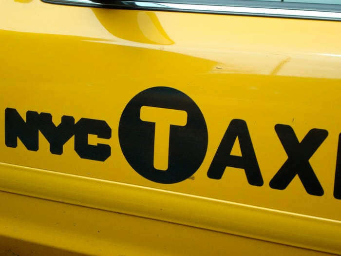
NYC Taxi logo
One blog post title published when New York released the new NYC Taxi logo read: “‘World’s Capital’ cursed with world’s worst logo.” New Yorkers hated the logo so much that The New York Times invited readers to submit their own designs.
Why it didn’t work
- The logo was simply badly designed and didn’t resonate with the target audience (New Yorkers).
- The uneven kerning (letter spacing) and circled “T” made it seem like “AXI” was a separate word, which was confusing.
11. Mont-Sat
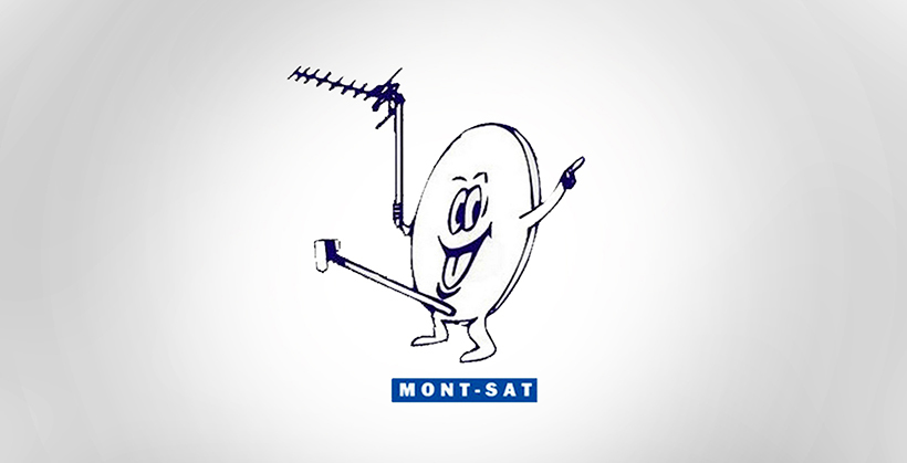
Mont-Sat logo
Interestingly, this logo is still in use today. After years and years of people pointing out its inappropriate nature, the owners never redesigned it. Perhaps controversy does sell.
Why it didn’t work
- The logo is suggestive, which doesn’t align at all with Mont-Sat’s antenna and satellite installation offerings.
12. Enron
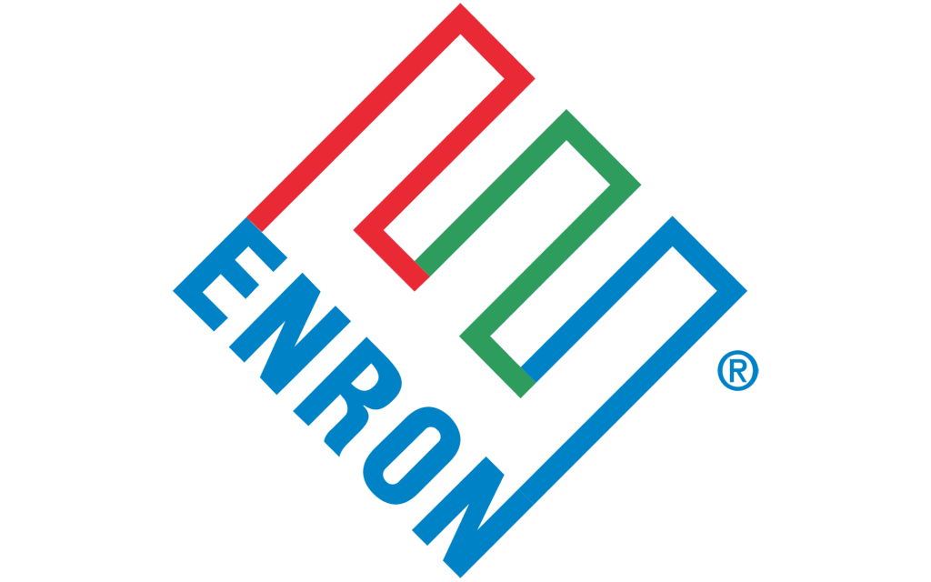
Enron logo
Enron, a former American energy, commodities, and services company, is famous for its major scandal and bankruptcy in 2001. Paul Rand, a renowned art director and designer, was the brain behind the Enron logo – however, it’s not one of his best creations.
Why it didn’t work
- Quite frankly, this logo is ugly – from the color palette to the overall design. For one, it has three colors and while this is not unheard of, the choice in colors plus the way they don’t blend into each other makes it somewhat of an eyesore.
- The letter “E” and word “Enron” are tilted, making the logo look unstable.
13. Kids Exchange
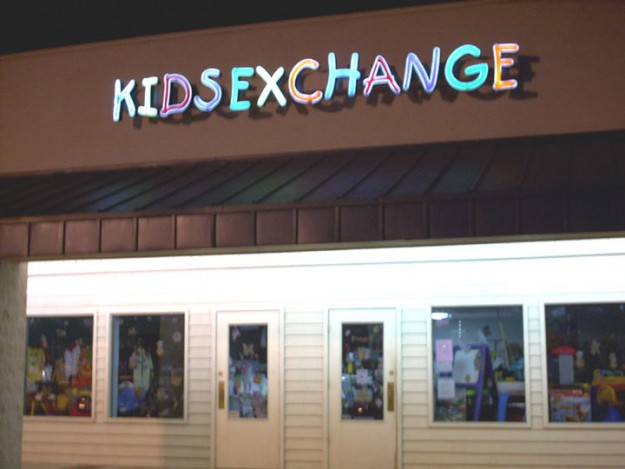
Kids Exchange logo
This is a company that buys and sells used kids’ clothing, but the logo seems to say something different, depending on how you read it.
Why it didn’t work
- We cannot overemphasize the importance of kerning – especially when you don’t want any mixed messages or wrong interpretations from your audience. Because of the poor spacing, this logo passed a misleading message.
14. Safe Place
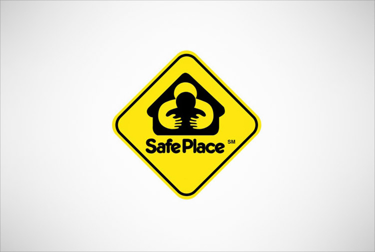
Safe Place logo
Safe Place is a national youth outreach program with the aim of helping youths feel safe. But this disturbing logo does the opposite of that.
Emanuele Abrate, a graphic designer, redesigned this logo, so we decided to test both on PickFu to see which one people prefer. Here are the results:

As you can see, the winner was the updated logo. Respondents’ feedback included comments like:
- “The image of the larger person hugging from behind is very creepy. It looks like a predator.”
- “I like B because it has a more simple design to it. I think A looks odd and confusing.”
- “I like this one more because of the house shape for the logo, I think it offers a much warmer and more inviting feeling about it.”
Why it didn’t work
- The poor use of negative space, bright colors (often used in warning signs), and the uncomfortable implication portrayed by the icons added up to a poor design.
How to ensure you don’t end up with a bad logo
You’ve just seen some epic brand logo fails. How can you ensure your logo doesn’t join the list?
- If you’re not a professional, outsource it to an expert designer. Avoid cheaping out on this, as you want to create a high-quality logo. Communicate to the designer what your company does, your brand values, and what you’re expecting from them so they can help bring your vision to life.
- Keep it simple. Simple is memorable. Don’t create overly complex designs or incorporate unnecessary elements that could confuse people.
- If you’re rebranding your company or redesigning your logo, involve your customers in the process. You don’t want your customers to be blindsided by a major logo or brand change, and it’s important to take their feedback and perceptions into account. Conduct market research and test logo designs using audience polls or surveys.
- Find a balance between embracing design trends and creating a timeless design. It’s good to stay on top of trends, but leaning too far into them can cause your logo to look outdated quickly. It’s best to focus on simple, classic, timeless design best practices.
- Produce your logo in different file sizes and types for use in various digital and print formats, such as websites, social media platforms, mobile apps, business cards, signage, etc. Furthermore, ensure it works in both color and black-and-white formats. This will guarantee consistency across all mediums for brand recognition.
- Test your logo in the market and gather feedback from your target audience. This will help you design a good logo that resonates with your customers and catch unintentionally inappropriate imagery or mistakes before launching it.
How to receive feedback on your logo
To test your business’ logo, use PickFu. Our online polling platform lets you share your logo designs with your target audience and get real-time feedback, helping you avoid expensive mistakes.
Whether you’re designing a logo for your new company or rebranding your current one, you’ll access our built-in pool of 15 million global respondents, which you can segment to fit your ideal customer. We even have a pre-built logo test template you can use to get started quickly.
Below, we’ll walk through two brands that used PickFu to test their company logo.
The first example is PickFu itself! The founders didn’t know which logo to choose, so they ran polls to test their app’s logo:
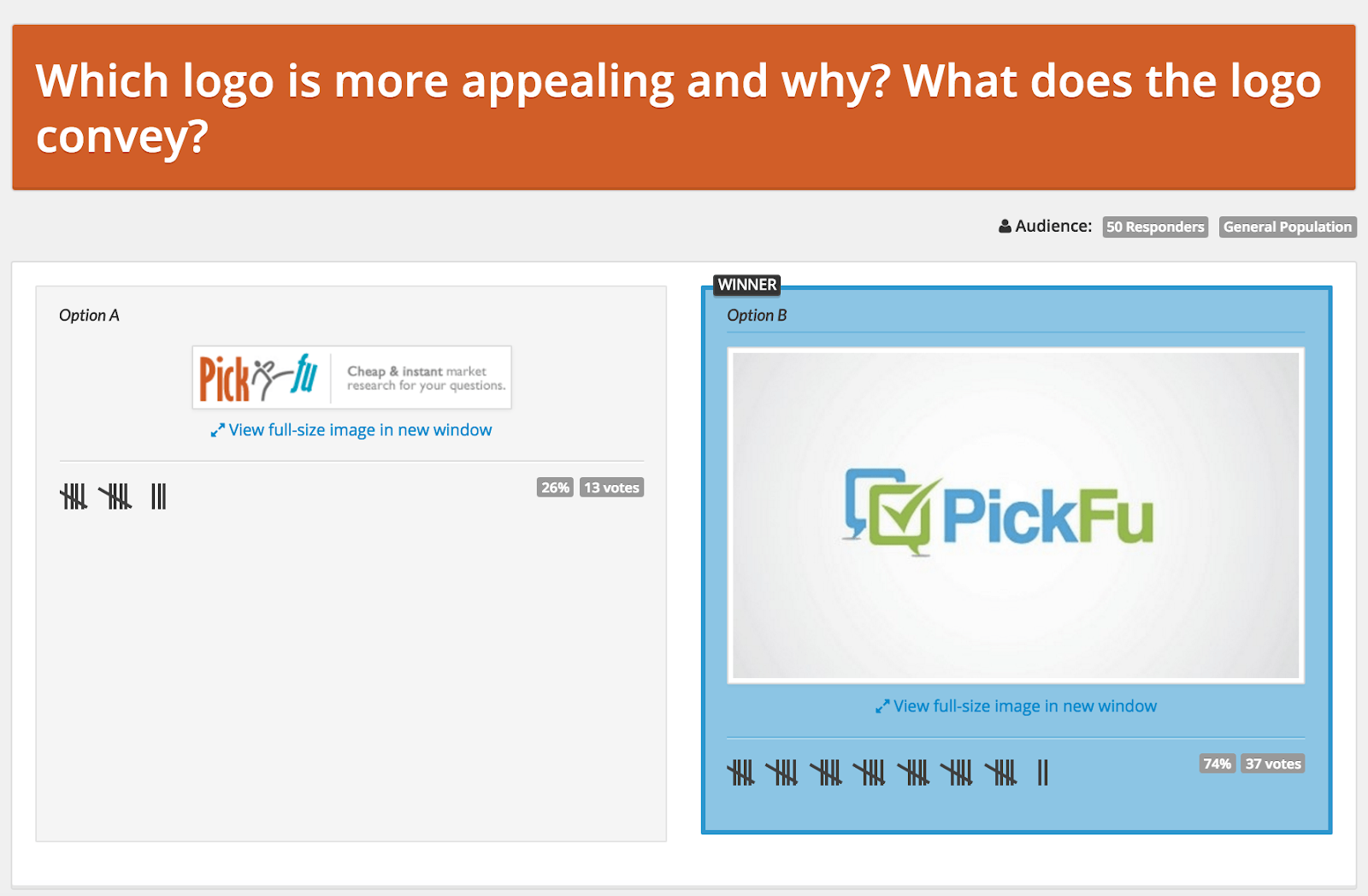
Option B was the clear winner and, besides the colors, is the design PickFu uses to this day.
The second example is a nutritional supplements brand that conducted a three-option Ranked poll to decide on a design:
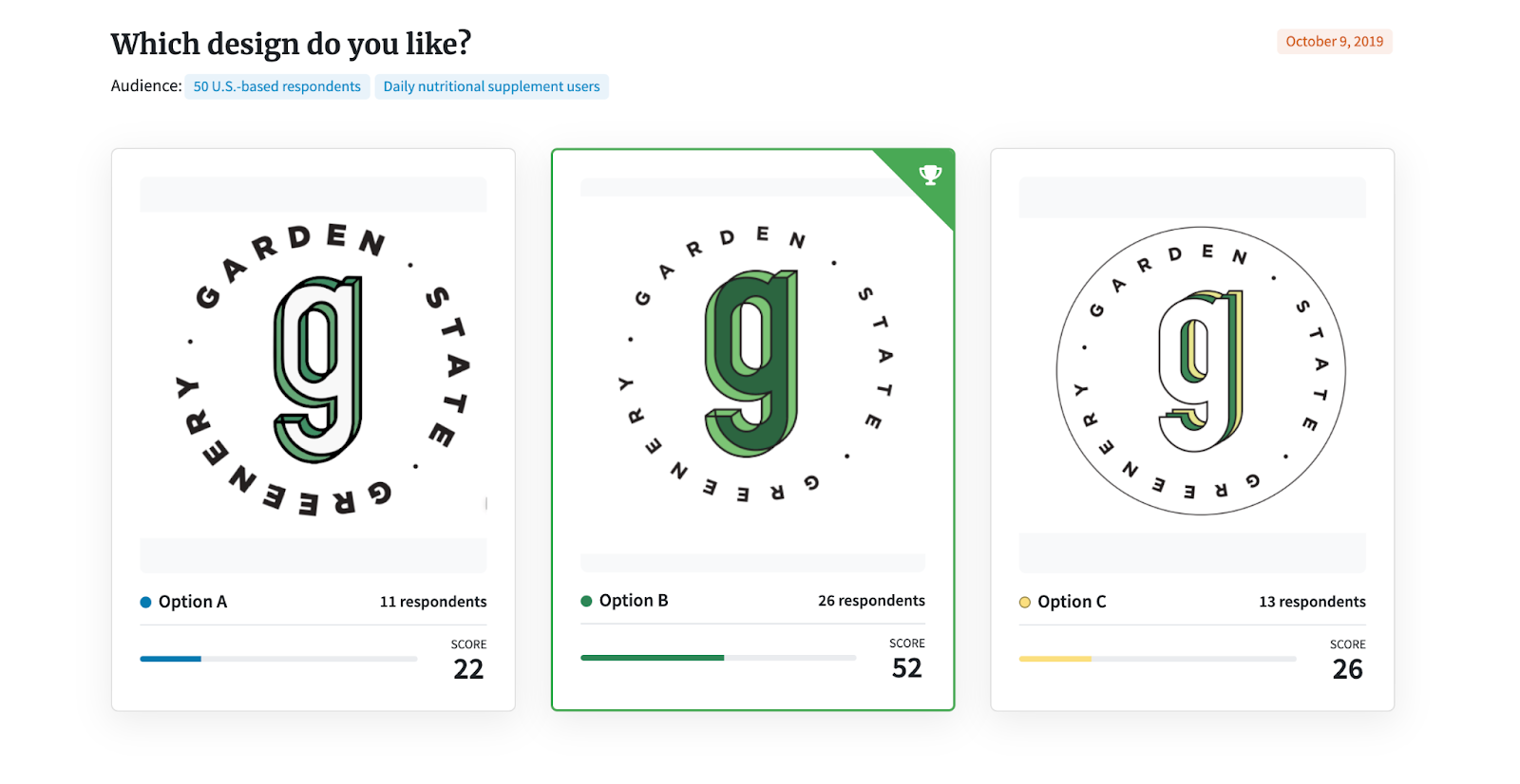
Here, the winner was also option B. Respondent’s feedback included the following:
- “It’s the easiest to read.”
- “It’s the most eye-catching and colorful.”
- “The shade of green really makes it stand out. It fits really well too since gardens are of course mostly green.”
- “Green G in the middle stands out and the font size of the name around it in the circle is just the right size.”
By testing your logo with PickFu, you can avoid a misguided identity shift (negative outcome from trying to alter brand identity) or a failed brand makeover.
FAQs
What makes a bad logo?
A bad logo is one that fails to resonate with its target audience, has inappropriate imagery that offends people, and/or conveys the wrong message about the company. Since the logo is one of the first impressions people usually have of a business, a bad logo or logo rebrand can greatly impact your brand perceptions and performance.
What role does typography play in logo design?
Your choice of font can make or break your logo. If you use a badly designed typeface, poor kerning, or the text is not legible, it will affect your logo’s effectiveness. On the other hand, the right typography can enhance a logo’s visual appeal and make it more memorable.
How can a poorly designed logo negatively impact a brand?
A poorly designed logo can repel your target audience, diminish your credibility, and cause you to lose customers. That’s why investing in producing a clear, thought-out, and well-designed logo for your brand is important.