Have you ever felt a sense of peace when you entered a restaurant? Maybe it was the lighting, the furniture, or the signage. On the other hand, has a restaurant ever made you feel stressed or unwelcome?
If you’re opening a brick-and-mortar business, you need to be aware that even the smallest design details can make a customer feel relaxed — or the opposite.
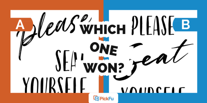
That’s what one PickFu user found after polling 50 people to see which of four signage designs they prefer.
The signs, which look like they’re for a restaurant, say “Please Seat Yourself.” Each uses slightly different font styles and word positioning to get the message across.
Can you guess which one won?
Option A 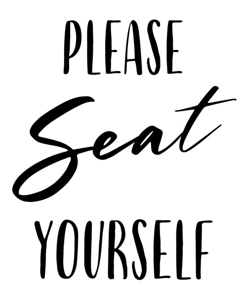
Option B
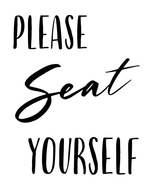
Option C 
Option D
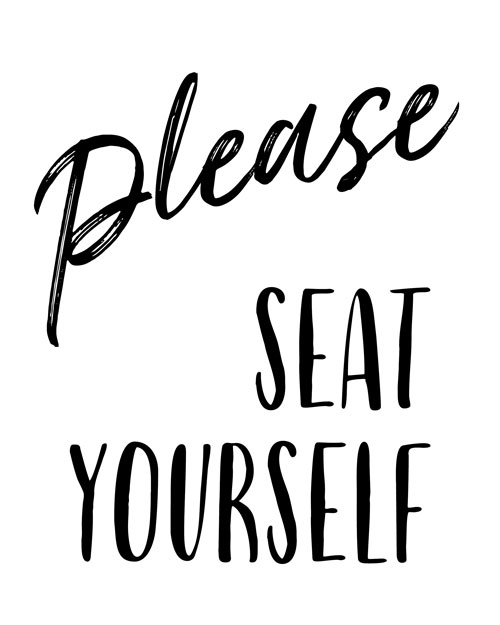
And the winner of this Ranked poll is…Option D, with a score of 62! Respondents liked the sign with Please in cursive and Seat Yourself centered beneath it.
Option C came in second with a score of 38, Option A scored 26, and Option B was last with 12. Let’s figure out why.
Pretty please
When it comes down to it, respondents liked how Option D has the word Please in, well, a pleasing cursive font that looks handwritten. The sign reads like a “kindly request,” one person wrote.
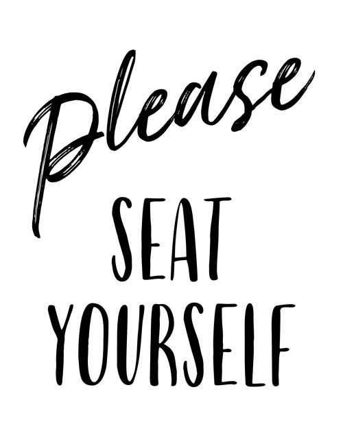
While Option A also uses a cursive Please, the positioning of Seat Yourself on the righthand side isn’t appealing, some respondents said. That might be because the English-reading eye naturally looks first at the lefthand corner of a page.

Options B and C also use cursive font but with the emphasis on the word Seat, which several respondents found off-putting. It sounds like a directive instead of a request, they said.
“Options B and C I do not like either way,” one person wrote. “In my brain it emphasizes the wrong word and kinda makes it sound like a command.”
Who knew that switching the emphasis from one word to another could make such a difference?
Other highlights
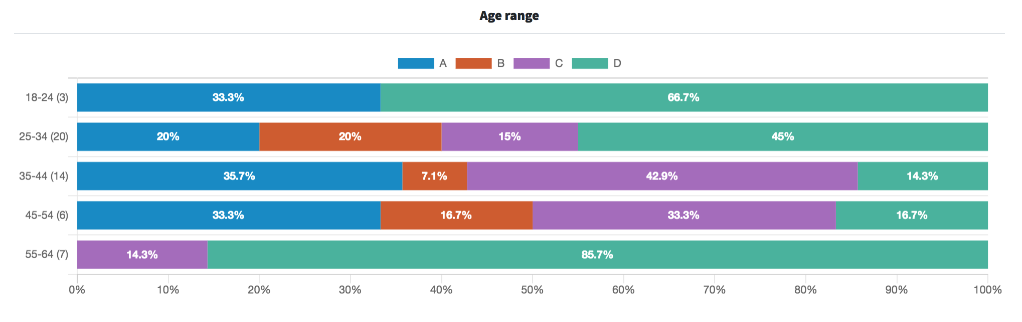
- Four of the six people who favored the lowest-scoring Option B were 25-to-34-year-old male respondents
- Those in the youngest and oldest age groups (ages 18-24 and 55-64) overwhelmingly preferred Option D
What they said
“I prefer [Option D]. It is easier on the eyes with consistent font use. The use of cursive could confuse some customers.”
“I like that the 1st word is script [in Option D]. It stresses the PLEASE.”
“The word ‘please’ being hand drawn evokes a feeling of sincerity; thus, Options A and D are ranked highest.”
“I thought it was important for ‘seat’ to be the word that was handwritten in feminine lowercase since ‘SEAT YOURSELF’ in all capital letters felt too aggressive. Option C had a more feminine looking font than Option B.”
Key takeaways
Some respondents may have preferred for Seat Yourself to be written in cursive, but most found that a cursive Please felt more friendly and welcoming.
Here’s the catch: more than one person pointed out that not everyone can understand cursive. The business owner might consider using a slightly less cursive-like font.
If it were your restaurant, what would you do?
For more font guidance, read this article on choosing the best fonts for your brand.
Want to dive deeper?
Results by commonly used words:
Results by gender identity (there were no non-binary respondents in this poll):