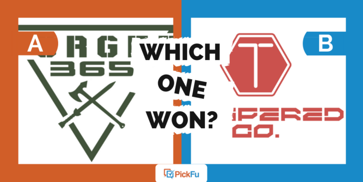
If you’re building a brand of clothing meant to endure the toughest conditions and come out the other side looking no worse for the wear, how do you pick the right name? This is the question one PickFu user recently faced. The entrepreneur decided to test not only two names but also two different logos for a durable apparel brand.
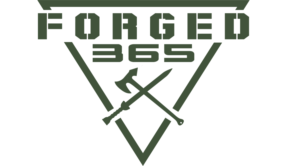
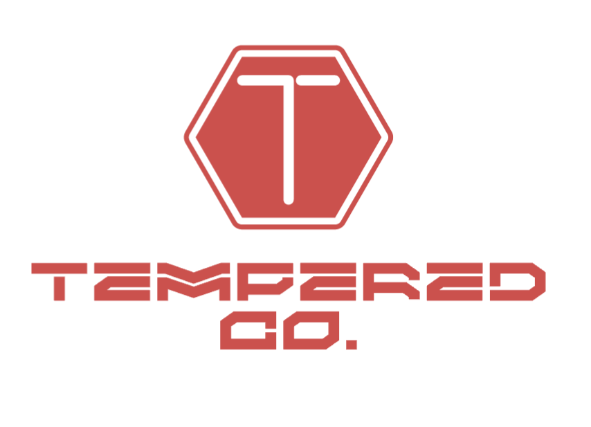
The first logo, Option A, features an army green triangle with matching text that reads “Forged 365.” Option B goes with a red logo and the name “Tempered Co.”
Can you guess which one won?
And the winner is…Option A, with a whopping 80 points to Option B’s 20!
Let’s find out why the respondents preferred the army-green logo with “Forged 365” as the business name.
“Forged” sounds stronger than “tempered”
Because forging is a way to whack metal into a desired shape, it sounds much stronger than “tempered,” according to PickFu respondents. Even better, the added “365” in “Forged 365” makes it sound as though the apparel brand can endure day-in, day-out wear and tear.
As one respondent said, “When I hear forged, I think metal and strength. The 365 tells me every single day out of the year. Combined to ‘Forged 365’ makes me think these clothes are items that I can wear every single day and they will last, they are strong and durable and of high-quality.”
“Tempered Co,” on the other hand, doesn’t have the same rugged vibe. It doesn’t help that the logo has some sort of stop sign on it, compared with Option A’s axe and sword — further symbols of strength.
Finally, several respondents noted that the green color in Option A gave the logo a military-tough, outdoorsy feel.
In short, it looks “more tough and macho.”
Other highlights
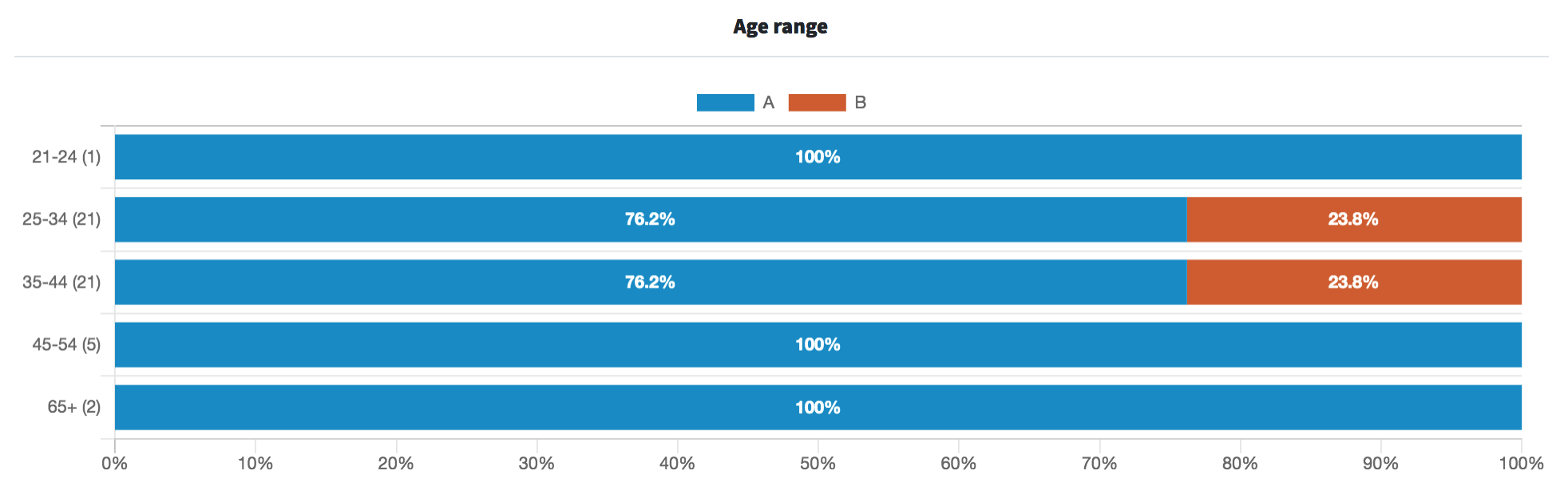
- Of all the age ranges, only the 25-34 and 35-44 age groups gave Option B any votes — there were exactly 21 respondents in each of these two age ranges and both gave Option B 23.8% of the vote.
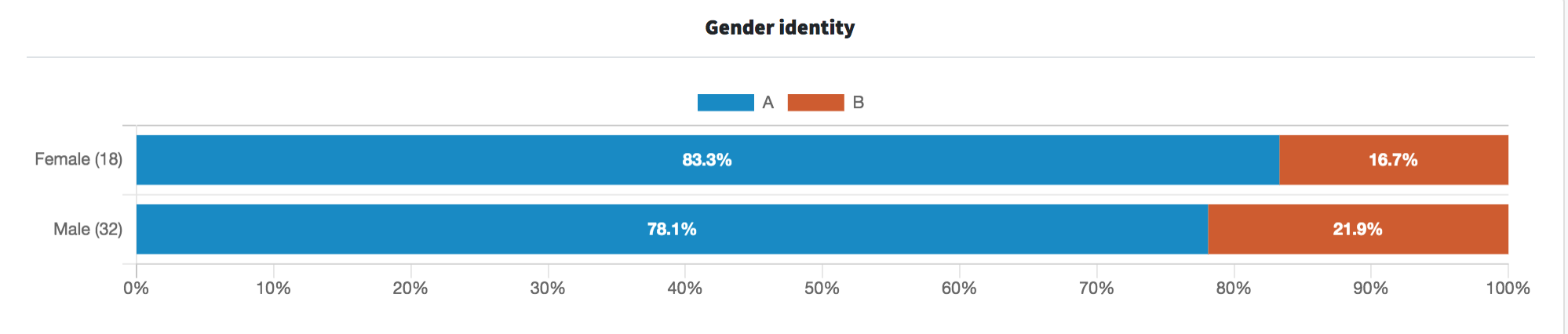
- Interestingly, female respondents gave Option A 83.8% of the vote, compared with male respondents’ 78.1%. There were no nonbinary respondents.
What they said
“This seems like a more rugged and reputable brand with the tool shown in Option A.”
“I like the logo that goes along with this name [in Option A]. It’s way better than the other logo.
“I like the idea of an item being super tough every day. I have a hard time actually reading [Option] B. It seems a little too cybertruck.”
“Tempered makes perfect sense to me because tempering chocolate or metal makes it more stable and durable, which is exactly what the company is looking to portray. Also the choice of using red fits perfectly with the tempering metal reference.”
“Option B will have more wide-ranging appeal since Option A having the sword and battle axe will inevitably conjure to mind images of violence (which may appeal to some, but be a strong turn off for many others).”
Try PickFu for free and test your book cover.
Key takeaways
Clearly, both males and females alike loved the rugged-sounding name, Forged 365, along with the military-green, sword- and axe-wielding logo.
But not everyone agreed. One male respondent who voted for Option B made the point that the axe and sword conjured “images of violence,” which could “be a strong turn off.” And it’s true: what, exactly, does a sword have to do with rugged clothing? Perhaps a hammer would be a better choice.
In the end, however, it appears that avoiding violence isn’t an issue for Forged 365, which is the name the brand ultimately chose. Their apparel is not only durable, but the unusual fabric used to make the clothing heavily features…weapons.
To each their own, we suppose.
https://giphy.com/embed/eLY38b9gib9LBlrl2L
While this name may appeal to a certain group of individuals, the logo may deter a large swath of people who also want rugged clothes — but without the implied gore. Learn more about why brand names and brand perception matter in our guide to considering brand perception.
Want to dive deeper?
Results by commonly used words: