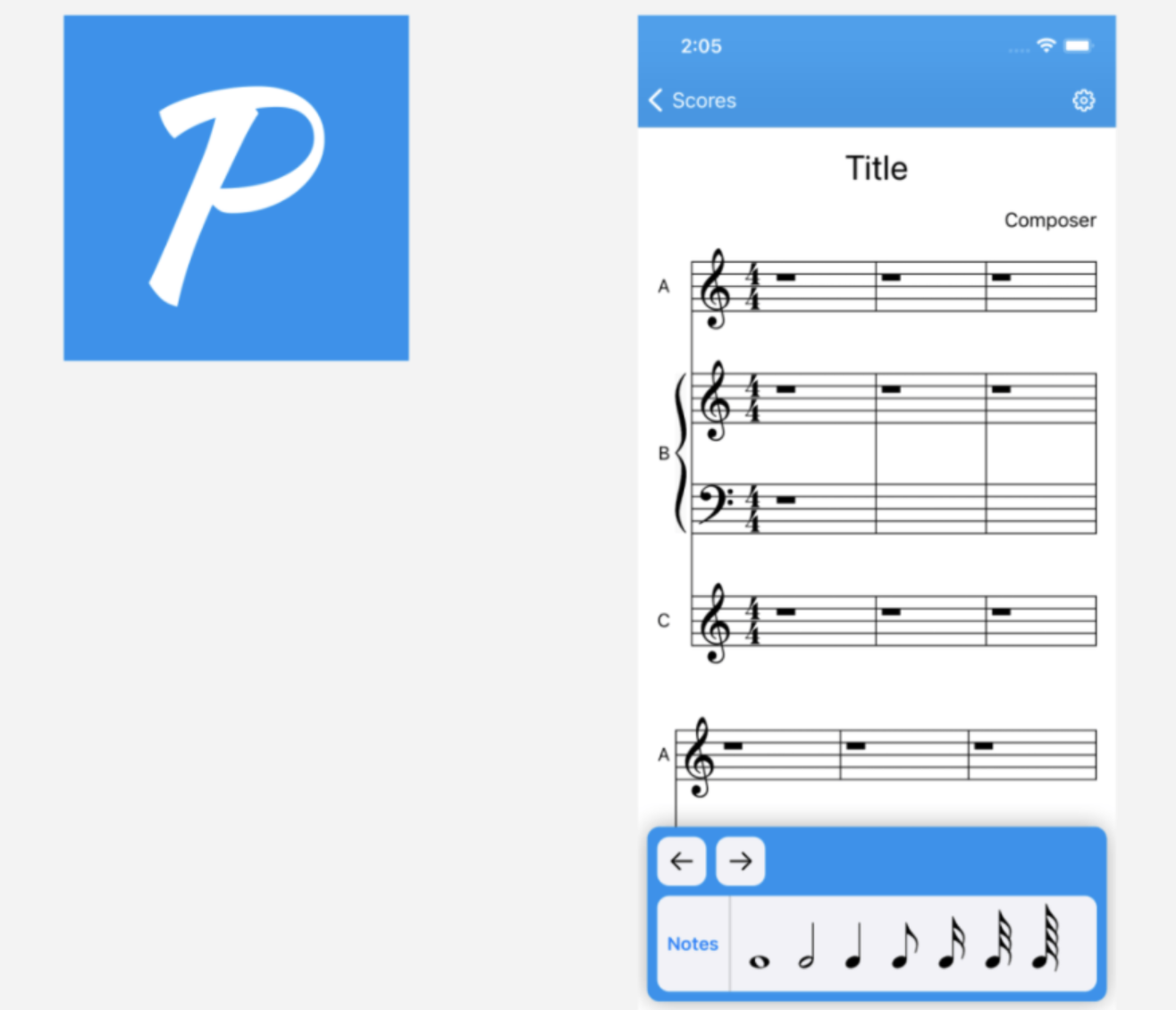
How important is color scheme when it comes to designing an app? Hugely important, as one PickFu user discovered in this app icon and screenshot split test.
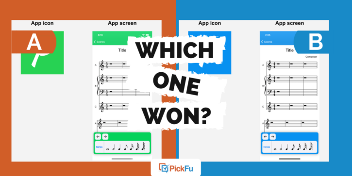
The user asked a general audience of 50 people which color theme they prefer for a sheet music app. They showed respondents both the app icon, which features the letter P, and the screenshot showing a page of sheet music.
The images are identical except for the color. Option A is green. Option B is blue.
Can you guess which one won?
And the winner is…Option B, with a score of 70 to Option A’s 30.
Let’s find out why respondents liked blue more than green.
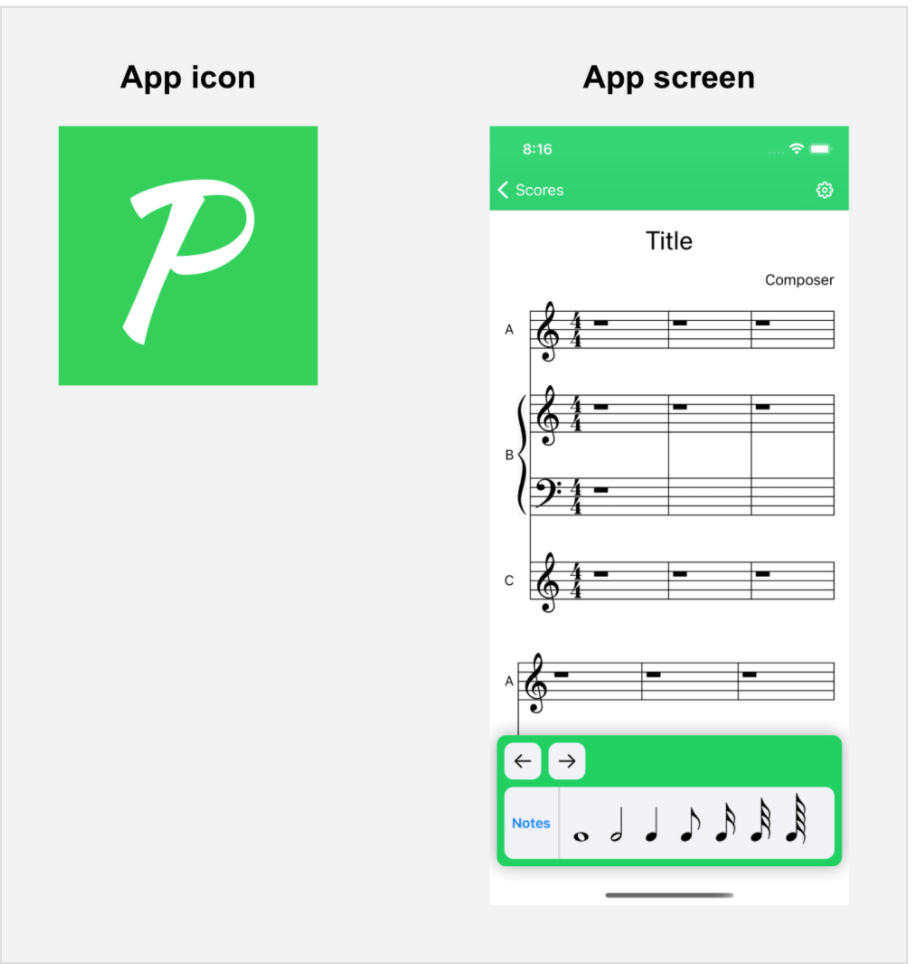
Option A 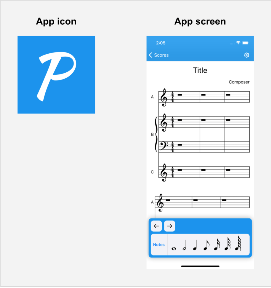
Option B
Soothing blue
A common theme among respondents who voted for Option B was that blue is easier on the eyes than bright green.
One male respondent described blue as “less abrasive.” “Typically if I am reading sheet music, it will be for prolonged periods so I would select anything that was the least taxing on my eyes as well as the least distracting,” he said.
Some said blue reminded them of other blue apps, in a good way. A few pointed out that blue is a better contrast to black musical notes.
Another musically inclined male respondent said that while green is generally a nice color, it is “really annoying to stare at while trying to play the music.”
Worse, according to a female respondent in the 25-to-34 age group, is that Option A’s particular shade of green calls to mind a financial company more than a music-related app.
Other highlights
- 73% of female respondents and 68% of male respondents voted for Option B
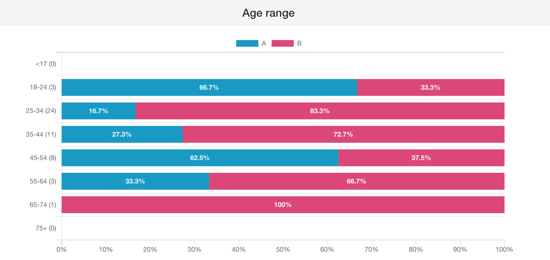
- 18-to-24-year-olds and 45-to-54-year-olds preferred Option A; for respondents in the other age groups, the opposite was true
What they said
“I think the blue just makes more visual sense and better highlights the black musical notes. The green is a nice color, but probably too bright for this purpose.”
“The darker colors are easier to see on screens, especially cell phones.”
“The blue seems softer and serene, but the green theme (despite being pretty) looks gaudy and too flashy.”
“I’m more attracted to the green version that I am with the blue. The blue seems to be somewhat common and I feel that green is a bit more unusual, which is ideal for marketing and display.”
“I feel like the bright green would keep me focused better.”
Key takeaways
Soothing. Calming. Serene. These are just a few of the adjectives respondents used to describe Option B. Since playing the piano is generally a meditative activity, a relaxing blue color seems to fit this app.
But what if Option A had been a darker green and Option B a lighter blue? Would people have voted the same way? And what about those who said blue is a common color among app icons? How can this music app stick out in that sea of blue?
These are among the questions the user who ran this poll should consider when finalizing the app’s visual elements.
If you need help figuring out how to make an app icon and color scheme stand out and appeal to your target audience, see our guide to optimizing apps.
Want to dive deeper?
Results by commonly used words: