What’s the right App Store icon size? What should you depict in your icon? What difference will it all make? This guide to app icons will help answer these important questions, offer tips, and link to resources.
Why app icons matter
The app store icon size is tiny. When icons appear on your smartphone screen, they each take up just a thumbs-width of space. But in the Apple App Store or the Google Play Store, the design you pack into this little
As with book covers or product listing images on Amazon, mobile app icons help your potential customers make a snap judgment in a split second.
Before they read the app title or description, they’re going to see the icon. Your mobile app icon needs to tell them about your app in an appealing way, driving them to learn more. Once someone has clicked on your icon, they’re more likely to install your app. And that’s what you want. Basically, your app icon is the gateway to installs.
That’s why it’s crucial to get it right.
An app icon is not a logo
It might seem easiest just to transfer your brand logo onto your app icon and call it a day. Don’t. An app icon isn’t a logo. A logo represents the brand behind the application, yes, but the app icon represents the app itself.
Just as you wouldn’t use a logo in place of a product image on an Amazon listing, you shouldn’t slap a logo into the app store icon size requirements and call it an icon. Only mega-brands like Starbucks or Target can get away with this.
If you’re a decently established and well-known brand, however, feel free to add your logo to your app icon in some way, but don’t make it the focus.
In the example below, the well-known travel book publisher Lonely Planet includes its logo in the app icon for Guides by Lonely Planet. But the logo is just one piece of the app design. The calming blue border makes the warm yellow-toned cityscape pop, inviting the viewer into their next adventure.
The tagline says that this app is a compilation of “curated city guides,” and the app icon hints at that function.
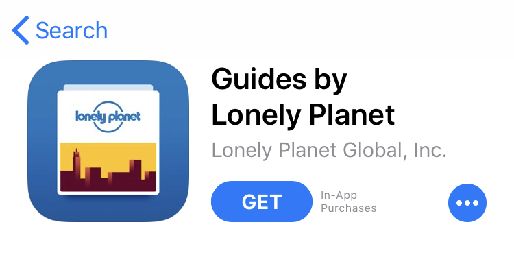
Anyone who loves to explore new cities and who runs an in-store search for “travel guides” will be drawn to this warm yet exciting app icon.
Compare the Lonely Planet app to another travel guide app you’ll find under the same search.
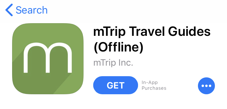
mTrip takes
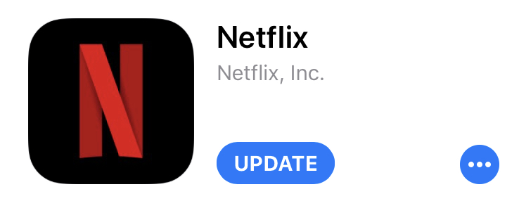
But the icon says nothing about what the user is getting, and mTrip isn’t well-known enough to be recognizable by a single letter. Netflix, below, also takes the first letter from its logo and uses it as an app icon, but this brand can pull it off because everybody knows what Netflix is and what it does.
Now that you know the difference between a logo and an app icon, let’s take a look at the important questions you need to ask yourself before you start designing.
App Store icon size: 4 questions to ask before creating an app icon
It’s true that your app icon needs to attract as many eyes as possible. You want it to stand out from all the app icons around it, and in an app-saturated world, that’s no easy task.
But here’s a secret: you don’t need to make your app icon appeal to everyone in the world. Instead, focus on making it appeal to the people in your target audience.
So here’s the first question to consider.
Question #1: Who is the target audience for this app?
Is your app for people who love to cook? Parents with young kids? Lovers of games like Candy Crush and Angry Birds? Travelers? Budding musicians?
Since you’ve already built the app, you should know the answer to this question. But make it the focus of your app icon design, too.
Search a simple phrase that defines your target audience.
Let’s say, for example, that your app teaches people how to play the piano. A search for “learn the piano” on the Google Play store brings up these top apps.
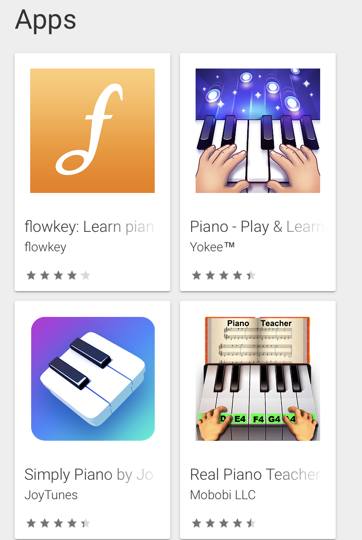
Of the four app icons, which would you click on to learn more?
For me, a former pianist who would love to re-learn what I once knew, this one wins. Hands down.
I don’t find Flowkey’s app icon appealing at all because it tells me nothing about playing the piano. (Again, it’s basically a logo and nothing more). The other two feature piano keys inside the icon — expected, perhaps, but totally fine.
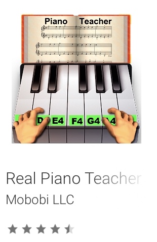
For me, Real Piano Teacher wins because it shows hands playing the piano on labeled keys with a sheet of music in front of the person playing.
You cannot learn to play the piano without learning notes, and learning to read music notes can be as challenging as learning to read a written language. By its app icon alone, this app promises to help users learn to read notes, speeding them closer to achieving their dream of playing beautiful tunes on their own.
Now here’s the catch: you, as an app creator, must ask yourself this how can I make my app icon even better than the one I like best (Real Piano Teacher’s)?
Design your app icon to rise above all your top competitive choices.
Question #2: What current design standards should I follow?
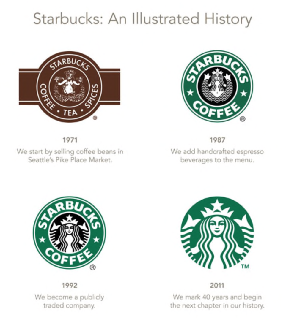
Design trends change all the time. I’ve been around long enough to remember the most recent Starbucks logo change
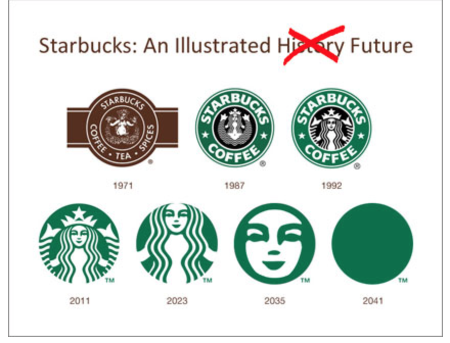
Of course, some people find the new logo too spare and joke that eventually it’ll be nothing but a green dot.
Joking aside, it’s important to keep track of the current design trends and how they relate to your app design. Both the Google Play Store and the App Store publish up-to-the-minute guidelines that you can (and should) follow.
These guidelines help you create an app icon with the most modern, accessible feel.
Google’s Material Design offers a thorough set of guidelines that cover the following topics:
- Design principles, including brand expression and design approach
- Grid and keyline shapes
- Specs — a detailed breakdown of app icon anatomy and lighting specifications
- Icon treatments: information on app color, layer, scoring, overlap, accordion, and distort
Material Design aims to help you create an app icon with a tactile feel through the medium of pixels. It’s complex stuff, but it’s worth studying.
Apple’s Human Interface Guidelines read in a friendlier way that’s also easy to follow. It offers ten tips, such as “Embrace simplicity” and “Test your icon against different wallpapers” along with instructions on how to follow them.
After this, Apple offers information on how to:
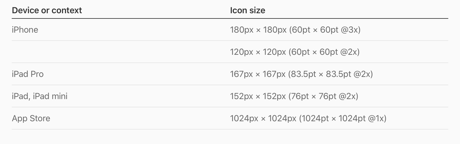
- Format app icon attributes
- Produce the app icon in several different sizes
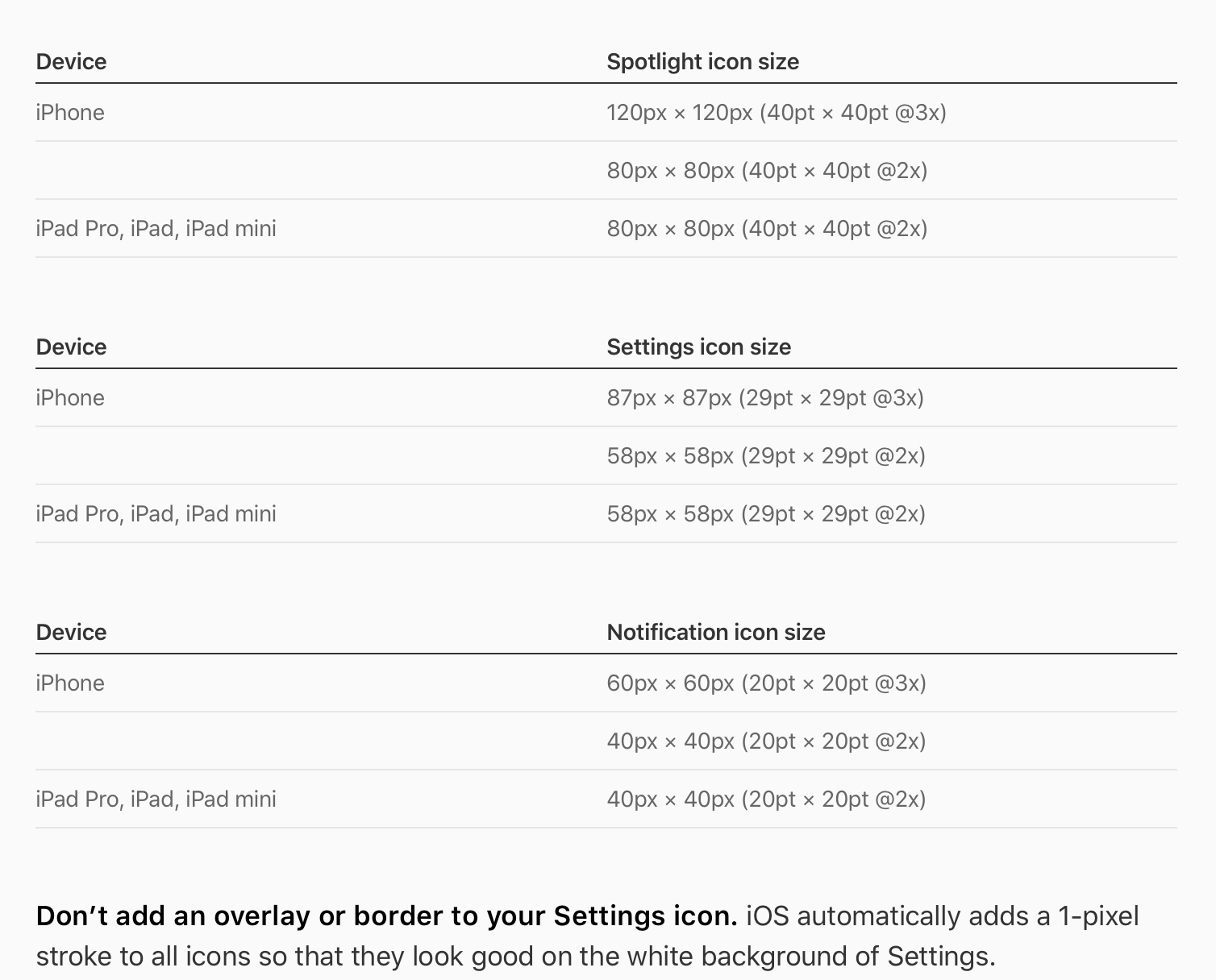
- Provide user-selectable icons
- Create spotlight, settings, and notification icons for iOS
While the Human Interface Guidelines are shorter and in many ways simpler than Google’s Material Design guidelines, the latter offers more in the way of design tips.
Question #3: How can I hint at my app’s purpose?
As we saw in the case of the learn-to-play-piano apps, communicating your app’s purpose to your audience is critically important.
Let’s take a look at another example. Say you’re designing an app icon for an app that helps writers organize their thoughts and ideas. Maybe your app also sets word count goals and allows users to track daily writing time. On top of that, perhaps your app provides kick-in-the-pants quotes to get writers writing.
So who’s your audience?
Writers, of course. Beginning writers. Novelists. Freelancers. Journalists. Every writer could use your app!
Now take a look at your competition.
On the App Store, search “apps for writers” and you’ll get an array of organizational apps.
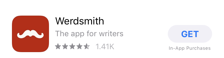
Focus on the app icons here. First, there’s a mustache with a red background. If you didn’t see the title, you wouldn’t know that this app is even aimed at writers. Even then, it’s unclear what t
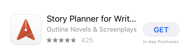
The next app icon features a white background with a red…paper airplane? Pen tip? Salmon head? It’s not super clear.
The final app icon in our little study features a lightbulb pen against a black background. Just by looking at the icon, you get the sense that this app will help writers form ideas and keep that inspiration flowing until it turns into a book, article, or poem.
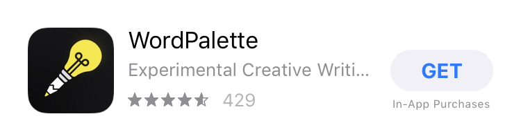
Emulate this icon, not the first two. Hint at the functionality your app offers.
Take note that hinting at functionality should look different for different types of apps.
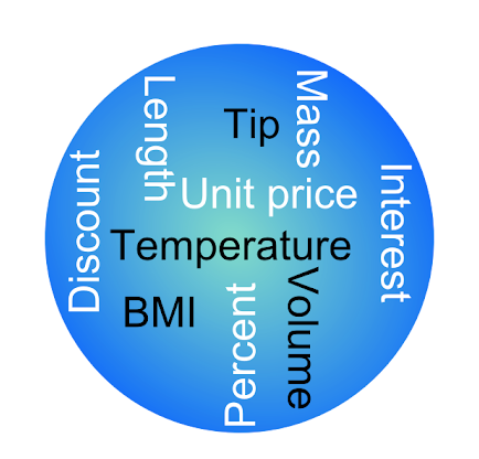
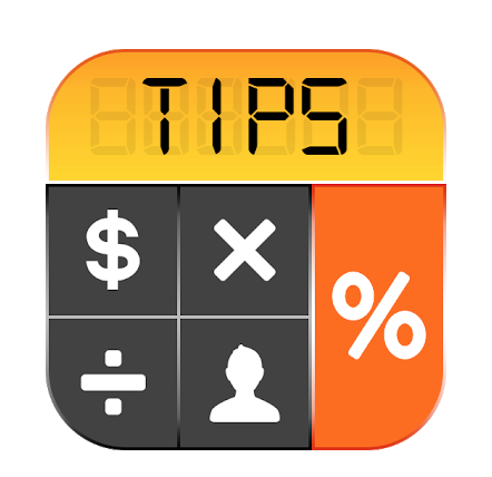
If you’ve created a utility app, for example — like a tip calculator or a flashlight — the app icon should make the person browsing feel like they’re already using the app before they even click the icon.
The app icon below does not achieve this goal, and what’s more, it’s crowded and hard to read.
By contrast, the app icon below makes you feel like you could quickly access this tip calculator because it’s practically already open.
Icons for mobile games also need special treatment. Your goal in a game app icon is to make the viewer feel like they’re immersed in the world of the game already. All they need to do is click the app icon and they’ll get the dopamine rush of playing something new, exciting, and rewarding.
Here’s a great example of an app icon that accomplishes this:
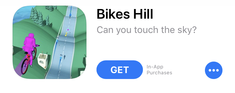
You can almost feel the rush of riding down a bumpy hill just by looking at this app icon. It’s a delicious thrill, though, one that makes you want to play the game.
A not-so-great example? This app icon for a basketball game.
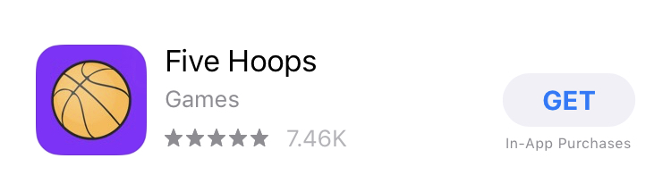
You feel like you’re… staring at a basketball. Not playing a game. BORING!
Question #4: What’s the look and feel of my app?
While it’s a good idea to exercise creativity while designing an app icon, you don’t want your app interface and app icon to have different textures. They should work together in a seamless design system.
Here are two word-block games whose icons match the look and feel of the games they represent.
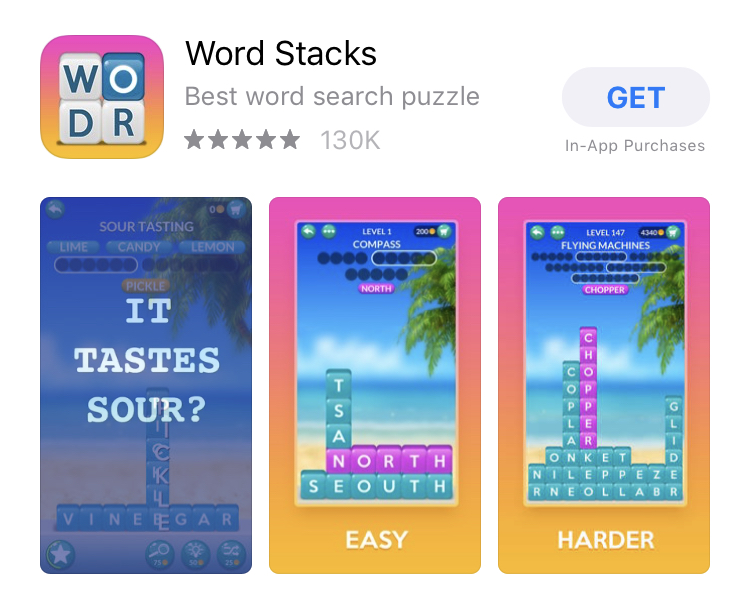
Word Stacks’ icon features the same sunset colors and chunky word blocks as the game itself.
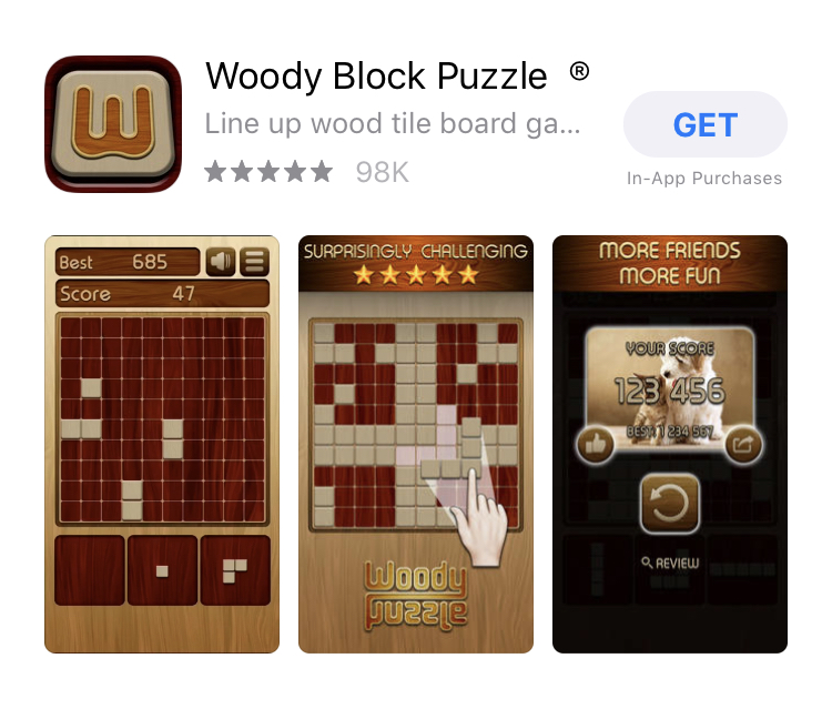
Woody Block Puzzle’s app icon is as woody as the game itself.
You don’t want to lead your audience to think that your app is a woody block type of game but then reveal a sunset-colored, frothy word block game instead. Inconsistent branding is poor design.
As one blogger writes on 99designs, “If your app design is flat, your icon should also be flat. If your app contains skeuomorphism, your icon should also have at least some element of skeuomorphism.”
Make your app icon reflect your app’s colors, textures, and feel as much as possible.
Tips to keep in mind while designing your app icon
Now that you’ve answered the four essential app-designing questions, it’s time to start creating several variations or proposed designs for your app icon. Start with a basic design outline and then experiment with different colors, borders, and graphics.
Here are a few tips to guide you:
- Rely on just two or three colors. More than
three and your app icon starts to look too busy. - Avoid using a real photograph. You can always turn a photograph into an illustration/vector image, though.
- Think small. Your app icon might look big to you while you’re designing it, but it’s tiny on an iPhone or Android screen. Make sure each element is clear even in the icon’s smallest form.
- Save words for the title and tagline. An app icon is meant to have a visual impact. You can say what you need to say in words on the title, tagline, and app description.
- Always follow Apple and Google’s app store icon size requirements and guidelines. You can find Google Play’s size requirements here and the Apple App Store’s here. Keep in mind that you’ll need to create several versions of your app icon for each store. Also note that even though the App Store on iPhone features rounded corners, you should submit all your app files in square form. The Apple system will round off corners for you.
Once you’ve got two or three potential app icons to pick from, it’s time for the most important step of your app icon-creating journey: split-testing your icons to find out what your target audience thinks.
Beyond App Store icon size: split testing app icons on PickFu
The best way to know what your target audience thinks of your app icon is to split-test it on PickFu before you actually publish your app listing on the Google Play Store or the App Store. Sure, you could do an in-app A/B test and run several variations on the store itself, but this is a slow process that can suck away your time and money.
By split-testing to a pool of respondents on PickFu before posting your app icon live, you get the feedback you need without losing money in the process.
It only takes a few minutes to set up a poll on PickFu. Remember how I said that audience targeting is crucial? PickFu makes that easy for you. You can target audience members by iOS or Android device, whether they are a mobile gamer, and how much they’ve spent in the App Store, among many other useful traits.
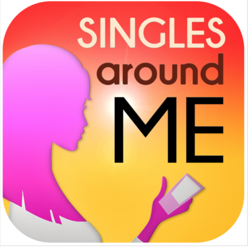
One app developer recently took to PickFu to test between two icons for a dating app.
The first icon shows the pink profile of a woman holding a phone, the app title in two different colors, and a reddish and orange background. In all, this app icon features about six different colors.
The second option eliminates the woman, keeps a more streamlined orange-red background, and leaves the words, but in white with a little heart tucked into the crook of the letter M. This app icon features just three colors.
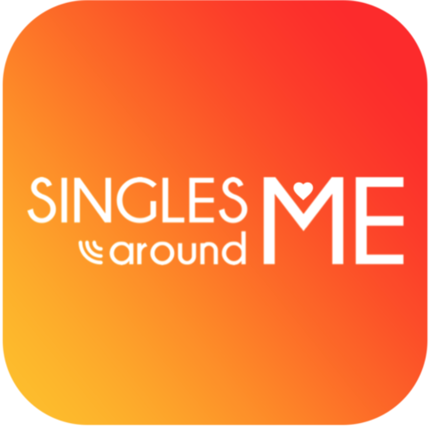
Respondents overwhelmingly voted in favor of the simpler, cleaner Option B. Unlike in a traditional live A/B test, PickFu respondents give you detailed written feedback. So we can see exactly why Option B won.
First of all, respondents appreciated Option B’s simpler, more professional look, saying things like, “I just like the simplicity of this one and it doesn’t single out one gender for usage” and “I really dislike the bright purple/pink coloring in Option A – it’s really hard on the eyes.”
Hopefully, the app developer went with the second app icon, which is much more likely to attract potential users than Option A.
Have any questions about using PickFu to split-test your app icons? Let us know in the comments or visit our Help Center.