E-commerce optimization can be a daunting process, but it’s necessary if you want to increase conversions and boost sales.
This article will explain what e-commerce optimization is and how you can put it into practice today to improve your online store.
But before we talk strategies and tips, let’s hear from the people you’re optimizing for — your website visitors.
Use these links to skip to the section you want:
- Why does optimization matter in e-commerce?
- Testing methods for e-commerce optimization
- 5 e-commerce optimization tips to improve your website
- #1 Streamline homepage navigation
- #2 Increase site speed
- #3 Make your CTA hard to ignore
- #4 Personalize your website content
- #5 Simplify checkout
- TL;DR: Use these 5 tips to guide your e-commerce optimization strategy
Why does optimization matter in e-commerce?
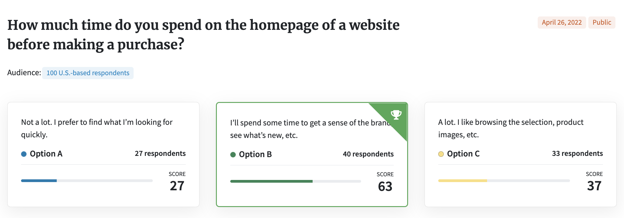
We wanted to get a good picture of people’s online shopping habits, so we asked 100 consumers how much time they spend on the homepage of a website before they buy.
Only 27% said they prefer to get in and out quickly.
The majority — 63% — spend a fair amount of time browsing, whether to look for a sale or simply get comfortable.
Here’s some of what respondents said:
- “I spend as much time as it takes me to see if I trust the site and brand, then I buy. I don’t like to linger too long, though.”
- “It depends on what I’m buying, but I like to see if there are any sales or important information. I also typically make informed decisions so I’m not going to spend very little time on it.”
- “I want to make sure I trust the brand and the website before I start really shopping so I explore everything.”
The word “trust” might’ve stuck out to you. We’ll talk about building trust with your e-commerce site in a bit.
For now, let’s keep going with how shoppers behave online.
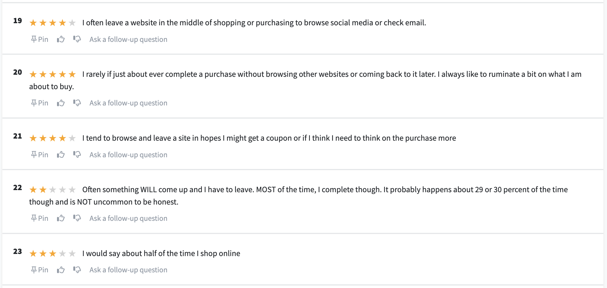
We asked another 100 consumers to rank on a 1-5 scale how often they leave a website while shopping.
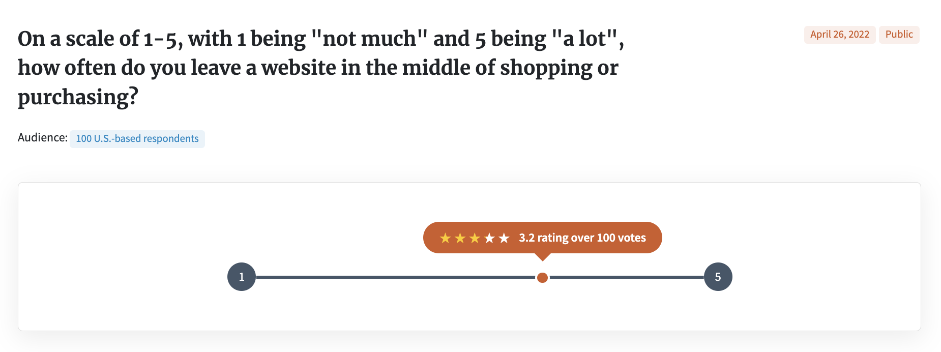
More than one-third (35%) of respondents are in the middle, meaning they report sometimes leaving a website, while nearly 40% do it even more frequently.
What’s driving this? Respondents’ comments reveal a few themes, namely distraction, indecision, and a desire to compare prices.
You can’t do much about distracted window shoppers.
But not all hope is lost for online retailers. Far from it. There are several things e-commerce businesses can do to tackle an exceptionally high cart abandonment rate.
We ran another 100-person poll to find out what, specifically, makes shoppers leave a website: issues with the site loading, a lack of information, unappealing site design or navigation, or a complicated checkout process.
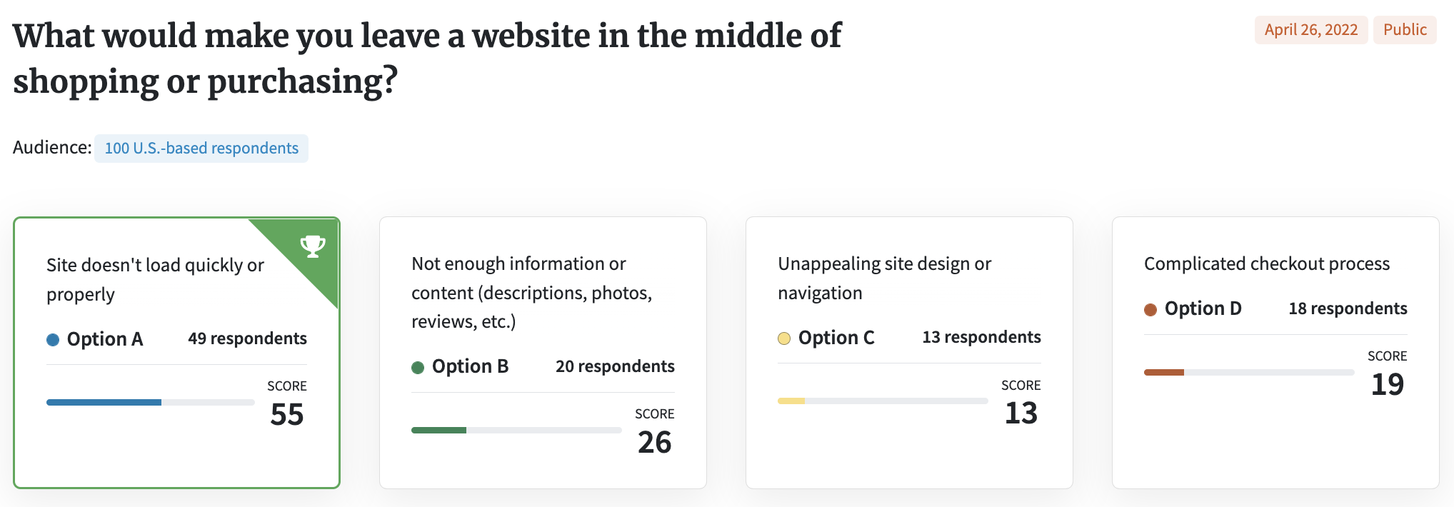
For 55% of respondents, a slow-loading site is enough to make them leave. 26% would bounce if a website didn’t have enough information about the products or brand.
In truth, all of the above are red flags, as several people pointed out:
- “All four are annoying. A is a pet peeve of mine, B makes me distrust the site, C makes me distrust the site, D is just obnoxious.”
- “Obviously none of these are good and truly all of them would lead me to leave a page, but A is the worst offender to me. If a site doesn’t load properly or keeps failing, then I get annoyed at the searching and shopping process, but I also don’t trust that my transaction will go through properly.”
There’s that word again: trust. Shoppers want to feel they can trust your website before they’ll buy.
So what is the mark of an effective website, one that gains a consumer’s trust? We ran a fourth, final poll to find out.
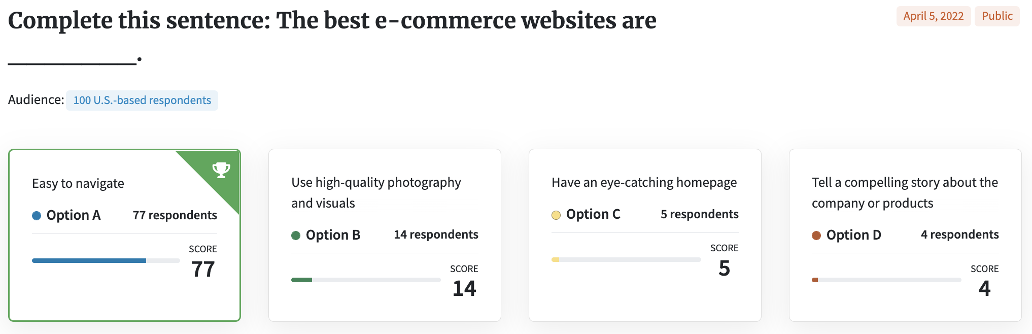
77% of respondents agreed that while looks are important, the best e-commerce websites are easy to navigate.
“I think ease of navigation is the most important part of a good e-commerce website. Without it, all the most beautiful designs and photos would not save the site.”
“People need to quickly and easily get around the site. I think having an eye-catching homepage is fine but navigation takes top priority compared to all of these choices,” said one person.
“Definitely my first two ranked options [A and B] are most important to me and gives me a sense of trust that the site is legit,” another person said.
Bottom line:
People are busy. They’re multitasking. When they come to your online store, they might leave as quickly as they came.
But that doesn’t mean they’re not paying attention.
Consumers are willing to spend time on your website. If it’s easy to use and they know they can trust it, they’ll spend money, too.
That’s where e-commerce optimization comes in.
Testing methods for e-commerce optimization
Optimization is all about making gradual changes to improve your online store.
The changes can be straightforward: say, swapping out a headline or hero image on your homepage. Optimizing product pages is part of it, too.
They can also be less straightforward, under-the-hood changes as they relate to your site’s functionality.
Split testing, a.k.a. A/B testing, is how you compare and track the impact of these changes on your traffic and conversion rate.
There are two approaches to testing:
- Test live with customers (Google Optimize, Manage Your Experiments, etc.)
- Test in a sandbox environment (PickFu)
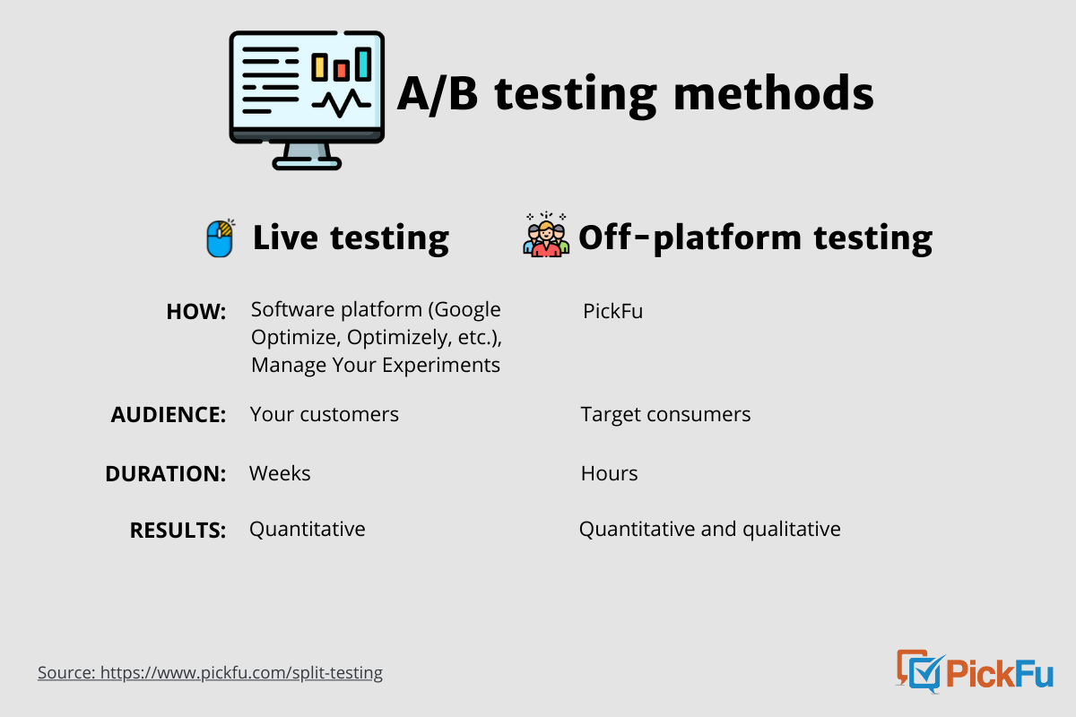
You run live tests via a software platform, an Amazon A/B testing tool, or the Amazon marketplace itself. Typically, you’re testing two options against each other.
The experiments happen in real-time with your actual customers, so you’re able to see changes in traffic and conversions. It takes weeks to accrue enough data to determine a “winning” option.
Testing with PickFu involves a lookalike audience of consumers, so there’s no impact on your sales. The platform lets you test up to eight options in ranked or head-to-head formats. You get results, including written feedback, in hours or less.
Both testing methods can guide you in conversion optimization, which is the ultimate goal for 60% of companies who A/B test and, I’m guessing, for you too.
With that, here are five areas to focus on when optimizing your e-commerce store.
5 e-commerce conversion rate optimization tips to improve your website
#1 Streamline homepage navigation
As you’ll recall from our polls, people are willing to spend some if not a lot of time on your homepage.
But they really only need 50 milliseconds to do a gut check and form an opinion of your site.
A simple, user-friendly structure not only makes a strong first impression, but research shows it also increases usability.
Here are 5 ways to improve your navigation and layout:
📎 Simplify the menu: A long dropdown menu can be overwhelming. Get rid of unnecessary categories or options. Use a footer menu to condense further.
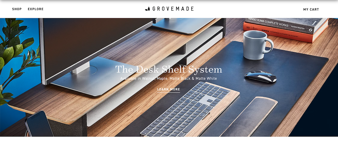
The header menu for Grovemade, a desk accessories company, is as streamlined as it gets:
👀 Focus on the top: Put your most important information on the upper half. Website users notice and memorize what they see at the top, center, and right of a page, researchers found.
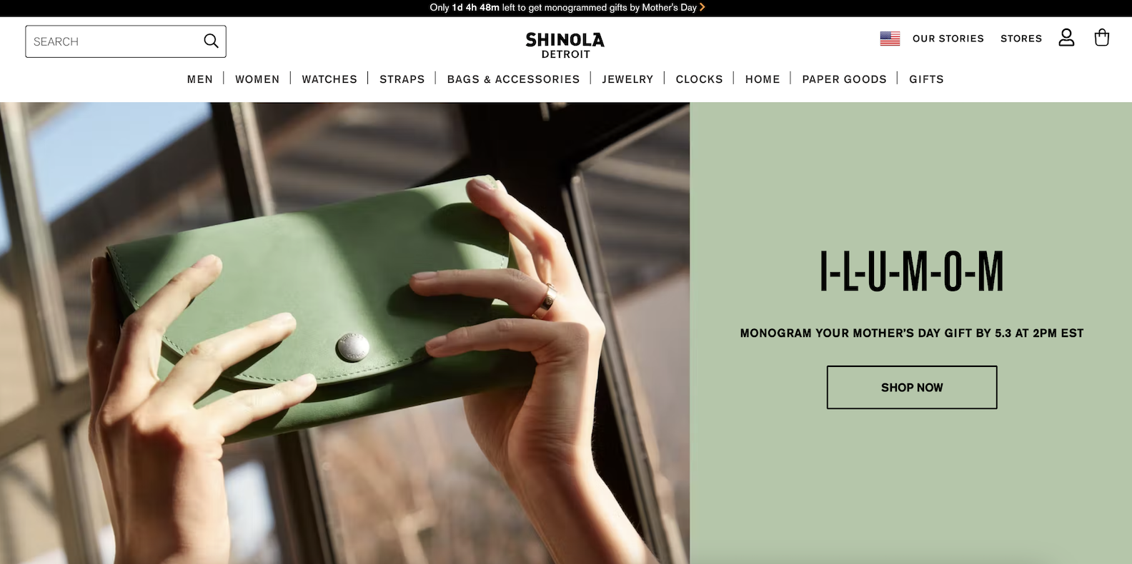
Check out Shinola’s homepage, which puts the emphasis on a soon-to-expire Mother’s Day offer:
For even more examples, check out Sleeknote’s comprehensive list of above-the-fold techniques at their best.
🍞 Leave breadcrumbs: Breadcrumbs are useful if you have a lot of products and pages. They help shoppers remember where they are on your site as they search and move between pages.
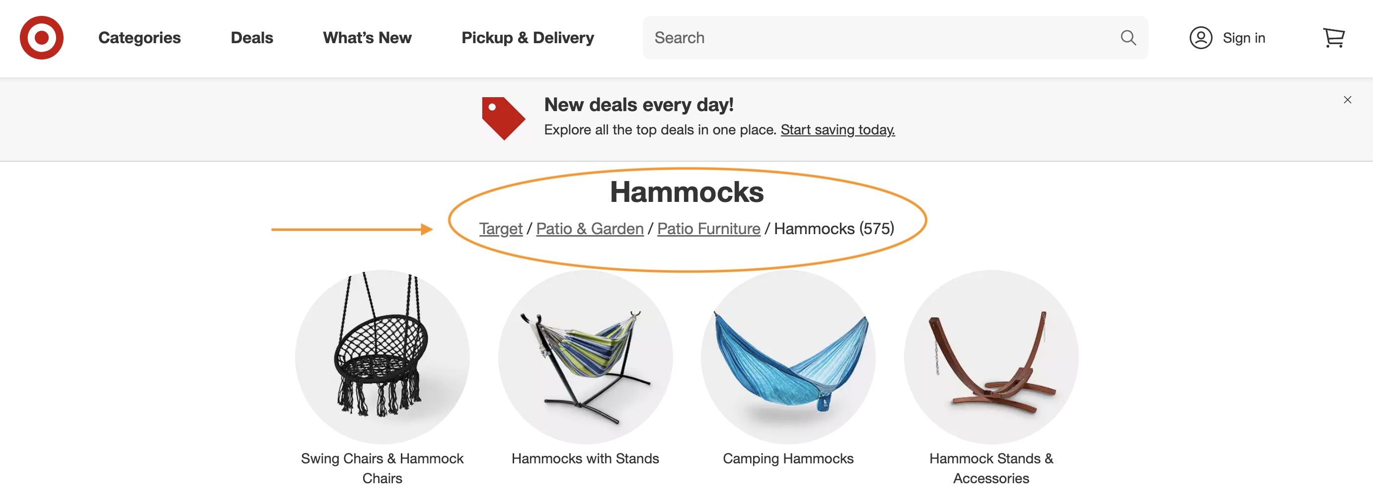
Here’s an example from Target’s website:
🚦 Use visible and obvious buttons and symbols: These should stand out but also be intuitive for a user.
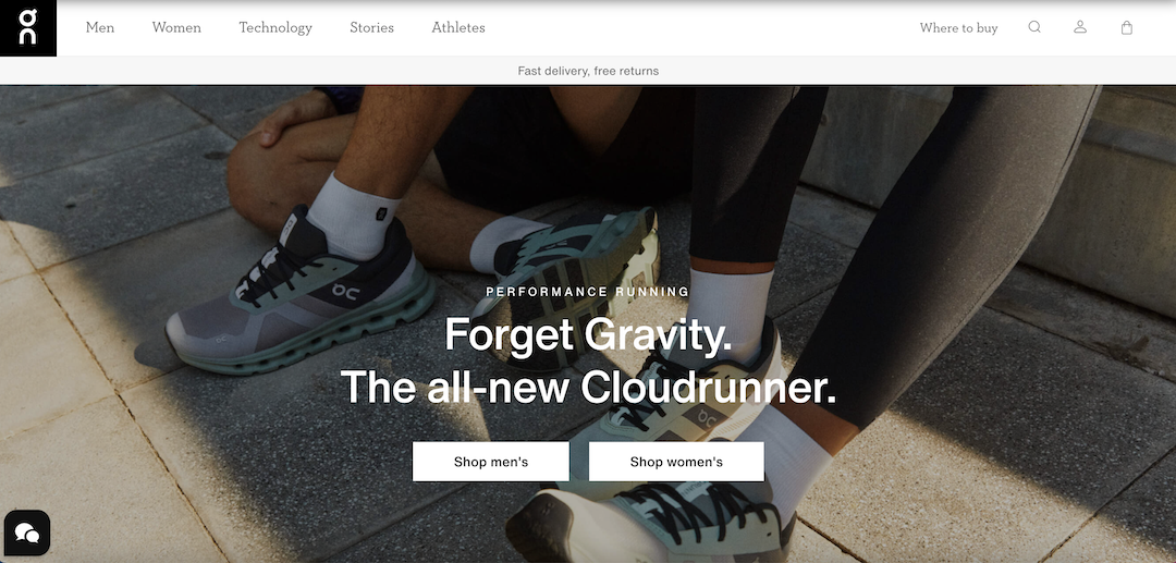
Here’s an example from the On shoes website. The symbols in the upper-right corner don’t need much explanation, and with little color on the page itself, the white call-to-action buttons pop:
📱 Think mobile-first: Our mobile devices account for nearly 60% of all web traffic. Make sure your site looks and works as well (or better) for mobile users as for desktop users. Two-thirds of online shoppers say too-small links or pages are a major headache.
Optimizing your site navigation is all about putting yourself in a potential customer’s shoes to create a more seamless user experience.
Heatmaps or click tests will show you how users interact with the changes, so you know if you’re on the right track.
Beyond that, focus on being fast. Really fast.
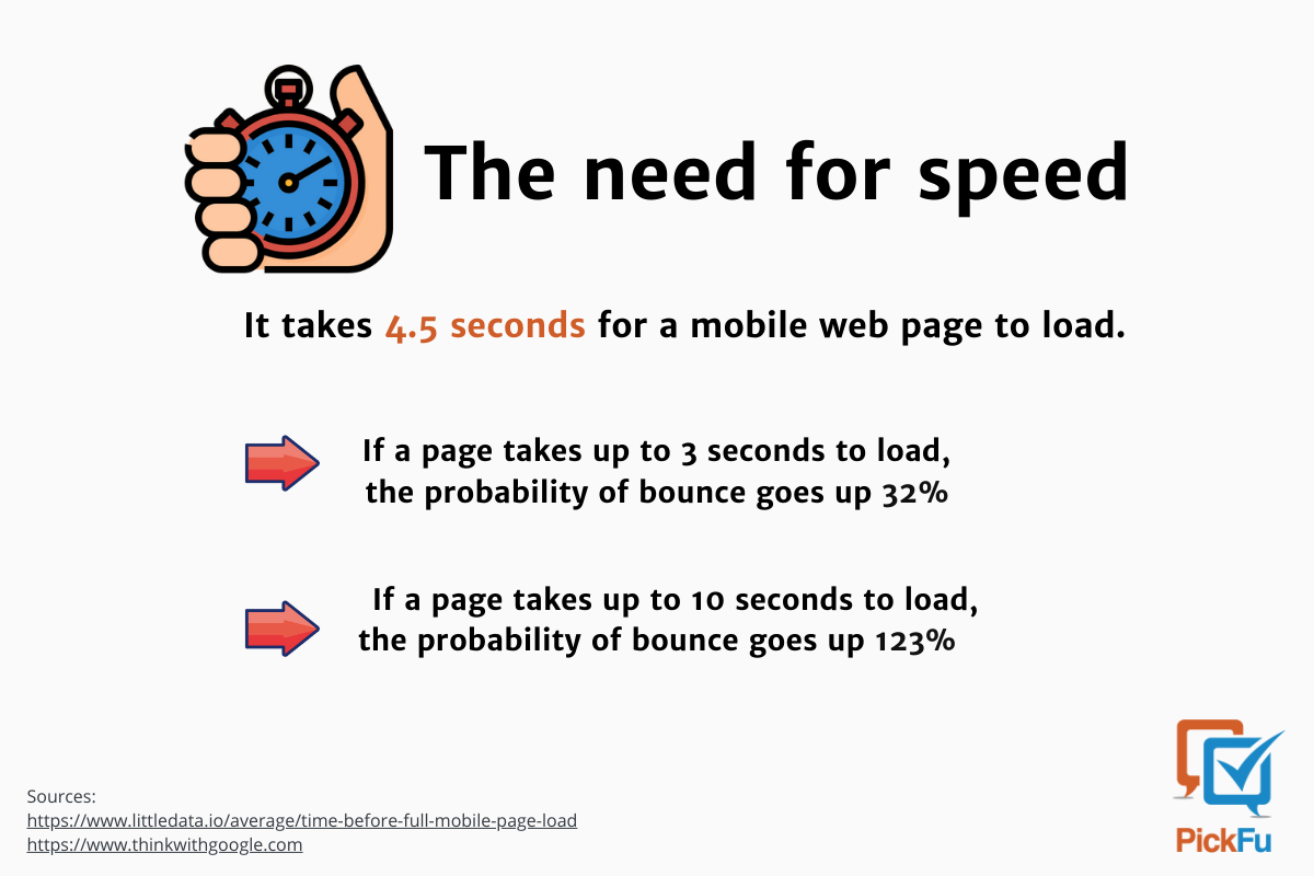
#2 Increase site speed
The faster your site, the better.
Consumers want to save time, which is why 76% use their phones to shop. When they come across a slow site, it’s a “deal-breaker,” as a respondent in our third poll put it.
Every second truly counts. If a page takes up to 10 seconds to load, the likelihood that a user will bounce goes up 123%, Google data shows.
Customer experience isn’t the only thing at stake. Site speed also impacts SEO. A slow site is less relevant to search engines, so it’s likely to get lost in the rankings.
And if the content on your site isn’t search-engine-friendly, that bumps you further down the ranks. (Check out these SEO tips for writing product descriptions that are relevant.)
Various factors can affect site speed and performance, including the hosting platform you use and the number and size of product images on your site.
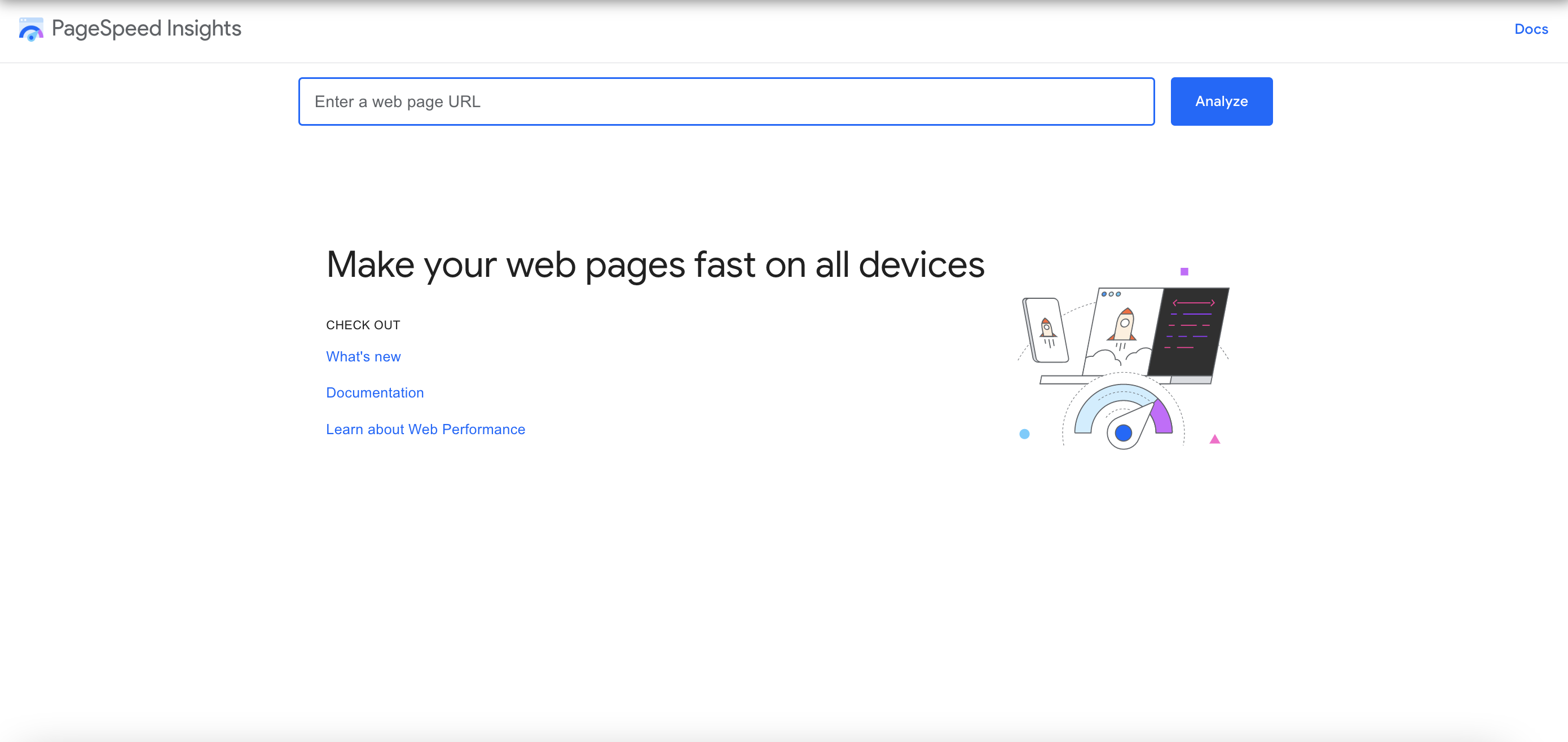
Google’s PageSpeed Insights tool is a good (and free) starting point to figure out and start fixing your site’s speed bumps.
Plug your URL into the PageSpeed Insights site. You’ll get a score and diagnosis of your site’s performance on mobile and desktop, plus suggestions for where and what to improve.
The good news is even a small increase in site speed can have a huge impact on your business.
One report found that a tenth of a second increase in site speed for retail sites led to an 8% jump in the conversion rate and a 9% increase in shoppers’ average spend.
That’s powerful. Something else with major conversion power is your CTA. Let me explain.
#3 Make your CTA hard to ignore
An effective call-to-action, or CTA, does just that — it gets a user to take action.
Common actions include:
- Sign up
- Subscribe
- Download
- Try it
- Share this
- Buy now
You’ve seen them all and probably clicked on your share, too. E-commerce has the fourth-highest average click-through rate for CTAs among 19 industries — 8.16% compared with 4.23% overall.
But if you’ve dug into your site metrics using Google Analytics or other tools, you know there’s always room for improvement.
Here are 5 key areas of your CTA to optimize:
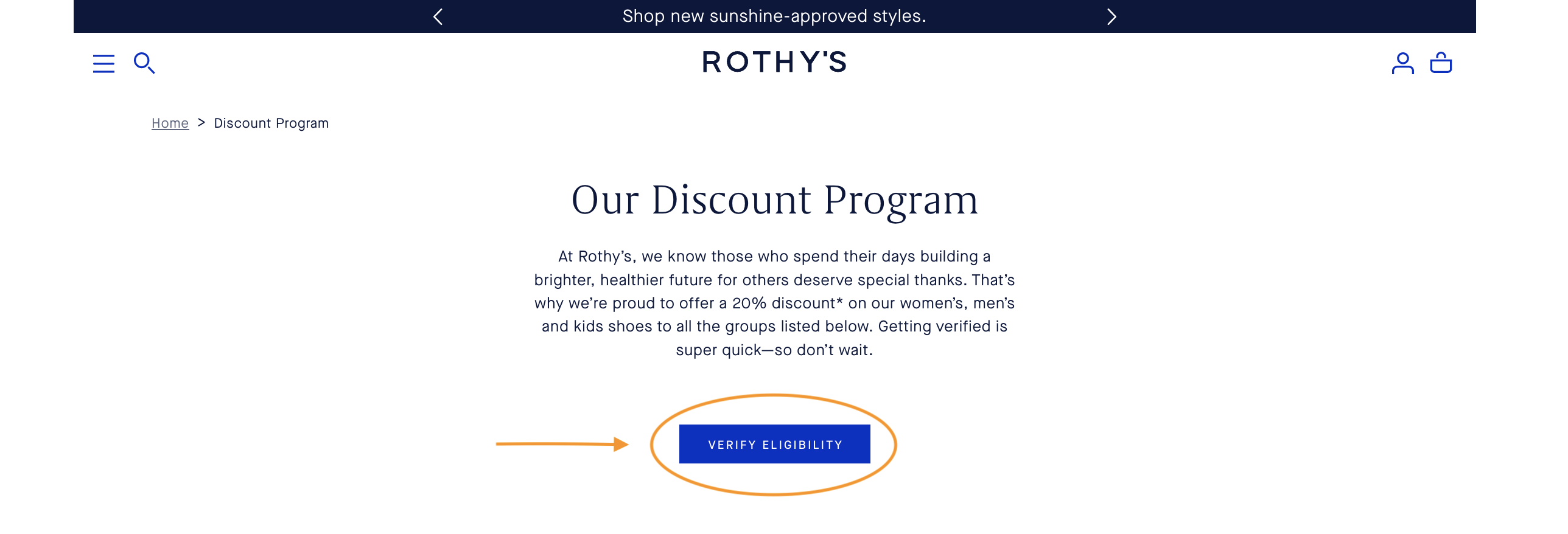
Text: Use specific, active language to let a user know where their click will take them — “Claim your free copy” instead of “Learn more”.
On the shoe company Rothy’s website, the blue “Verify Eligibility” CTA is a clear starting point for customers to see if they’re eligible for a discount:
Color: Vivid colors attract the eye. Certain CTA button colors may even lead to higher conversions. But don’t go overboard. Focus more on the color contrast between your CTA and the page.
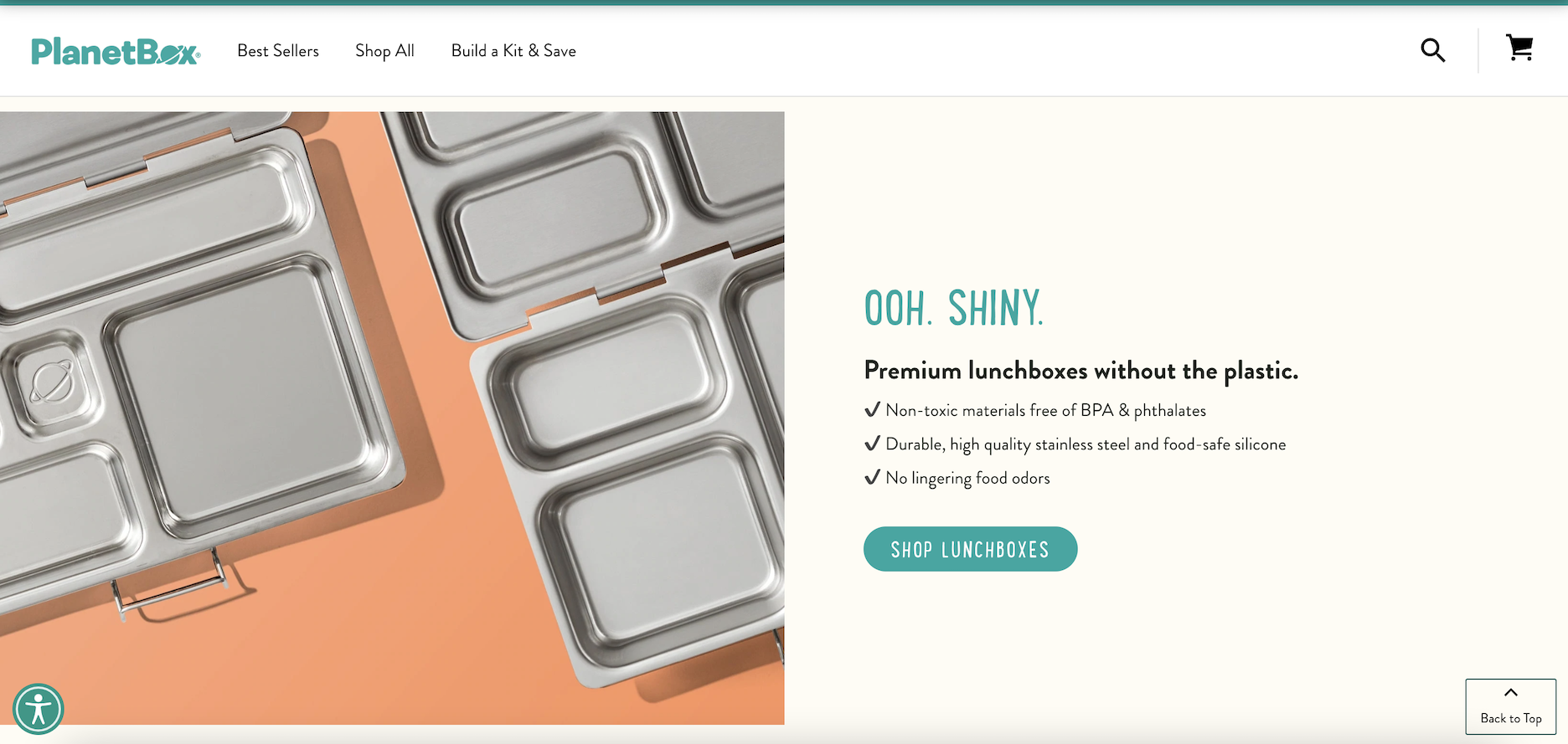
Size: CTAs should be easy to spot. As with color, aim for prominent but not overwhelming.
Here’s a fun example from the PlanetBox homepage. The “Shop Lunchboxes” CTA is colorful, easy to spot, and uses white space to its advantage:
Quantity: Ever heard of Hick’s Law? The more options or, in this case, CTAs you give a user, the harder it is and longer it takes them to decide. They might end up choosing nothing. Stick to one (but feel free to repeat it).
Placement: It’s common to put your main CTA first or high. But you could make a case for placing CTAs at the center or bottom of a page, so long as you have a consistent goal and style.
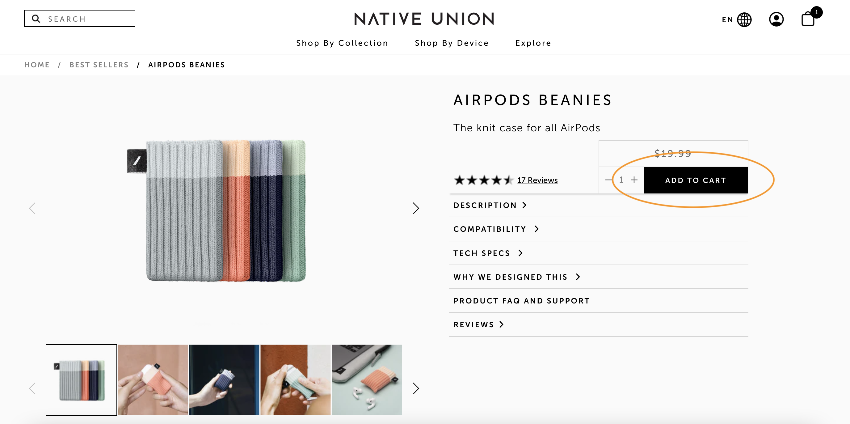
Check out this product page from Native Union. The “Add to cart” button is the star; the rest of the CTAs take a subtle backseat as text links:
Some shoppers don’t need much prompting to click “Add to cart”. Others prefer a more personalized experience, which brings us to this next tip.
#4 Personalize your website content
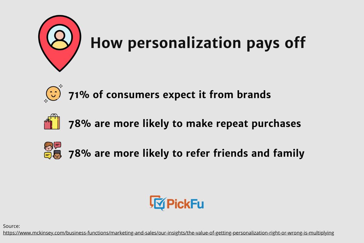
Content that’s tailored to individual users, whether it’s a landing page or a special offer, shows that you’re paying attention to customer needs.
When brands use personalization, consumers are more likely to:
- Buy from them
- Recommend them to others
- Make repeat purchases
People don’t just like personalization. They expect it.
You can personalize based on data such as a customer’s location, purchases, and browsing history.
Here are a few ways to optimize your product listing and site through personalization:
- Offer “just for you” recommendations
- Suggest related products
- Share customer testimonials from products they’ve previously viewed
- Show recently viewed items
- Create personalized CTAs
- Offer discounts based on location, user history, etc.
- Display content in the user’s native language or currency
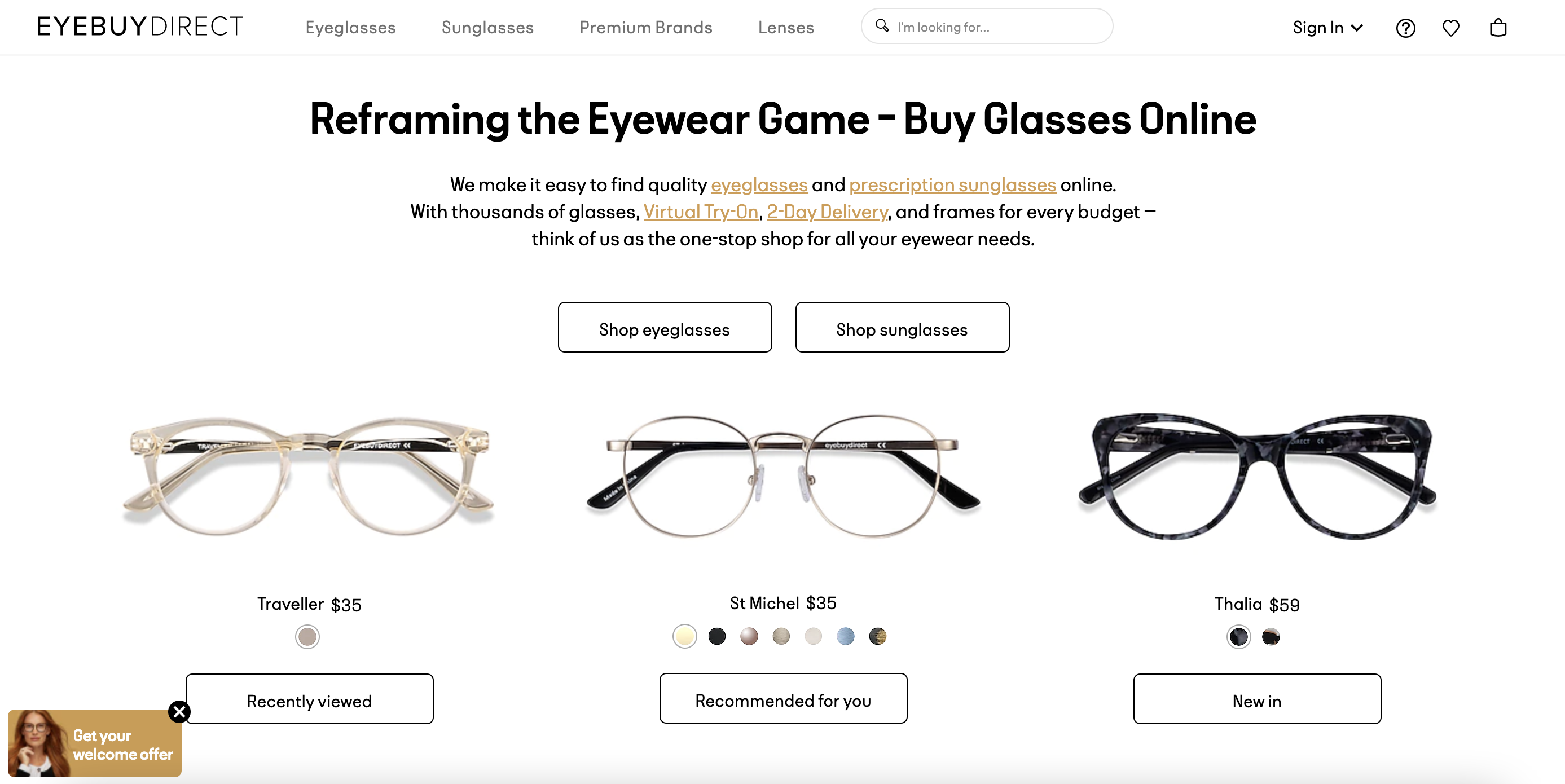
Below, you can see how an eyeglasses website greeted me on my last visit: with a reminder about a pair of reading glasses I’m considering (cute, right?) and a few recommendations.
Whatever personalization methods you use as part of your overall e-commerce marketing strategies, experts recommend targeting your most loyal customers first for the highest ROI.
Let’s say a customer has reached the checkout page. If you think your work is done and the sale is in the bag, think again — and read on for one last, crucial tip.
#5 Simplify checkout
A user came to your site, found what they were looking for, added it to their shopping cart, and then, poof, they left.
Unfortunately, 70% of online transactions end this way. It’s arguably why conversion rate optimization came to be.
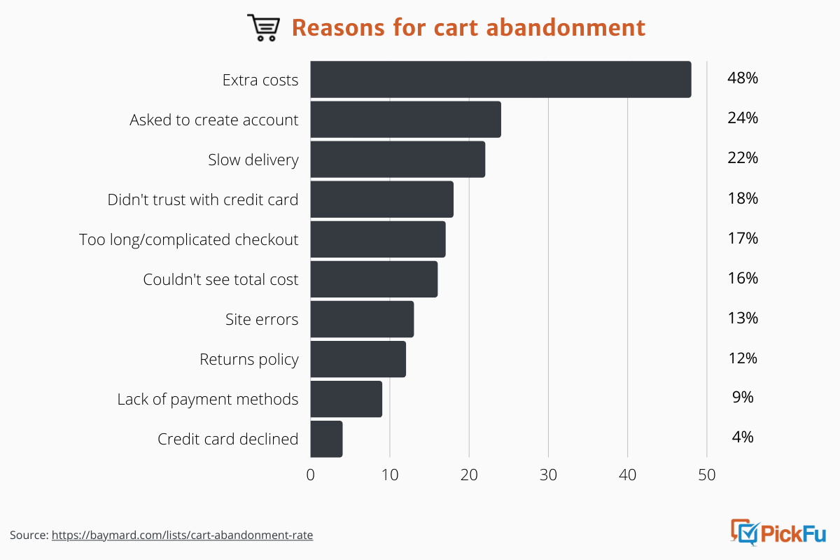
The reasons can vary. As we know from one of our earlier polls, a complicated checkout process can turn people off.
Other top reasons for shopping cart abandonment include having to create an account, feeling uneasy about sharing credit card information, and not being able to see or calculate a total cost upfront.
So what can you do to improve checkout so that customers will make good on their purchasing decisions?
🛒 Offer guest checkout. One in 4 consumers will bail if they have to create an account. Guest checkout, on the other hand, could convince a one-time buyer to return. You’ll have to balance your business need to use email marketing or drive conversions, but it’ll probably be the latter.
🏷 Keep checkout brief. Cut down the number of steps a customer has to take to check out. Even better, reduce the number of form fields to be filled out. Your checkout page shouldn’t feel like homework.
🖱Offer one-click checkout. Amazon mastered this; think about how easy it is to buy on Amazon and how often you do. Using 1-click checkout yields a 9% average increase in conversions and an 18% higher conversion rate for returning customers, Shopify data found.
📍Use “sticky” or “persistent” cart technology. A persistent cart saves the items if a shopper leaves and comes back to a site. A sticky cart stays fixed somewhere on a page as they shop.
Remember: consumers are distracted, and they’ll take their time browsing. Make it easy for them to pick up where they left off and, when they’re ready, to click “Buy”.
TL;DR: Use these 5 tips to guide your e-commerce optimization strategy
E-commerce optimization is a marathon, not a sprint.
Done consistently and thoughtfully, it will help you address your customers’ pain points and create a better, more effective website.
It should do a lot to take down your bounce rate, too, and keep people on your product pages for longer.
Focus on these 5 areas to start improving your e-commerce store today:
- Streamline homepage navigation
- Increase site speed
- Make your CTA hard to ignore
- Personalize your website content
- Simplify checkout
Use A/B testing to validate the changes you make to your site. You’ll be on your way to higher conversions and happier customers.